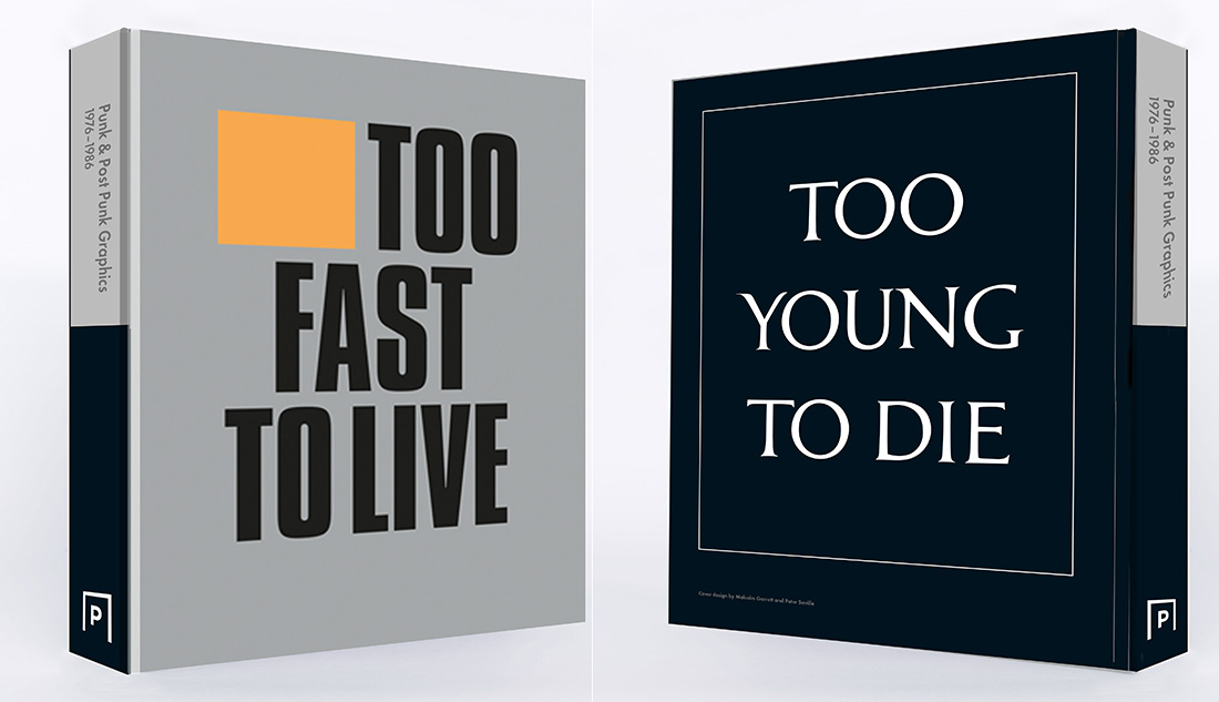
New York-based (former musician, banker, and collector) Andrew Krivine is arguably the most passionate Punk music devotee in the world — which is to say, I don’t know anyone who has collected as many visual artifacts of this period of popular culture and design as him. For over three decades he has amassed virtually every iota of graphics produced by, for, and from the nether and upper regions of punk. I met Krivine in 2014, following his exhibition Pretty Vacant: The Graphic Language of Punk at the Galleries at the Moore College of Art and Design in Philadelphia, which showed only a fraction of his collection. At that time, he was dedicated to getting an over 700-page book published on the entire collection. Unfortunately, the cost of doing a volume (or two, which was the initial plan) of this size was prohibitive. In 2018 he collaborated with Andrew Blauvelt director of The Cranbrook Art Museum to mount Too Fast to Live, Too Young to Die: Punk Graphics, 1976-1986, which opened in 2019 at the New York’s Museum of Design (MAD). This month Pavilion Books in London is publishing the first of two versions, a deluxe and trade edition of Too Fast to Live, Too Young to Die the limited edition will be released this summer. I talked with him recently on about his passion-quest and the historical significance of his collection.
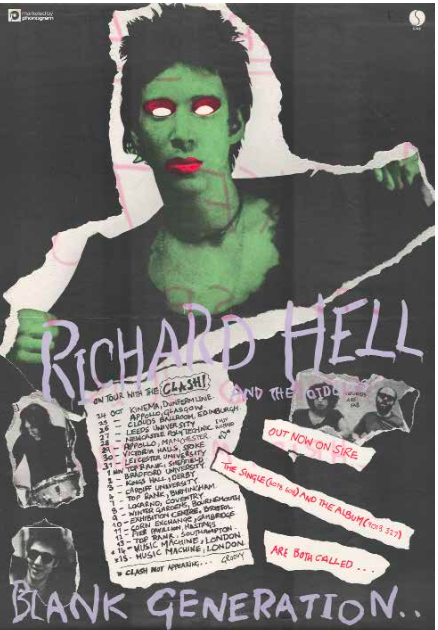
Steven Heller: What has driven you to devote such a significant part of your adult life to building the collection?
Andrew Krivine: Really the same impulse that gave me the strength to see the book through to completion — after six years of toil and rejection by three publishers (before I had the good fortune of being introduced to Pavilion)! As you know, I am fanatical about these posters, flyers, and fanzines, and wish to share the collection with the wider world.
Full disclosure: I have zero academic grounding in graphic design! Ironically, I am one of the untutored visual arts “unwashed” but I am convinced that readers will conclude that great art was produced by these designers. Hundreds of these works have a timeless quality, and hopefully the book won’t come across as a rambling trip down memory lane, filtered through a middle-aged punk rocker!
SH: So what gives you the chops to create such a volume?
AK: The book is my attempt to illustrate two central point; 1. that the received wisdom of punk graphics as exclusively the creation of working-class street urchins cum DIY artists is wildly overstated, and 2. that this comprehensive survey forcefully demonstrates why many punk and post-punk designs deserve to be considered art — not just rock music artifacts.
SH: Please expand on the second point.
AK: I want readers (particularly those outside the UK) to be exposed to several outstanding designers. Of course, Jamie Reid and Peter Saville are almost universally recognized (both have created stunning works) — but Malcolm Garrett, Alex McDowell, Neville Brody, Trevor Key, Barney Bubbles, Ken Maharg, Brian Linney, Russell Mills and others also richly contributed to punk and post-punk design. All of these designers deserve their day in the sun. And nothing would be more gratifying than to see The Whitney mount a retrospective of the works of Barney Bubbles on a similar scale to their recent Andy Warhol — From A to B and Back Again exhibition a few years from now!
With this book, I hope to change how these posters and their creators are perceived. In the vintage poster collecting world, punk posters are viewed with a mixture of bemused disdain and condescension, rather than respect. I hope my book will be a corrective in this regard. These posters are bursting with rage, exuberance, humor, irony and social commentary — which is why the visual legacy is so powerful.
My ambition may never pan out, but I believe passionately that many of the works on paper in the book (not just posters, but also flyers and fanzines) are as vibrant, visually compelling and sophisticated as those of created by the outstanding designers during the early decades of the 20th Century — including Carlu, Cassandre, Hohlwein, Klinger, Leupin, Rodchenko, the Stenberg brothers, and Stoecklin.
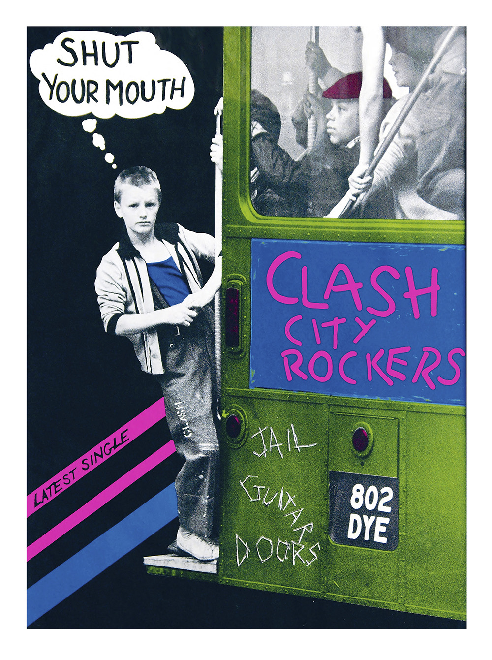
SH: Just out of curiosity, given your interest in the above poster makers, you seem disinterested in the psychedelic poster movement, which was, shall I say, more artful. How come?
AK: To date, punk and post-punk concert posters have been completely overshadowed by the output of artists associated with Bill Graham Presents and Family Dog circa 1966-70. As you know, several museums have mounted exhibitions of psychedelic poster art in recent years. I feel strongly that the punk and post-punk posters in my collection deserve their place in the graphical canon, and hopefully the book will trigger a re-assessment of these works.
Furthermore, unlike the psychedelic concert posters, punk gig posters were printed in small productions runs and are thus inherently rarer. Scores of San Francisco concert posters were printed by the thousands, often in multiple editions. Bill Graham did this intentionally — he created instant rock music collectibles as part of the concertgoing experience — which is why they survive in abundance.
And candidly, I see little design evolution or diversity in psychedelic poster art over the course of the hippie era. A handful of Grateful Dead, Big Brother & the Holding Company and Moby Grape posters can convey the entire creative arc of this poster genre. The contrast with my punk and post-punk posters could not be starker. I personally believe the graphic design legacy of punk and post-punk is just so much richer and more pervasive.
SH: Now that this book is on the cusp of publication, are you still passionately acquiring?
AK: Absolutely, and in fact the pace of acquisitions has accelerated since Cranbrook Art Museum first presented Too Fast To Live in 2018. Not only has the Too Fast To Live exhibition been subsequently mounted in New York and Brussels, but I have also loaned materials for smaller exhibitions at the Museum of Sex, Bucknell University and Michigan State University during 2019. One unexpected and fortuitous “by-product” of mounting these shows, is that people with vintage punk posters, flyers and fanzines have reached out to me after visiting the galleries.
For example, thanks to the ADAM Brussels exhibition, next month I will be taking delivery of one of the ‘’Holy Grails” of post-punk — an original Joy Division poster for a concert at the legendary Brussels club Plan K, from 1980. I have been looking for this poster for several years, and until now had to be content with an early 80s re-print (which can be seen in my book). It is hard to understate the rarity of this poster; it was printed on extremely thin newsprint paper stock, and because it was created for a single event almost no copies survived. This particular Plan K poster has been heavily restored (was in dreadful condition) and is one of my most costly purchases ever, but well worth it!
I anticipate making further acquisitions later this year and in 2021 as well, thanks to a series of exhibitions which will also be based on my collection. In late August, the University of Colorado-Denver is presenting an exhibition in their Next Stage Gallery (within the Denver Performing Arts Complex), which runs to the end of 2020. In addition, during the Summer and Fall of 2021 three other punk graphic design exhibitions are scheduled for Boston University, SUNY Binghamton and Georgetown University.
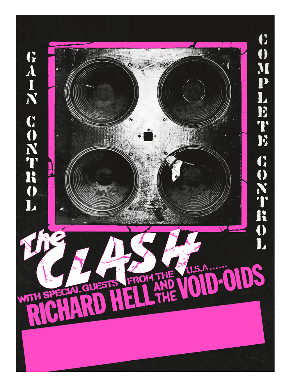
SH: What's next for you as author, collector, etc.?
AK: Given the state of the planet, who knows what the future has in store me! Seriously, on the exhibition front, I am still trying to secure additional venues for small scale exhibitions over the next few years. With the collection approaching 4,000 pieces, I should be able to quite lavishly supply three exhibitions running concurrently, along with the large Too Fast To Live exhibition.
In terms of what’s next as author, Steven I pray that the book will sell well for Pavilion Books. I have drafted a proposal for a book on New Wave graphic design (tentatively titled: Reversing Into the Future ), and have set aside literally 800 scans of related posters and flyers, ready to go. I have also identified several essay contributors who will be just perfect for the book.
During the process of editing Too Fast To Live , we had to ruthlessly cull the image count. The editor removed scores of New Wave images from the book, which hopefully will form the core of the next book. Pavilion — who could not have been more enthusiastic and supportive of the book - has the right of first refusal. If Too Fast To Live is well received, hopefully they will green light Reversing Into the Future before Labor Day 2020!
SH: Some might argue that Punk is actually anti-design-design, would you?
AK: Quite the contrary! As noted, one of my objectives in creating this book, is to change the perception of punk design as being a purely crude, untutored phenomenon. Rather I wanted to demonstrate through the images in the collection that most punk and post-punk graphic designs were created by people with a firm grounding in art history and practice. I recognize the attraction of describing punk design as a DIY phenomenon — it conveys an energy, velocity and spontaneity that is appealing and accessible — but the DIY ethos is just one brick in the punk graphic design edifice. I also love the DIY spirit, but do feel this characterization has become a rather facile shorthand, a label which isn’t accurate and risks trivializing the contribution made by punk and post-punk graphic designers.

