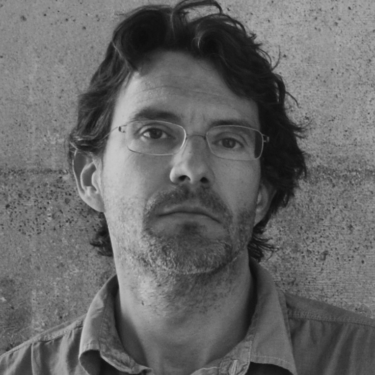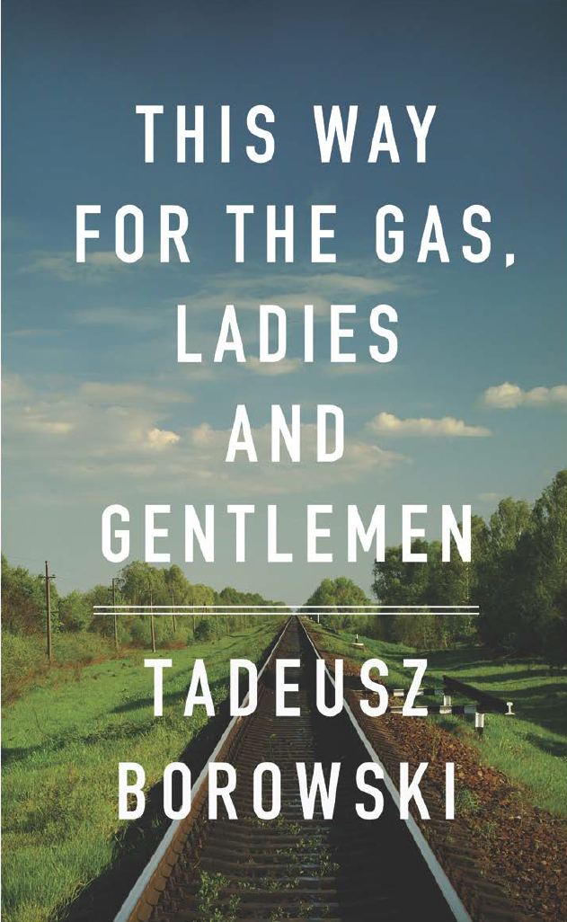
David Gee, final cover
This essay was originally published in This Way: Covering/Uncovering Tadeusz Borowski’s This Way for the Gas, Ladies and Gentlemen (Dunmore Publishing, 2011) and is reprinted here with permission of the author.
This Way for the Gas, Ladies and Gentlemen[1] is a collection of twelve stories written by Tadeusz Borowski (November 12, 1922-July 1, 1951) between 1945 and 1948 and based on his experiences as a "political" prisoner in various Nazi concentration camps between 1943 and 1945. Borowski was born in the Ukraine to Polish parents from whom he was separated for much of his childhood while they served time in various Soviet gulags. Eventually the family was repatriated to Warsaw where, at the time of the German invasion and occupation of Poland during WWII, Borowski was a young student and a burgeoning poet. As part of the Nazi program of "cultural genocide," Polish-language books, magazines, and newspapers not published by the German-controlled press were prohibited. It was in this environment that he secretly published his first book of poetry, Wherever the Earth (Gdziekolwiek ziema, 1942). In 1943[2], just days after the arrest of his fiancé who was a member of the Polish Underground, Borowski was also arrested and imprisoned in Pawiak, the Gestapo-run political prison in Warsaw, from which he was transported to Auschwitz and imprisoned, where his left forearm was tattooed with the number 119198. In August 1944 the threat of the approaching Soviet Army caused the Germans to evacuate the camp and Borowski was moved, first west to Dautmergen-Natzweiler concentration camp in the Black Forest, and then east, in April 1945, to Dachau-Allach outside of Munich where he was liberated by the US Seventh Army on April 30. After several months in a displaced persons camp in Freimann he was released in order to work for the Polish Red Cross Family Tracing Service in Munich. He returned to Warsaw in 1946, where he died in 1951.[3]
This Way for the Gas, Ladies and Gentlemen was first published in English in 1967, its stories collected from three separate books:[4] We Were in Auschwitz (Bylismy w Oswiecimiu, 1946), Farewell to Maria (Pozegnanie z Maria, 1947), and A World of Stone (Kamienny Swiat, 1948). We Were in Auschwitz, which contained the first four stories found in This Way for the Gas (including the story of the same name) was written by former prisoners Janusz Nel Siedlecki, Krystyn Olszewski, and Tadeusz Borowski, but is attributed largely to Borowski. A note in Postal Indiscretions: the Correspondence of Tadeusz Borowski states that Borowski was:
not only the author of the few stories for which he is known, but also the author of texts based on the other people’s accounts, co-author of most of the other stories, and also of the editing work (preface, dictionary, forewords to the stories, etc.).[5]We Were in Auschwitz was first and foremost the brainchild of Anatol Girs (1904-1990),[6] a graphic artist and publisher from Warsaw who Borowski met in 1945 while both were imprisoned in Dautmergen (prior to being moved to Dautmergen and then Dachau, Girs, like Borowski, was also imprisoned in Auschwitz) and for whom Borowski worked at the Family Tracing Service in Munich immediately after the war. It was Girs who encouraged Borowski, the poet, to first write prose (unfortunately, his stark, wrenching poems, many of which were written at Auschwitz, remain largely unpublished in English translation) and it is Girs who deserves much of the credit for the fact these stories have remained essential reading.
Although the four Borowski stories from We Were in Auschwitz were reproduced in This Way for the Gas, Ladies and Gentlemen Nitecki writes that We Were in Auschwitz
is not an anthology, but a single text written by all three authors. It is in chronological order — the opening chapters are set in the early days of Auschwitz, and the work closes in October 1944 when Siedlecki and Olszewski were transported out to other camps — Borowski had been transported out in August 1944. Also, Girs cited the authors in the order in which they had been brought to Auschwitz; Siedlecki in November, 1940; Olszewski in 1942; and Borowski in 1943.[7]We Were in Auschwitz was published in Munich by Girs’ Oficyna Warszawska na Obczyznie. Girs’ evocative design for the cover reproduced the prison stripes of the camp uniforms; an unknown quantity of books were bound with fabric from actual concentration camp uniforms to which a patch of fabric was sewn.[8] The red triangle denotes, in the classification system used at Auschwitz and elsewhere, a "political" prisoner (the letter P, a Polish national). The number 6643 was the actual camp number of co-author Janusz Nel Siedlecki. The title page prominently lists the camp number of each author next to his name (Borowski’s, 119198, being the highest). The English translation photographically reproduced the original cover as well as the title page and the dedication to the “VIIth American Army.”[9] Girs’ had his own copy bound in leather cut from an SS officer’s coat and embellished front and back with a strand of barbed wire and embossed on the spine with the image of a cracked skull.[10] A new edition of We Were in Auschwitz was published in 1958.
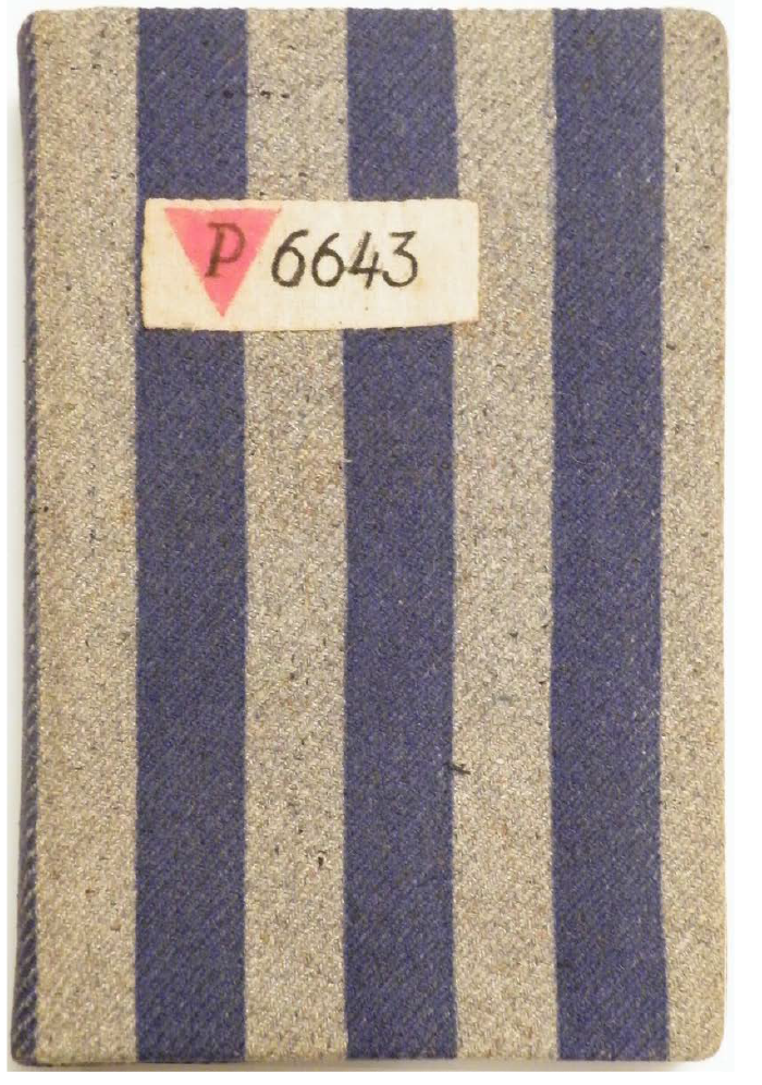
Original cover for We Were in Auschwitz (Bylismy w Oswiecimiu), Collection of Barbara Girs
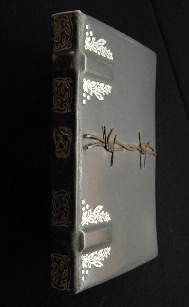
Anatol Girs’ personal copy of We Were in Auschwitz (Bylismy w Oswiecimiu), Collection of Barbara Girs
The first US edition of This Way for the Gas, Ladies and Gentlemen was published by Viking Press in 1967 in an English translation by Barbara Vedder. It featured on its stark dust jacket the title in bold red type on an upward creeping black background that appears to be in the process of blotting out the little lightness that remains at the top of the cover.[11] The 35 years since Penguin Books acquired Viking in 1975 have yielded just a handful of covers. The first was from the Writers from the Other Europe series inaugurated by general editor Philip Roth in 1974. Various cover permutations of this edition, all relatively uninspired and perfunctory, show the head and shoulders of a rigid German soldier pointing to his left. Much more engaging is the 2003 Penguin Classics ‘black cover’ series, with its dark, abstract image by Viktor Koen. For Koen, himself the grandchild of survivors of Auschwitz II-Birkenau and Auschwitz III-Monowitz and a student of the Holocaust,
capturing so much accumulated pain in one picture for such a book is impossible. When representational means are unable to communicate things a healthy mind cannot wrap itself around, the abstract qualities of a burned metal plate have to do. The rest has to depend on the mind’s eye.The current cover, from the "Twentieth Century Classics" series, shows a detail from German artist Max Beckmann’s gruesome rebuke of Nazism, Birds Hell.[12] With its unsettling combination of madness, barbarity and lack of emotion, as well as its specific references to Nazism, the painting is strangely sympathetic with Borowski’s grim stories.
In 2010, recognizing in Borowski’s book a unique opportunity to explore in depth one of the most confronting and challenging themes in the history of literature, Venus febriculosa and the Consulate General of the Republic of Poland in Los Angeles jointly sponsored a conceptual book cover design competition that attracted 241 entries from 44 countries. The images discussed here include selections from the competition as well as those specially commissioned from designers.
The design of these covers proved exceptionally challenging. As a practical and logistical exercise, the designers faced the monumental task of representing in a five inch by eight inch rectangle the depth and breadth of a dozen stories that portray, without respite and without apparent hope, the abhorrent brutality and dehumanization of the Nazi concentration camp system. Unlike, for instance, Primo Levi’s If This is a Man (Se questo è un uomo, 1958) which, though it perhaps cannot claim to be uplifting, speaks the language of humanity that is in essence hopeful, Borowski’s stories are harsh and unrelenting in a way that evoked accusations of “amorality, decadence, and nihilism.”[13]The mocking civility of the title (taken from the title of the first story in the collection) has proven to be a significant inspiration for the covers, more so, perhaps than the content of the stories themselves. Presumably it was chosen as the title for the English translation precisely because of its evocative nature.[14] It contrasts sharply with other notable Holocaust titles; for example, the ambiguity of Elie Wiesel’s Night or Levi’s If This is a Man (interestingly enough, also published in English under the significantly more descriptive title Survival in Auschwitz: The Nazi Assault on Humanity). So, it was perhaps inevitable, as was the case, that a large number of covers would feature images directly related to the title: directional arrows, pointing fingers and signs were well represented, in addition to the broader, if expected, palette of barbed wire, train tracks, swastikas, the Birkenau "Gate of Death," the Arbeit Macht Frei gate of Auschwitz I and the Star of David.
Berel Lang and James E. Young have convincingly and eloquently framed the debate about the treatment of the Holocaust[15] in art and literature. In the first sentence of his preface to Holocaust Representation Lang succinctly and lucidly states that “anyone who recognizes that the Holocaust poses unusual problems of representation also, in my view, admits the possibility of limits that apply to or constrain such representation.”[16] Later he notes complicating factors perhaps unique to the ‘genre’:
It might be asked, for example, how, or to what extent, aesthetic considerations should be encouraged or permitted to obtrude on Holocaust images. A ‘beautiful’ Holocaust poem or painting? An ‘evocative’ Holocaust novel or film? A Holocaust dance or symphony that is ‘tour de force’? To isolate such standard and valued terms of praise is in itself to face the problem of Holocaust representation, and to come close as well to recognizing the pressures of historical and ethical limits that I have been speaking about.[17]Any visual representations of inhumanity and war may be controversial and pose ethical challenges to artists. But it is without doubt the case for those who attempt to depict atrocities on the magnitude of those committed by the Nazis during their reign of terror.[18] The annihilation of millions of people (civilians, prisoners of war, Jews and non-Jews who perished in the gas chambers, in front of firing squads, by hanging and through death marches, starvation, disease and beatings at Auschwitz, Dachau, Treblinka, indeed the entire network of camps and sub-camps), arguably places intense responsibility on artists who must reconcile the competing demands of creative freedom, historical accuracy, responsibility to the experiences of survivors both living and dead as well as to the memory of those who did not survive. In a sense this small rectangle of a book cover, humble as it is, is weighed down with all of the myriad concerns that inform the design of the most significant Holocaust memorial.
There is of course, a strong possibility that such an exercise cannot be "successful" in the commonly understood sense of that word. Scholars continue to debate whether the Holocaust is "resolvable," in eitherhistorical or emotional terms. For instance, in discussing Oskar and Zofia Hansen’s “radical”[19] un-built winning entry[20] to the 1957 international competition for the Auschwitz-Birkenau memorial, Debórah Dwork and Robert Jan van Pelt, in the chapter “Epilogue: Owning and Disowning Auschwitz” of their extraordinary history Auschwitz, noted that it
gave form to the chasm between the 1.1 million dead and the living, an abyss the latter cannot traverse.and also:
Their design refused to allow the ruins of the camp to become objects for others to arrogate. It made no suggestion that there was some way in which the living could trace the steps of the victims, understand their experiences or share their memory; [21]
[t]he proposal was relentless. It refused to accept the illusion of memory. There were no stones to touch, no centre to stand strongly against the ravages of time, no majesty or dignity, no eerie but beautiful aura. There was to be no inscription commemorating the Six Million. Only silence and the bizarre granite walkway to pose the question for future generations: What happened here? [22]The passage of time and generations is yet another important factor, and without doubt the remove of sixty-five years has inevitably altered how the Holocaust is viewed and represented. As unlikely as it is that any of the participants in the Venus febriculosa contest were survivors themselves, clearly many were touched by the events in particular and significant ways. Many had close relatives who experienced the Holocaust firsthand.
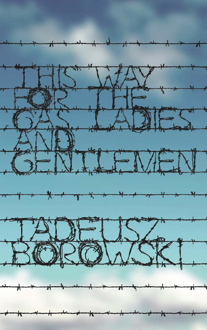
Anna Zysko
Anna Zysko, the Polish winner of the competition, specifically mentioned her visits to Auschwitz and Majdanek as well as the fact that the stories and poems of Tadeusz Rózewicz and Zofia Nalkowska[23] were required reading at her gimnazjum. Perhaps, both due to her nationality and geographic proximity to the sites of these events, she is at a lesser remove than her peers elsewhere. Still as James E. Young notes in discussing what he calls our “decidedly anti-redemptory age”[24] in At Memory’s Edge,
... by calling attention to their vicarious relationship to events, the next generation ensures that their ‘post-memory’ of events remains an unfinished, ephemeral process, not a means toward definitive answers to ephemeral questions.In her incisive essay Fascinating Fascism[26] Susan Sontag touches on an important point about the risks of aestheticization in the context of Nazism:
What further distinguishes these artists form their parents’ generation, moreover, is their categorical rejection of art’s traditional redemptory function in the face of catastrophe. For these artists, the notion either that such suffering might be redeemed by its aesthetic reflection or that the terrible void left behind by the murder of Europe’s Jews might be compensated by a nation’s memorial forms is simply intolerable on both ethical and historical grounds. At the ethical level, this generation believes that squeezing beauty or pleasure from such events afterward is not so much a benign reflection of the crime as it is an extension of it. At the historical level, these artists find that the aesthetic, religious, and political linking of destruction and redemption may actually have justified such terror in the killers’ minds.[25]
it is generally thought that National Socialism stands only for brutishness and terror. But this is not true. National Socialism — more broadly, fascism — also stands for an ideal or rather ideals that are persistent today under the other banners: the ideal of life as art, the cult of beauty, the fetishism of courage, the dissolution of alienation in ecstatic feelings of community; the repudiation of the intellect; the family of man (under the parenthood of leaders). These ideals are vivid and moving to many people.These quotes from Lang, Young, and Sontag strongly suggest that both the limitations and the potential pitfalls of this exercise are so great that it may be unreasonable to expect to overcome them. However, in examining a handful of the covers, it is interesting to observe how cleverly and perhaps intuitively many of the designers were able to sidestep the greatest dangers, some of them by presenting ‘solutions’ that referenced the ‘problem’ itself. For instance, Sulki & Min’s minimalist cover appears to confirm the insufficiency of any representation of the book’s contents or subject matter,[27] representing instead the “chasm between the 1.1 million dead and the living”. The square black void where an image might have been seems to acknowledge not only Sol Lewitt’s 1989 Black Form Dedicated to the Missing Jews (itself one of the few sculptures to successfully express absence) but also Elżbieta Janicka’s Miejsce nieparzyste/Odd Places (2005) a series of six large format photographs (apparently of ‘nothing’) taken at Auschwitz II-Birkenau, Kulmhof am Ner, Majdanek, Bełżec, Sobibór and Treblinka. At the same time it manages to simultaneously communicate both the gravity and negative quality of subject matter. Jimine Ha’s cover, unsettling, enigmatic, shares a similar sensibility. Ha noted that the theme is one of disorientation: the split ‘non-linear’ title, the inverted and slightly offset ‘path’ at the top of the page above the first part of the title, the tiny author’s name that receding into illegibility, the irregular edges of the rectangle. The figure-ground relationship between the black and near-black tones appears to oscillate: of the inner rectangle or the outer frame, which is space and which is solid?

Sulki & Min
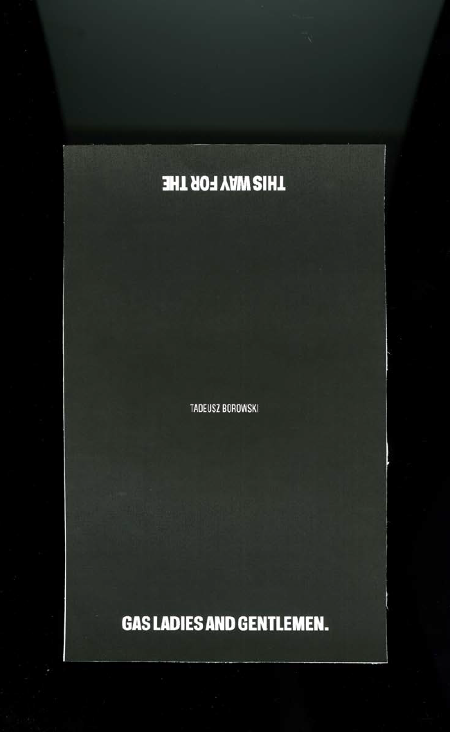
Jimine Ha
Among the more representational covers, images of train tracks figure prominently (the most common of which, numbering well over a dozen, being those that famously run through the gate of Auschwitz II Birkenau), symbolizing the horrors not only of the camps themselves but what Simone Gigliotti calls “traumatic transit”[28] in her study of a long-neglected aspect of the Holocaust: The Train Journey: Transit, Captivity and Witnessing in the Holocaust.
In one cover, Peter Chmela uses the device of a documentary-like image, a ‘realistic’ grainy and overexposed black and white photograph, its authority further reinforced by the use of a font modelled on jumpy mid-20th century typewriter text. The typical response to such indicators is automatic: it is seen as objective, matter of fact, historical; in other words, a cover befitting the gravity of the subject, a methodology commonly used when the imprimatur of verity is needed or sought (take for example, the use of black and white photography in Steven Spielberg’s 1993 film Schindler’s List, a half century after the advent of Technicolor’s three-strip process).
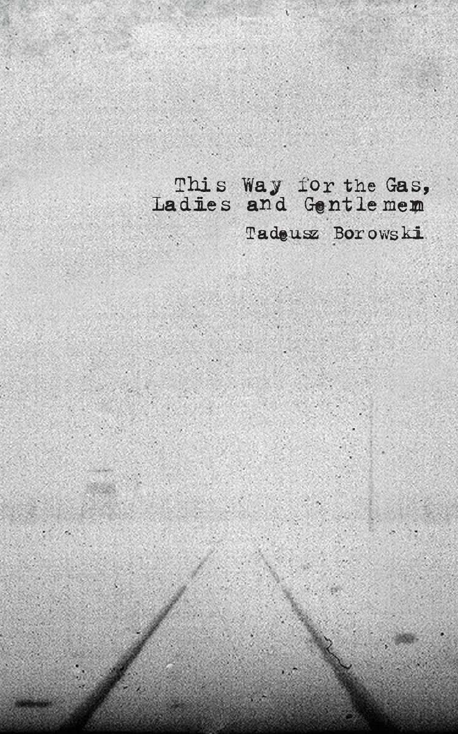
Peter Chmela
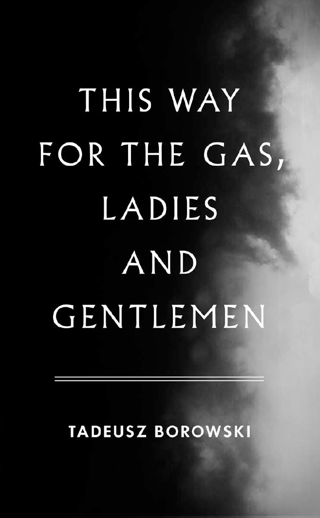
David Gee, early cover
David Gee on the other hand, quite consciously used no such indicators, explaining that the idea for his cover
came after noticing that there is a common visual language for books of this nature: black and white imagery, black letter text, grungy effects; all employed to do most of the work for the reader. I used a colour photograph to contemporize the cover and emphasize that these events did not occur in black and white. They happened on beautiful days as often as they did on overcast, grey, gloomy days, and this only serves to deepen the horror.Gee also took pains to clarify his use of the particularly legible font:
The type itself is set in DIN which was adopted by the German government in the late 1930s.[29] It was borne of a need and desire for ‘standardization and simplification’ (conveniently, Germans could read the new pan-European road and rail signs from their tanks) but the fact that these two words had greater and parallel ideological implications makes it all the more chilling.Upon request Gee agreed to share his initial idea whose sombre black and white cover and funereal font support his argument above. Beautiful, stately and perhaps appropriate in any other context, the austere design is elegiac, verging on the heroic, and vaguely fascistic. Gee obviously realized it was quite wrong for this ‘anti-redemptory’ collection of stories and instead chose the direction above.
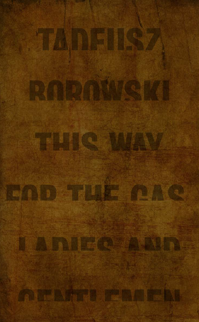
Jamie Keenan
Several nearly monochromatic covers reveal unexpected eloquence by using obscured, distorted and disappearing text to great effect. Jamie Keenan’s truncated words that appear to be in the process of sinking into a heavily textured background suggest the methodical erasure of countless lives that vanished into nothingness whereas Aliza Dzik’s text, fragmented by its projection onto wall and foliage, evokes the starkness, disruption and abnormality of ‘life’ in the camps as well the terror of being hunted and captured, of night arrests and deportations. Razan Mitiou also uses the interplay of light and shadow, here on a concrete wall painted with irregular text. In the lower right corner, barely discernable, emerge faces of prisoners. The full import of the composition is revealed when the source of light is identified as a can of the notorious Zyklon B. Giftgas used at Auschwitz and elsewhere. Mitiou’s deftly integrates these disparate elements that otherwise may have comprised heavy-handed pastiche into a subtle and lyrical composition.
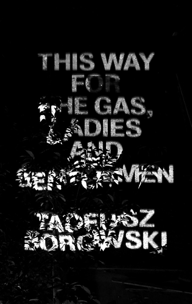
Aliza Dzik
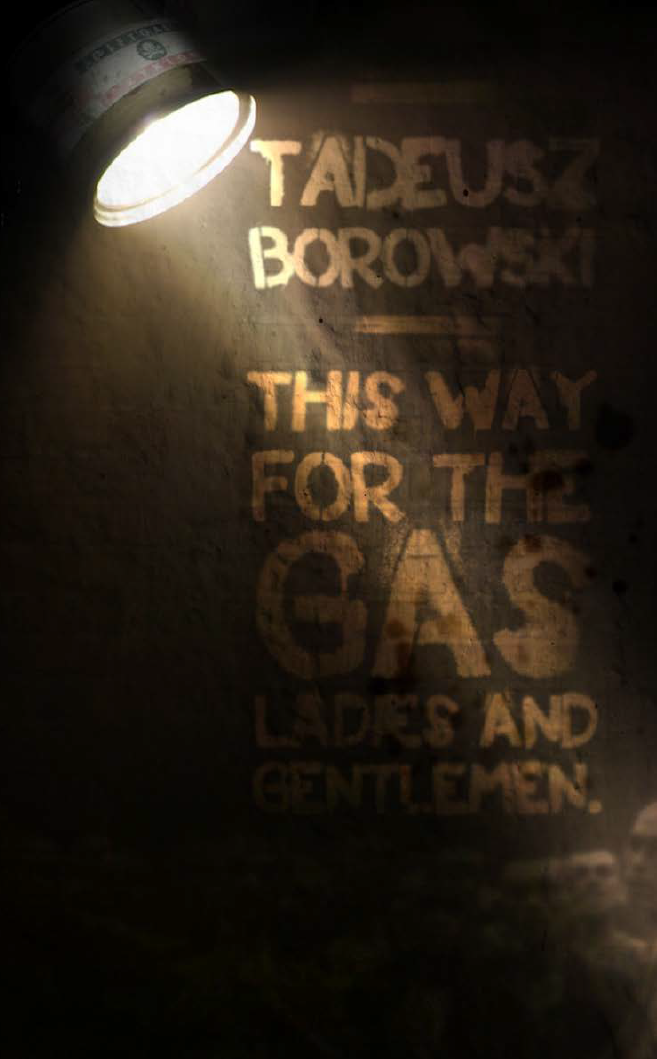
Razan Mitiou
In conclusion, the competition’s difficulty and, in some sense, its lack of success is what has made it such a fertile field for study which in turn provided the impetus for writing this essay. It is undoubtedly the case that this same complexity has eliminated the need (or desire) to showcase the worst attempts along with the best.
These covers, then, should be considered an opportunity for dialogue, not only about Holocaust representation but also, in the words of Mieczyslaw Lurczynski, “the methods by which people were turned into beasts and beasts into freaks of nature.”[30]
For more on the competition and book cover design, read Rick Poynor's "How to Cover an Impossible Book".
Notes
1. Tadeusz Borowski, This Way for the Gas, Ladies and Gentlemen, trans. Barbara Vedder (Middlesex, England: Penguin Books, 1976). The title for the English translation is taken from the story of the same name, Proszę państwa do gazu, which is perhaps even more sardonic than the translation rendered here. Alicia Nitecki writes that it can be expressed in a number of ways: “The expression prosze panstwa do stolu means ‘please come to the table (i.e. to eat), ladies and gentlemen.’ The word prosze can also mean ‘I invite you,’ so, literally, it can be ‘Please come to the gas, ladies and gentlemen,’ or ‘I invite you to the gas, ladies and gentlemen’ or ‘If you please, to the gas ladies and gentlemen’.”
2. Borowski was arrested on February 24, 1943. He arrived in Auschwitz on April 29, 1943, in Dautmergen-Natzweiler on August 24, 1944 and in Dachau-Allach on April 7 1945.
3. Most biographies state that Borowski committed suicide. However, to some the circumstances surrounding his death remain unclear, especially since Borowski not only left no note, but also allegedly told his mentor Anatol Girs that he would never kill himself. Similarly, Primo Levi’s death, once unequivocally deemed a suicide, is now increasingly gaining credence as accidental.
4. Farewell to Maria contains all twelve of the stories in This Way for the Gas, Ladies and Gentlemen in addition to ten others. A World of Stone contains twenty stories: seven of the stories in This Way for the Gas, Ladies and Gentlemen as well as five others also found in Farewell to Maria.
5. Tadeusz Postal Indiscretions: the Correspondence of Tadeusz Borowski, ed. Tadeusz Drewnowski, trans. Alicia Nitecki (Evanston: Northwestern University Press, 2007), 355, note 15.
6. In correspondence with Alicia Nitecki she has often noted Girs’ enormous influence on Borowski and his work.
7. Borowski, Correspondence, 06.15.10.
8. A 2000 exhibit at Yale University on the work of Girs curated by Jae Jennifer Rossman displayed two such copies owned by Girs’ daughter Barbara.
9. Janusz Nel Siedlecki, Krystyn Olszewski, and Tadeusz Borowski, We Were in Auschwitz, trans. Alicia Nitecki (New York: Welcome Rain Publishers, 2000).
10. Also in the Yale exhibit and also from the collection of Barbara Girs.
11. This is the translation still in print today. A new volume of Borowski’s prose, including all of the stories from This Way for the Gas, Ladies and Gentlemen, as well as many stories that never been translated into English, is scheduled to be published by Yale University Press in 2012 in a translation by Madeline Levine.
12. Die Hiille der Voge was painted in exile in 1938. Beckmann, an artist both well-regarded and lauded during the Weimar Republic, was dismissed from his teaching position at the Frankfurt School of Art in 1933 when the Nazi government came into power. He fled Germany in 1937, the very day the ‘Degenerate Art’ exhibition, which included several of his paintings, opened in Munich. That same year hundreds of his paintings were removed from German museums. 11
13. Jan Kott, introduction to This Way for the Gas, Ladies and Gentlemen, by Tadeusz Borowski (New York: Penguin, 1976), 19.
14. No edition exists in Polish with the analogous title nor, for that matter, was it the first Borowski story in We Were in Auschwitz. Also of note in this regard is the fact that the original Polish title for the story was the more prosaic The Sosnowiec-Będzin Transport.
15. Borowski was a gentile and while it is unclear what role, if any, this played in aesthetic terms, or whether his non-Jewish status created ambivalence about the use of certain Holocaust icons, to some the relationship of his stories to the Holocaust may be less than absolute, since scholars remain divided about the use of the term to define non-Jewish victims of the Nazis. There is little dispute, however, that Borowski’s stories constitute ‘Holocaust literature.’
16. Berel Lang, Holocaust Representation: Art within the Limits of History and Ethics (Baltimore and London: Johns Hopkins, 2000), ix.
17. Lang, Holocaust Representation, 13.
18. Because of the millions of images of which they are comprised and their unique claim to ‘reality’ films have perhaps been subject to the most intense scrutiny in this regard. Of special interest are those actually filmed at Auschwitz: Wanda Jakubowska’s Ostatni Etap (1948), Andrzej Munk’s unfinished Pasazerka (1963) and Andrzej Wajda’s Landscape after Battle (1970). Many films that have engendered controversy from Roberto Begnini’s Life is Beautiful (1997) to Steven Speilberg’s Schindler’s List (1993), and, notoriously, Gillio Pontecorvo’s Kapo (1959), which engendered two landmarks in film criticism: Jacques Rivette’s “On Abjection” (1961) and Serge Daney’s “The Tracking Shot in Kapo”(1992).
19. Deborah Dwork and Robert Jan van Pelt, Auschwitz (New York: Norton, 1996), 375.
20. Oskar Hansen (1922-2005) was a Polish artist and architect born in Finland. The competition team, of which he was the leader, consisted of Zofia Hansen, Jerzy Jarnuszkiewicz, Edmund Kupiecki, Julian Pałka and Lechosław Rosiński. The competition itself is an interesting and complicated story of controversy and compromise that ended with Hansen withdrawing his entry.
21. Dwork and van Pelt, Auschwitz, 375.
22. Ibid., 377-378.
23. Tadeusz Rózewicz and Zofia Nalkowska are not well known outside of Poland. Różewicz (1921-) is a poet who was also active in the Polish Home Army during WWII. Nalkowska (1884-1954) is perhaps best known for Medaliony (Medallions), seven short stories and an essay on Auschwitz, first published in 1946.
24. James E. Young, At Memory’s Edge: After Images of the Holocaust in Contemporary Art and Architecture (New Haven: Yale, 2000), vii.
25. Young, At Memory’s Edge, 2.
26. Susan Sontag, Under the Sign of Saturn (New York: Farrar, Strauss & Giroux, 1980), 73-105, reprinted from the New York Review of Books, February 6, 1975.
27. In addition, it should be noted that Sulki & Min’s cover was a direct inspiration for the cover of this book.
28. Simone Gigliotti, The Train Journey: Transit, Captivity and Witnessing in the Holocaust (New York: Berghahn Books, 2009).
29. The German standards organization Deutsches Institut für Normung adopted the font, known as DIN 1451 in 1936.
30. Mieczyslaw Lurczynski, The Old Guard, trans. Alicia Nitecki (Albany: SUNY Press, 2010), xi.

