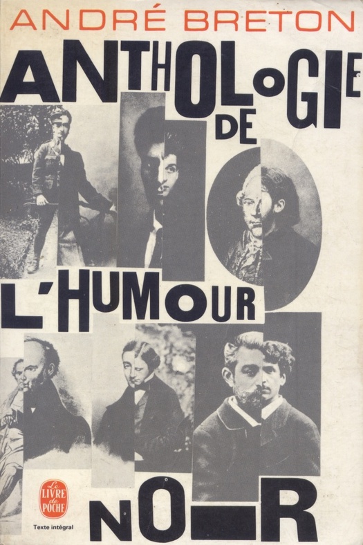
Anthology of Black Humor, Le Livre de poche, 1970. Credit: Pierre Faucheux
For a figure of Pierre Faucheux’s stature — Richard Hollis calls him “the single most important figure in French graphic design after Cassandre” — surprisingly little has been written about him in English. The article where Hollis made that claim, published in Eye as long ago as 1995, remains the only substantial consideration of Faucheux (1924-99) to be found online, and that includes writing about the designer in French. A monograph, Pierre Faucheux: le magicien du livre, also appeared in 1995 and it is an essential (though imperfectly illustrated) resource, but it was never translated and is long out of print.
Hollis concentrates on Faucheux’s achievement as creator of the “livre objet” (book object) and in particular his highly innovative typographic design from the mid-1940s for the French book clubs. Here, I want to look at Faucheux’s later work for the French pocket book publisher Le Livre de poche, to which both Hollis and Michel Wlassikoff in The Story of Graphic Design in France (2005) make only passing reference. It’s easy to see why historians with a need to be selective would relegate Le Livre de poche to a secondary role. Faucheux’s designs for the book clubs dealt with the “architecture” of the entire book, the relationship between its parts — Faucheux knew Le Corbusier and harbored partly realized architectural ambitions of his own — and he was also an exhibition designer of note. For Le Livre de poche, established in 1953 as a way for leading French publishers to make their books more widely available, Faucheux’s independent atelier (founded in 1963) dealt only with the books’ covers. These designs are part of the larger international story of the mass dissemination and promotion of low-cost, paper-covered editions to a growing audience of educated consumers in the post-war years.
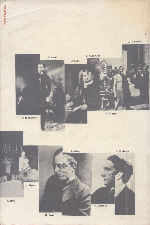
Anthology of Black Humor. Back cover
The most impressive designs are fine examples of the interpretative skill, graphic invention, and compressed imaginative intensity that a good cover requires. “He loved to find ideas,” says Bernard de Fallois, a former director of Livre de poche, in Faucheux’s monograph. “His taste was both classical and full of fantasy. The research of reference material occupied a large place in his graphic constructions.” Before Faucheux took up the task, Livre de poche titles tended to have conventional painted covers by a usually unattributed artist. These earlier figurative illustrations are frequently charming, often kitsch, and now look very dated (good examples here). For all the books, the smaller “poche” size (110 x 165 mm) is undoubtedly part of their appeal.
As time passes, old paperbacks assume ever greater significance as graphic documents. Unlike most other forms of ephemeral graphic design, they have remained in everyday circulation; they are highly visible and easy to source, offering an immediate, object-based insight into earlier graphic styles and approaches. Contemporary posters, though still available to see at firsthand, require more searching out from specialist sellers, and even 12-inch record sleeves are slowly becoming less available. All of the covers shown here were found in French used bookstores and markets, most of them this summer. I made a list of some comparatively rare titles, such as the complete works of Lautréamont (below), and usually located them quite quickly. Their condition obviously varies. They are also inexpensive: the typical price for a 1960s French design classic is one to three euros — slightly more in dollars.
The Atelier Pierre Faucheux’s prodigious output of book covers is listed at the back of his monograph. During the height of production, from 1964 to 1978, it averaged around 120 Livre de poche covers a year and this was usually less than half of the total output of book covers (the studio was also designing book interiors, exhibitions and other projects). In 1972, the atelier designed 219 Livre de poche covers and 419 covers in total. Naturally, this was a team effort; by the early 1970s, Faucheux employed 14 assistants. The credits on the back covers vary. Most of those I have seen say: “At. Pierre Faucheux.” Some say: “Faucheux art graphique.” The Anthologie de l’humour noir (top), one of Faucheux’s most inventive covers, based on his own collage, for Surrealism’s founder André Breton, an author he knew and admired, is simply signed: “Pierre Faucheux.” Some covers known to be by Faucheux, such as the Lautréamont, have no credit.
Faucheux’s main assistants — Bernard Flageul, Pascal Vercken, Daniel Le Prince and from 1975 Josseline Rivière — all acknowledge his strength of vision and control of most of what left the atelier. “The choice of images, the choice of type were 90 percent down to Pierre,” recalls Flageul, who joined the atelier at the start. “He explained things, made a sketch, which he signed and dated, and we executed it. . . . He marked us all: we are all little Faucheux in some way.”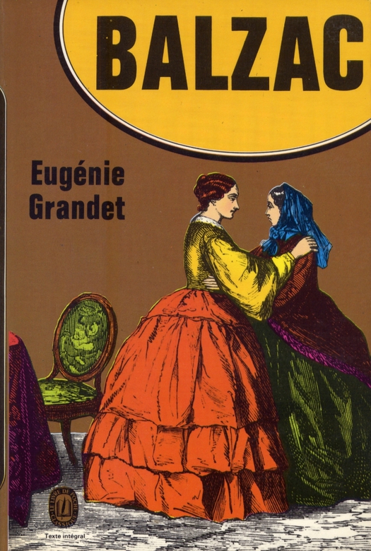
Eugénie Grandet, 1972. Credit: Atelier Pierre Faucheux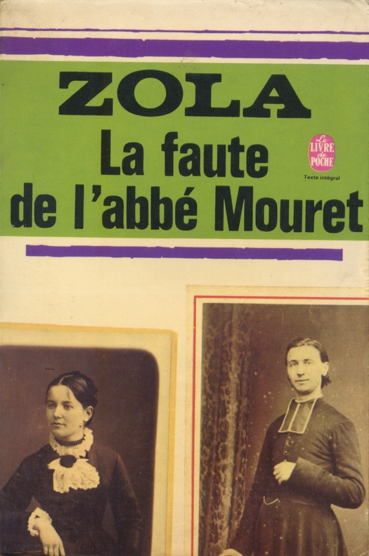
The Sin of Father Mouret, 1971. Credit: Atelier Pierre Faucheux. Photographs: Jean Vigne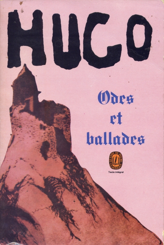
Odes and Ballads, 1969. Credit: Atelier Pierre Faucheux
I have chosen to concentrate here on showing Faucheux’s interpretations of French literature (though Breton’s anthology of black humor also includes non-French writers). These examples broadly represent the atelier’s stylistic diversity. Faucheux handled classic French literature from the 19th century — Balzac, Zola, Hugo — and earlier with an almost irreverent boldness and panache, and these books often followed a series style established for the author, with the writer’s given name rendered in heavy letters and a free graphic treatment of source material, which might be colorized for impact. All of these devices can be seen on Balzac’s 1833 novel Eugénie Grandet (above). The impression is often postmodern avant la lettre, a graphic diversion or jest for the visually literate reader, though archival research tends to underpin the playfulness. The idea for the medicine label frames used on both sides of Bouvard et Pécuchet came from Flaubert’s father being a doctor. It perfectly reflects the autodidactic mania and frenzied collecting habits of the two buffoons who give the novel its title.
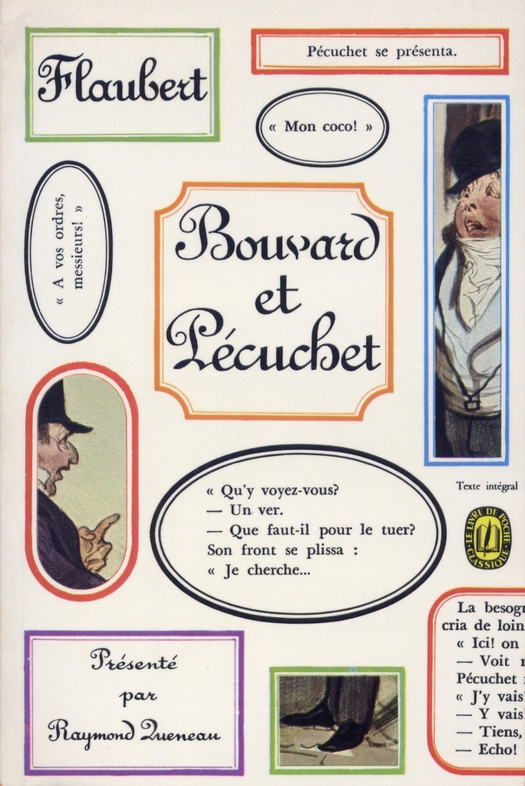
Bouvard and Pécuchet, 1966. Pierre Faucheux (no printed credit)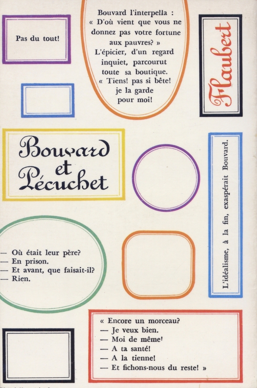
Bouvard and Pécuchet. Back cover
The books have no blurb on the back cover, though sometimes, as with Zola, all the titles in a series are listed for the reader’s convenience. In most cases, the atelier had the luxury of using both front and back for graphic imagery. This might be an extension of the front cover concept, as with Flaubert and Breton, a partial repetition or an inversion of the front (the Hugo simply flips the name and image, omitting the title), or an entirely new graphic idea and image, sometimes a document or a piece of writing in the author’s hand. Gerard de Nerval was revered by the Surrealists for his poetic interest in dreams and the back cover of his Poesies, an image of “La Main de Gloire” (Hand of Glory), is a particularly satisfying contrast. The book, decorated with a border of arcane symbols, has the dark air of a forbidden volume or an occult tract that promises strange knowledge and perverse illumination. Heady stuff for a small, inexpensive paperback.
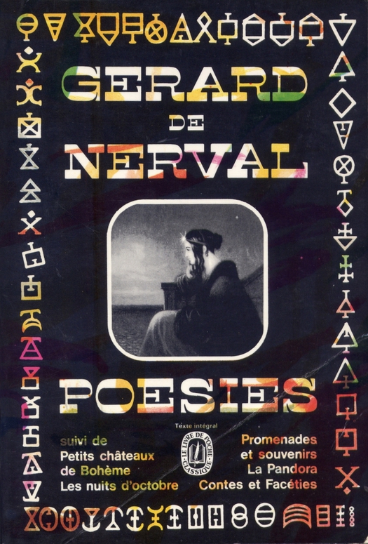
Poetry, 1968. Pierre Faucheux (probable attribution: no printed credit)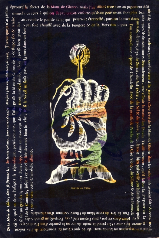
Poetry. Back cover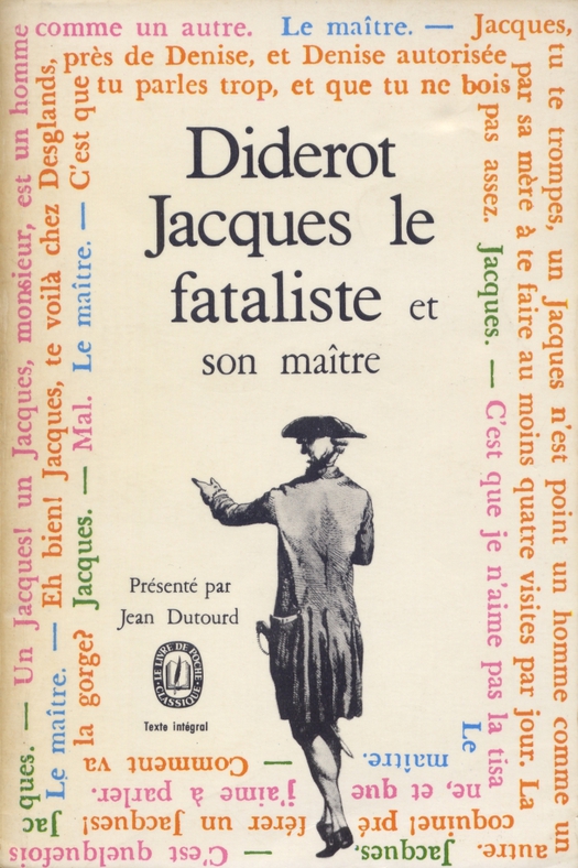
Jacques the Fatalist and his Master, 1968. Pierre Faucheux (no printed credit)
Equally arresting is the cover of outlaw writer Albertine Sarrazin’s autobiographical novel L’Astragale (1965), where the largely empty back cover is given to a portrait photo of the back of the author’s head, which wraps around the spine. This audacious gesture — a void in the image where a sales pitch might conventionally go — is as fresh and experimental for its context as anything being attempted in cover design today.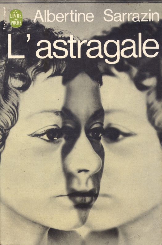
L'Astragale, 1968. Credit: Atelier Pierre Faucheux. Photograph: R.J. Segalat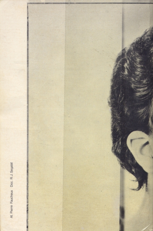
L'Astragale. Back cover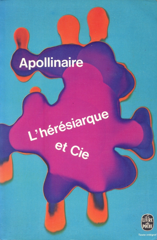
L’Hérésiarque et Cie, 1973. Credit: Faucheux art graphique
As the covers here indicate, Faucheux was entirely open-minded in his choice of letterforms and the designs are delightfully non-doctrinaire in their pursuit of styles of expression in keeping with the subject. Modernist sans serif is used only where it is effective; the intersecting, coldly monochromatic mirror faces of L’Astragale benefit from minimal distraction. An almost scientific yet eccentrically placed sans serif also works well with Faucheux’s surreal biomorphic blob (above) for Apollinaire’s collection of short stories, L’Hérésiarque et Cie (1910). Elsewhere, Faucheux mutilates the Didot titlepiece used in his 1950 design for the book club edition of Les Chants de Maldoror, and contrives a jaunty, pre-punk typographic cut-up for Raymond Roussel, another talismanic figure for the Surrealists. Boris Vian’s bizarre 1953 L’Arrache-coeur (Heartsnatcher) receives a viciously torn alphabet, like a series of injuries inflicted on the cover, while a crime novel made into a film by Louis Malle is graphically summarized by a smeared, descending “ascenseur” (elevator). 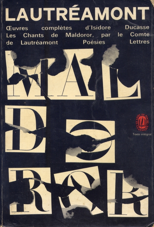
Complete Works of Isidore Ducasse (Lautréamont), 1967. Pierre Faucheux (no printed credit)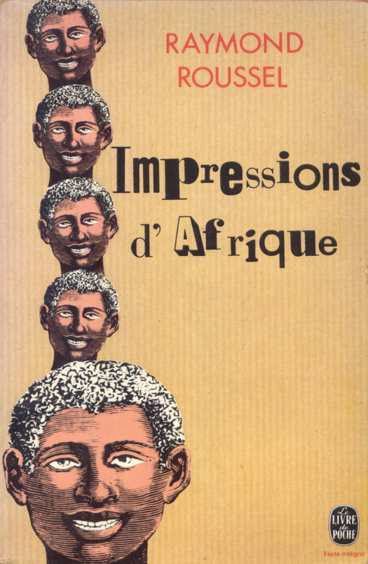
Impressions of Africa, 1972. Credit: Faucheux art graphique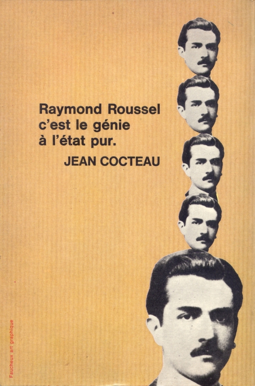
Impressions of Africa. Back cover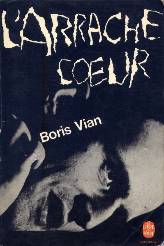
Heartsnatcher, 1968. Credit: Atelier Pierre Faucheux. Photograph: H. Guilbaud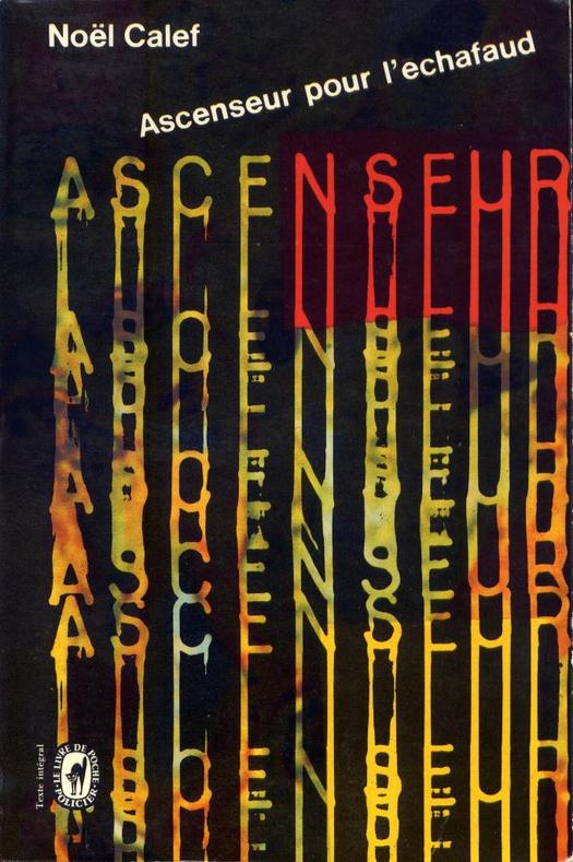
Elevator to the Gallows, 1965. Pierre Faucheux (no printed credit)
As Richard Hollis notes at the end of his article about Faucheux, “Typeface designs are never value-free. They refer to cultural inheritance.” Nevertheless, a slightly different view of Faucheux the focused typographic theorist and innovator perhaps emerges from this huge, little studied, later body of work, particularly from the Livre de poche covers created from 1964 to the mid-1970s. (Faucheux continued to produce them until 1990.) For here we see a designer for whom Surrealism, the fantastic and the ludic are never far away — I plan to return to this in a later post — and for whom the letterform is just one vital element (or set of elements) and not necessarily always the most important, in a field of communicative resources that includes every kind of made, found or photographic pictorial device. Nor should we overlook Faucheux’s engagingly uninhibited and often stunning use of color.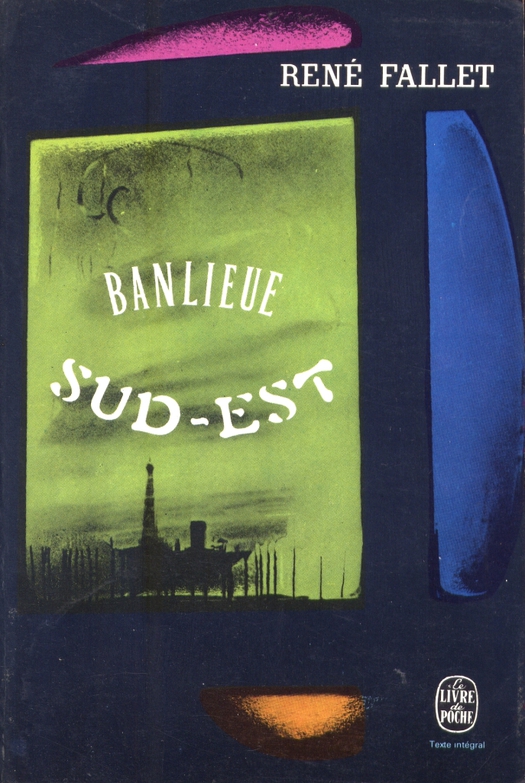
South-eastern Suburbs, 1967. Credit: Atelier Pierre Faucheux. From a photograph by Izis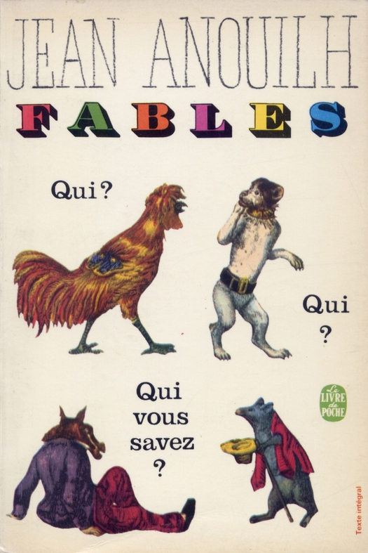
Fables, 1966. Credit: Atelier Pierre Faucheux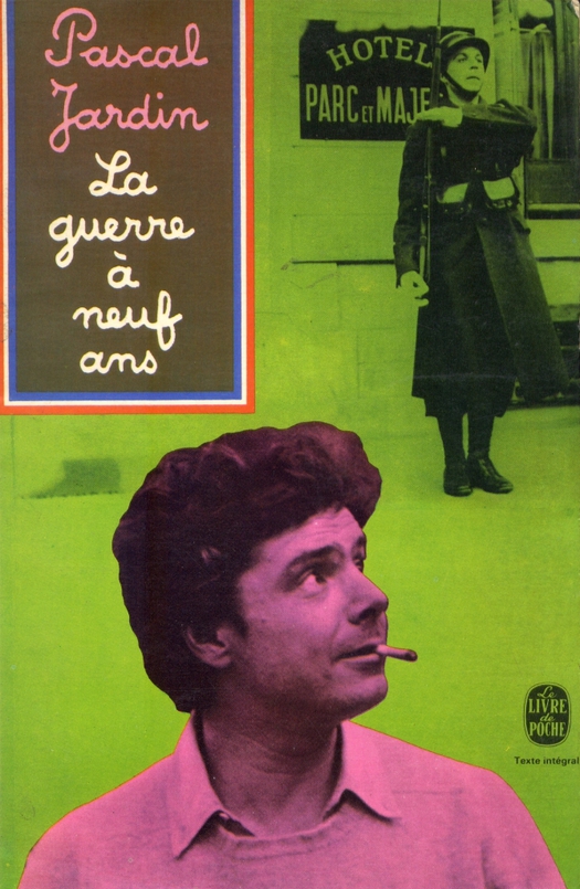
The Nine Year War, 1972. Credit: Faucheux art graphique: Photograph: Roger-Viollet
See also:
The Shape of a Pocket
Bright Idées
On My Shelf: Jean-Luc Godard Anthologized


Comments [11]
I recently met and interviewed Massin in Lisbon, and he told me a curious story about him and Faucheux. The latter had been, of course, the former's master in the late 1940s at the Club Français du Livre. In 1973, Bernard Pivor invited them to the very first airing of his "Ouvrez les Guillemets" series of programmes. He was expecting some angry words, perhaps a fist fight (to help boost the ratings), at the very least a tense showdown. Unfortunately for Monsieur Pivot, Massin (who was art director at Gallimard at the time) and Faucheux got along pretty well, like old friends. Massin also told me that what Faucheux truly wanted to be was an architect, although his lack of formal training meant that he was not officially recognized as one, something that ate at him (much of ÉCRIRE comes out of that need to vindicate himself as a worthy architect).
07.31.12
08:52
How about a new edition B42?
I agree about the quality of the "Libertés" series, with their lovely kraft paper covers and beautifully arranged cover type. I have a couple of those. But the Livre de poche books are something else: a response to the demands of the mass-market pocket book to be sold in tens of thousands that manage, when they are on form, to be explosively inventive.
More and more with graphic design, I want to argue for anarchic diversity rather than visual systems that end up imposing needless limits.
07.31.12
09:56
Massin told me that he intended to publish in his Typographies Expressives imprint a monograph on Faucheux, but apparently Faucheux's heirs were not very keen on him doing so.
You're right of course about the LIVRES DE POCHE being in a different arena than the more "elitist" or avant-garde series of Pauvert and Losfeld. Faucheux covers some of his work for Livres de Poche in ÉCRIRE (his concept of books covers being "psychological spaces" that mirror the essence of the book's contents is a catchy one).
07.31.12
10:21
07.31.12
05:42
08.01.12
05:32
08.01.12
11:45
Catherine is also a research student at the Royal College of Art in London writing a thesis on Faucheux which will be the authoritative account when published. She shares Rick's interest in anarchic diversity, arguing that Facheux is best understood as someone who escaped or eschewed the traditional structures and boundaries of graphic design - she calls this deterritorialisation (or dépaysement).
08.02.12
10:19
Off topic or not, I was knocked out the one time I had Chris Marker's Commentaires in my hands. Two more titles for the wish list.
08.02.12
01:23
I must also mention that my thesis abstract currently on view on the RCA website will be updated soon. The present one is a little misleading I confess. This was an earlier version of my research, which now concentrates on the figure of Pierre Faucheux and how the deleuzian notion of «deterritorialisation», which finds an echo in the Surrealist idea of «dépaysement», can be applied to understand the «lines of flight» of this magicien du livre.
08.08.12
06:40
Kind Regards,
Gyorgy
03.28.14
08:33
07.14.15
04:56