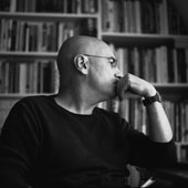
A student recently asked me an unusual question: "How come," he said, "so many designers read James Joyce?" I was flummoxed. Are there significant numbers of designers interested in the master of the interior monologue? David Foster Wallace, perhaps. Cormac McCarthy, possibly. I know a graphic designer with a big P.G. Wodehouse habit. But Joyce? I’m not so sure.
I asked my student what prompted his question. Seems he had noticed that a number of designers, when invited to submit reading lists, had cited Joyce as a favorite author. And it’s true that Joyce’s most famous book, Ulysses, appears at No. 3 in the Designers & Books list of 10 Most Frequently Chosen Non-Design Books (he only makes a solitary appearance in Tony Brook’s 2006 publication 50 Reading Lists). This is hardly confirmation of a widespread obsession, but something snagged my interest. I’m a Joyce fan and a graphic designer—could I find a link between graphic design and Joyce?
My own fixation with Joyce began long before I discovered graphic design. At school I read Portrait of the Artist as a Young Man and was mesmerized by this account of how the young Joyce sloughed off his Catholic faith, navigated the neurosis of family, school and friendships, and dealt with the adolescent tumult of sexual discovery (what he called the “swoon of sin”).
But more than anything, it was the sheer aesthetic rush of the language that—even then—I found intoxicating. Joyce’s ability to mix vivid, lyrical prose—the kind that can only be produced by someone who possessed a classical education (which Joyce did)—with the sewer talk of a frequenter of Victorian Dublin’s redlight district (which Joyce was).
It was my first encounter with the power of language to induce altered states. Joyce’s ability to use language to create a riptide of aesthetic delirium, where meaning, allusion, pattern, rhythm and sound combined to form an effect that was both deeply sensual (“… he heard the snow falling faintly through the universe and faintly falling, like the descent of their last end, upon all the living and the dead.”) and entirely matter-of-fact (“Sardines on the shelves. Almost taste them by looking. Sandwich? Ham and his descendants musterred and bred there. Potted meats. What is home without Plumtree’s potted meat? Incomplete. What a stupid ad!”).
I intuitively understood—and recognized—the Joycean universe. Naturally, it helped that I’d grown up in a Catholic household and have Irish ancestry, but more than this I felt an affinity with the interior monologue—for which Joyce is justly famous (although he didn’t invent it). Here I found a mirror image of my own interior landscape: a jumbled accretion of memory, haphazard reflections, and directionless paths of thought.
Much later, after reading Dubliners and then Ulysses (declaration: I never managed Finnegans Wake, though I’ve dipped into it many times, and enjoyed big chunks of it as an audio book), I read Richard Ellman’s great biography of Joyce. In this monumental account of the writer’s life and work, it became clear that Joyce was both a model of creative fecundity and artistic courage in the face of every imaginable obstacle, but also an often cruel and self-obsessed figure. He had a deep love for his wife Nora and his two children, but he was a shameless cadger of money and a ruthless exploiter of others in the pursuit of his various obsessions—paramount of which was writing.
So, is there a link between Joyce and design? He certainly can’t be held up as a master of the visual. Descriptions of the "look of things" are thin on the ground in Joyce—something that is partly explained by the fact that he suffered from chronic myopia throughout his life, enduring endless debilitating eye surgery, and spending his final years in near total blindness. And because of his relentless candor and his frenzied imitations of the chaotic reality of psychological life, it’s hard to see him as an agent of order: Joyce dealt in chaos and the disjuncture between thoughts and deeds, whereas designers are agents of order and the smoothing-out of disjuncture.
It would appear, therefore, that there isn’t much to connect the master of twentieth-century modernist literature with the mundane world of graphic design. Perhaps the attraction felt by designers to Joyce is the same attraction felt by other Joycelovers (he was keen on neologisms)—a reverence for the raw power of language.
Yet what attracts me to Joyce is a quality that is close to what interests me in graphic expression: Joyce’s ability to use vernacular language and make it appear fresh minted is something that well-considered graphic design also does. Defamiliarize the ordinary, said Paul Rand. Joyce does just this. He can list brand names of foodstuffs, horses and riders at the races, and the pompous titles of civic dignitaries, and make them into poetry. Take this account of Dublin transportation:
"At various points along the eight lines tramcars with motionless trolleys stood in their tracks, bound for or from Rathmines, Rathfarnham, Blackrock, Kingstown and Dalkey, Sandymount Green, Ringsend and Sandymount Tower, Donnybrook, Palmerston Park and Upper Rathmines, all still, becalmed in short circuit. Hackney cars, cabs, delivery waggons, mailvans, private broughams, aerated mineral water floats with rattling crates of bottles, rattled, rolled, horsedrawn, rapidly.”
Ulysses is full of this wonderful literary alchemy. A simple list of tramcar destinations becomes a litany of poetic discovery (read it aloud and its phonological power will be revealed.) I don’t think it is too fanciful to suggest that good graphic design—all design in fact—has this same transformative power to make the quotidian into the unexpected.
This essay was originally published in September, 2014.