The first time I was introduced to Chris Ware’s work was at R.O. Blechman’s Ink Tank office on West 47th Street (I think). It was a gothic styled wood paneled room where Blechman, Art Spiegelman, and a couple of other members of the Swann Foundation for Caricature and Cartoon were voting for the first annual fellowship award, a small sum of money earmarked to help an up and coming cartoonist.
Spiegelman brought some newspapers from the University of Texas at Austin with a series of delightful color comics by one F.C. Ware—“Chris,” to his friends. We were all anxious to give the award to a deserving “underground cartoonist” and Ware’s comics were not the usual brand of undergrounds. They were not Crumb-like, Spain-like, Bode-like or like anything else that was familiar to me at the time. I can’t even tell you what they were like, but we all agreed with Spiegelman without any token resistance that these self-published comics would benefit from the $1,000 to $1,500 that we had to offer. Spiegelman assured us that Ware would be so darn grateful and that we’d be happy too.

© Monograph by Chris Ware, Rizzoli New York, 2017.
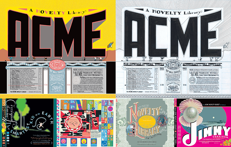
I had forgotten all about the award and F.C. Ware until a few years later, when I began buying his ACME Novelty comics. I had stopped collecting comic books, although I did frequent Forbidden Planet on a weekly basis to see what was available. Ware’s beautifully drawn panels, and vintage mail order catalog-esque, hand-lettered comics were not just stories; they were artifacts extraordinaire. Without hesitation, I bought whatever Ware produced—not just to read, but also to admire the quality of the draftsmanship, precision of the lettering and typography, and the bookmaking virtuosity. Ware’s work was a thousand times more masterful than those first newspapers we saw—and they were already good. So once again, Spiegelman had discovered a talent in the raw that had quickly become a master of the comics domain.
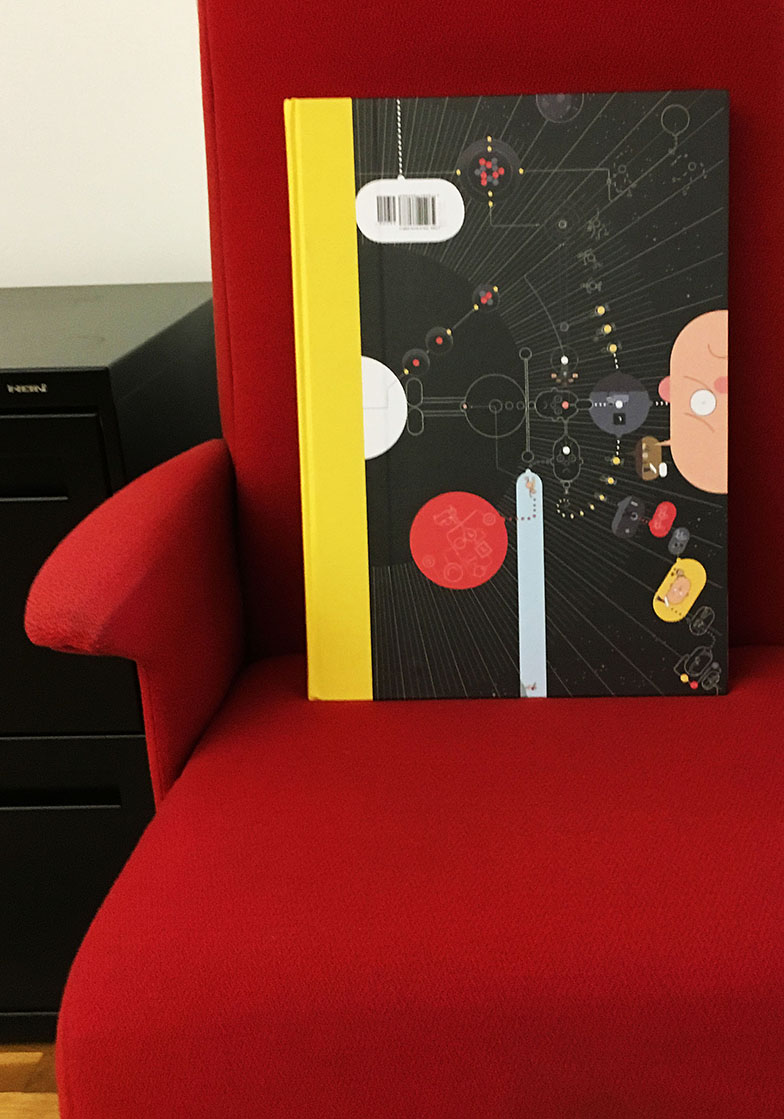
Just the other day, I received the ultimate opus, Chris Ware: Monograph (Rizzoli), and tore through it knowing that this extra tall, super heavy, inspiringly printed volume (with a few surprisingly tipped in comic book gems) was going to take up a lot of my free time. And, given the book’s hefty proportions, a lot of space in my increasingly decreasing library space. As much as I try not to add volumes, Ware’s wares cannot be dispensed with. His last box of book goodies, Building Stories, a collection of variegated comic books and ephemera, was too exciting to ignore. Likewise, Monograph, with delightful introductions by Ira Glass, Francoise Mouly, and Art Spiegelman (as well as photos of Ware’s rare handmade toys, sketches, and notes), is one of those indispensable objects d’art and cabinets of wonder that any Ware fan would be a fool to pass by.

© Monograph by Chris Ware, Rizzoli New York, 2017.
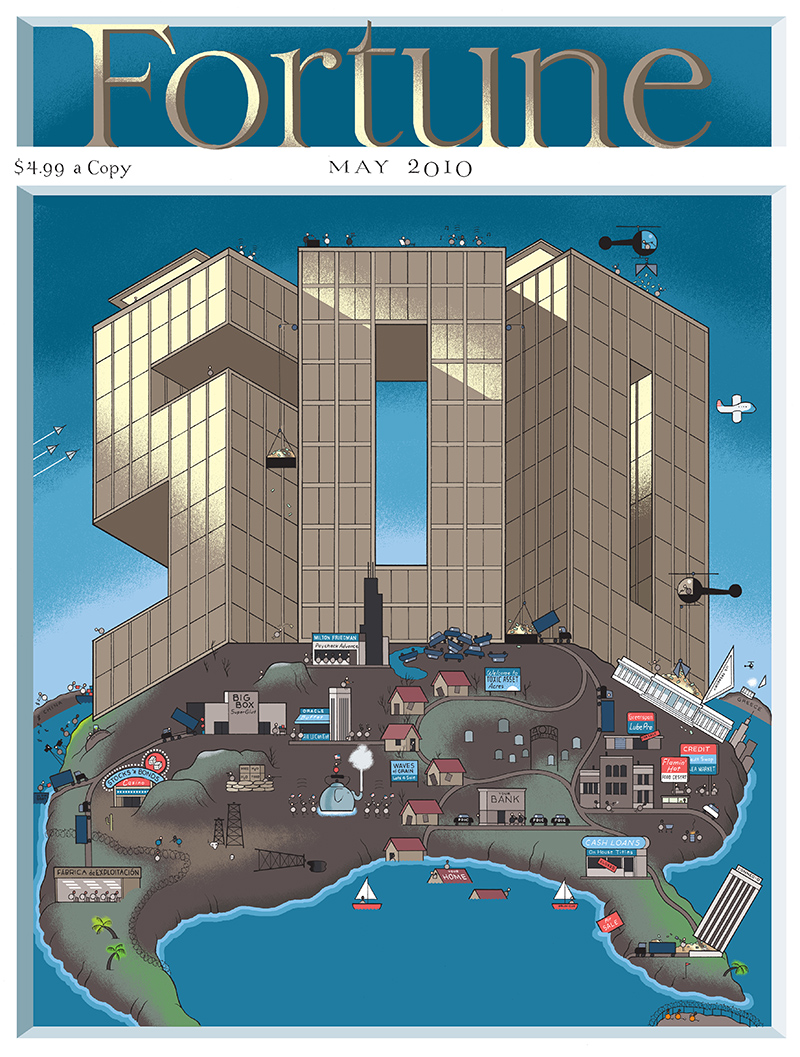
As I looked through the volume for the first time of what will be many journeys, I noticed some pages showing a cover he did for Fortune magazine where he recreated the original 1930s Thomas Maitland Cleland nameplate of the magazine. This reminded me of when he designed an entire Summer issue for me of The New York Times Book Review, which I loved then and treasure now: Not only did he totally redesign the Book Review nameplate in a typeface of his own creation (basically a no-no), he redrew The New York Times masthead following a 1928 version. I knew something didn’t look right, but it wasn’t until I was called in to see the big boss for a stern reprimand that I learned of its vintage. “Never do that again,” I was warned. “I won’t,” I promised, knowing full well that since it was already a fait accompli, it was on the record in the paper of record for all time.
That cover, which still means so much to me, is not in Monograph, but so much of Ware’s brilliance is that it makes no difference.
You can read an excerpt from Monograph here.

Chris Ware. PHOTO: Seth Kushner

