Poster by Neville Brody
In a response to Michael Bierut's essay, Battle Hymn of the Tiger Mentor, Or, Why Modernist Designers Are Superior, Andy Chen questions the rules of modernism, examining why we need to look beyond the -isms.
I’ve often asked myself why graphic design so seldom reflects or delivers deeply emotional experiences in the way that music, theater, or film can. Part of it, I think, results from modernism's pervasive influence and insistence on neutrality — the removal of the visible presence of the designer's hand and a belief in clarity, restraint and order. In his recent essay on modernism, Michael Bierut notes that the search for these attributes requires rigor, humility and a respect for craft. However, so-called “rules” that demand a modular grid or prescribe a palette of “authorized typefaces” define the boundaries and character of communication. While modernist designers refine this approach with an attention to appropriateness and ambiguity, their belief in a “universal” form puts constraints on expression. This is particularly evident in typography, where gestures that inject a sense of personality — extreme tracking or leading, vertical or horizontal scaling, stacking of letterforms — are considered “crimes.” While it's true that design is a problem-solving mechanism, and not a vacuum for self-expression, I wonder if our work could benefit from a more personal tack.
Discipline is not the same as repression, and personality is not the same as indulgence. After all, Massimo Vignelli's work is full of his personality: it’s austere, restrained, and dignified. But reifying his beliefs as a universal set of rules limits our ability to express the full gamut of human experiences and emotions. Sure, the type is in a grid, it's perfectly legible and it's carefully laid out. But does that mean that I want to read it? Or that it successfully honors its content in the most appropriate way? Bierut notes that readers might “react with horror” at his submissiveness to Vignelli's rules, but the message is actually quite conservative: learn the rules before you break them. I appreciate Bierut's injunction to “fuck them up a little,” but who gets to decide these rules, and why? No design device is implicitly right or wrong; typography, color and composition produce emotional effects that can be calibrated to serve content while preserving personality.

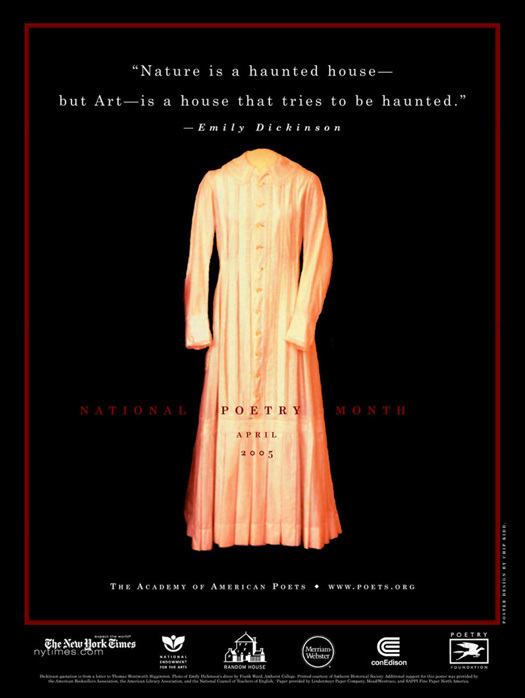
Chip Kidd, National Poetry Month poster, 2005
This review of Chip Kidd’s poster for the 2005 National Poetry Month is a case in point: the reviewer praises Kidd’s design only to disparage his use of lowercase letterspacing as a self-indulgent distraction. The poster features Emily Dickinson's dress floating in a field of black below a line of her poetry: “Nature is a haunted house — but Art — is a house that tries to be haunted.” Kidd's letterspacing does not distract from meaning; it modulates it. Like the treatment of the image, the spacing helps create the sense of haunting indicated by the quote. The air between the letters suffuses the words with feeling. The choice is conceptual, and not merely stylistic. This willingness to look beyond -isms and rules, treating devices from multiple design traditions as fair game, typifies Kidd's approach. The repeated use of lowercase letterspacing across many of his covers represents a sustained exploration of this device and its contribution to visual cohesion, emotional resonance and concept.

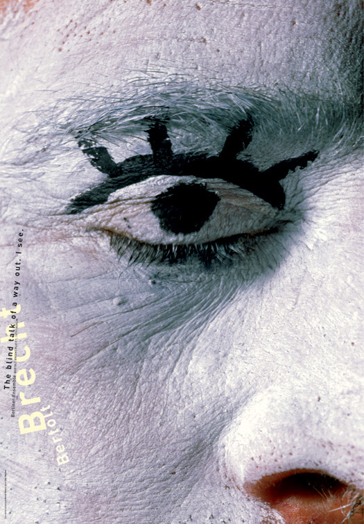
Michal Batory, Bertolt Brecht exhibition, 1997
Respect for a tradition is not the same as unquestioning fidelity to it. On this point, Bierut and I would seem to agree. Some of the most emotionally-resonant graphic design manages to borrow qualities from modernist philosophy without slavishness to its formal dictates or a loss of personal touch. In a poster for an exhibition on Brecht by the Berliner Ensemble, Michal Batory uses a single, tightly-framed image of a mime’s eye to illustrate a carefully chosen line of poetry: “The blind talk of a way out. I see.” The eye is closed, but an open eye is painted over it. Typographically, Batory uses wide letterspacing and a painterly arrangement to contrast the dense photo with a sense of weightless flow. The resulting composition is surreal and irreducible — beyond formal prescriptions and the desire to break them.

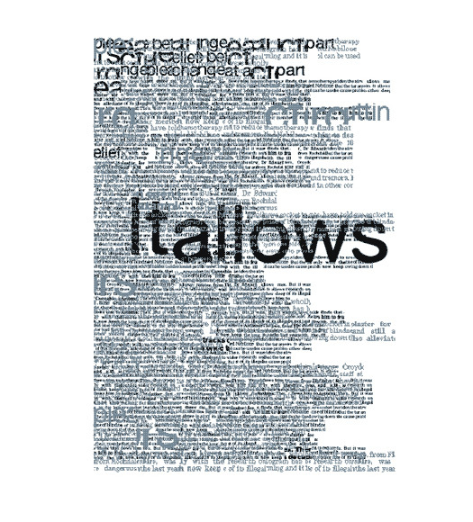
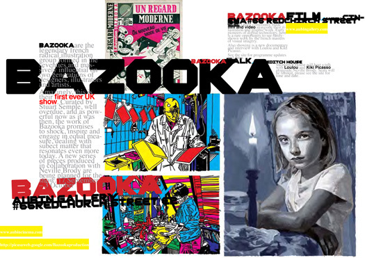
Neville Brody, Spread from the Anti Design Festival guide, 2010
Last summer, I had the opportunity to work with British designer Neville Brody on the inaugural Anti Design Festival. Clearly, the festival was meant to incite controversy and make a case for anarchy and disruption. I was never completely comfortable with this stance, but working with Neville helped me come to terms with it. Watching him design the festival's materials was both shocking and inspiring. He would throw design elements onto the page with an improvisational flair, bending and twisting them to his will. He would use big type with leading so tight that the ascenders and descenders would clash, shift type sizes and faces in the middle of a sentence, and value type for the way it felt as much as for what it said. What resulted was a fearless graphic language that gave voice to schizophrenia, failure, anger and frustration. Disordered as it was, Neville's design had a logic all its own: one filled with as much humanity and mastery as Vignelli's oeuvre. Towards the end of the summer, he asked me why I was going to graduate school. Innocently, I responded that I hadn't been educated in graphic design, and that I needed to learn the ground rules to become part of the profession. He grinned at me wryly and said, “Andy, there are no rules. You have to make your own rules.”


Comments [13]
thats a load of BS.
from personal experience I can tell you that its very very very hard for someone who does not know the rules of typography to create great design, Neville knows the rules off by heart and that is the only reason he can make breaking the rules look so good.
make up your own rules? what does that mean?
typography is a craft, you have to learn it first before you go and experiment with it.
Who made the rules?
very smart people over hundreds of years who made thousands of mistakes and learnt from them and passed them down to us so we could add to them and pass them down to the next generation of designers.
all this breaking the rules crap is fun when your a rich, famous designer like Neville but as a graduate no one gives 2 pints of shit about you breaking the rules, studios want people who can design without their ego getting in the way...
thats what I love about Micheal Bierut, you look at his work and you think 'this is a very well designed piece', you read the piece, get the info and get on with your life, you don't look at it and say 'this was designed by Micheal Bierut' which is what happens when you see SOME of the things designed by the superstar bad-boy designers like Brody, Sagmiester ...
I mean SOME of Sagmiester's posters are anti-design, they do the opposite of what design does, instead of informing people of something he sometimes just creates posters with unreadable hand drawn text, so its nothing but a waste of space, ink, paper, glue ... its the type of design designers do get people to talk about them, no more no less... if u want to add an ism to it then call it Egoism ... I'm glad that this style of design is becoming less and less popular.
03.11.11
10:24
"Who gets to make the rules?" is an important question, but I do not think it is worth spending a whole lot of time on it. What is worth spending time on (for instance, in pursuing graduate study) is (while you are making your own work) understanding the context of design: who makes it, who uses it, who does it address, how is it made, who is paying for it, how it has developed over history, how people think about it in both the past and the present. Only a person who wishes to mummify the practice of design (or someone who is willfully ignores the history of typography and graphic design) would argue that there are fixed or perfected forms to be adhered to now, in 2011, when in fact, graphic design in its form and process and methodology has ALWAYS inflected itself to the time. Please understand that I am not saying this gives everyone a free pass to pretend that nothing matters: however, the so-called rules and conventions are literally there to be used as raw material to work with, not as dictation tools. In graphic design, the road to Hell is paved with "timelessness".
p.s.: you might review about 15 years of critical writing in Emigre magazine (particularly starting with Issue 15, "Do You Read Me?") if you are interested catching up what others have had to say on the same topic of typography and the issue of expression and "rules."
03.11.11
12:26
I very much appreciate this post, as I, too, relate to your ambivalence over the often opposing forces of Modernism's neutral leanings and personal expression in design.
What's depressing to me is J.D.'s cynical response, which in a nutshell perfectly encapsulates design's (I'd say somewhat depressing) evolution from a tenuous, yet often wonderful mix of art and commerce, to a practice all about strategy, metrics, quantitative data, "design thinking" and "user experience," often at the expense of that unnameable creative quality that makes the best design so special. "You read the piece, get the info and get on with your life"? Really? That's such a depressing estimation of design's potential.
Certainly there's a bigger discussion around the economic and technological forces that have brought us to this point, and I'm not here to condemn the aforementioned new practices and processes, as I, too, in my practice engage them regularly. I was educated in the early 1990s, and witnessed firsthand the autumn period of Brody and his ilk's heyday. While much of the postmodern/grunge work did devolve into simply surface style without much substance, the best work in this vein was startlingly original and galvanizing. Love or hate this period of design, there's no denying that there was an energy and emotion in the work (and the discussion around it) that's rarely been matched since. That's what I miss most. It felt like there was really something at stake, as opposed to now where most design discussions seem to revolve around "creating meaningful experiences" and seem like canned elevator pitches rather than impassioned rhetoric.
It's not about style, J.D., but a methodology, an intent. Just last night I was lucky enough to see James Victore speak, and what a breath of fresh air! His work, stylistically, couldn't be further from Brody's but they share a similar philosophy—to engage people viscerally, and beyond just solving the design problem at hand. Emotion AND efficiency, not the latter at the expense of the former. As evolving technology and corporate hegemony slowly continues to sand down the rough edges of human existence (and thus design with it), I think we need this so-called "Egosim" more than ever.
03.11.11
12:37
Well said, Eric. I refer to designers or a group of designers that take this approach as the “designinista.”
As Eddie Opara states “Process is King . . .”
03.11.11
01:48
Brody knows exactly what he is doing - don't be fooled otherewise!
03.11.11
03:51
its not an estimation, its reality, and I have no idea why it's depressing to you.
Is making peoples lives less stressful, less complicated and generally making life easier for people a depressing thought to you?
Are you depressed when you think that Harry Becks Tube map design is now copied in several countries and allows tens if not hundreds of millions of people to travel easily and with less confusion? ... the last time I used that map I read it, got the info and got on with my life.
'Brody knows exactly what he is doing - don't be fooled otherwise!'
thank you peter that was exactly what I meant, you don't make up the rules, after you know them then you can make up ways to break them or choose to never follow them. thats when you get design that breaks new ground, if Brody is implying that designers should just take a white paper and do as they please then the greatest designers would be first year university students.
Its like saying you don't need to know anything before you start to cook, just experiment and make it up as you go, thats fine, knock yourself out, but your going to get a nasty surprise when reality hits you in the face and you realize people won't eat your food because it tastes like shit.
Even Heston Blumenthal had to learn how to fry an egg before he started to experiment and thats why he is such a great chef, he knew the basics ('the rules') and then ripped them too shreds, but he could only have ripped them to shreds if he knew what they were in th first place, their is an intelligence behind his experiments that comes from him learning the craft, its the same with Brody.
03.11.11
08:51
If you are only pleasing yourself (and will keep it "G" rated here) you eventually will end up with yourself as a client.
Rules, shmules… no fun being unemployed. Rule No. 1: get paid for your work.
Crazy "fucked up shit" will only get you so far, and down at the coffee shop talking about your big ideas.
VR/
03.11.11
10:16
We would love to share some of our work and ideas. Keep being outstanding.
Best regards!
Nikola
03.11.11
10:20
Rules don't necessarily lead to successful design pieces nor will breaking any rule. In the end its all about how well execute it.
03.12.11
12:21
Andy,
Neville is actually giving you great advice and is opening a window into his own thinking process, because he thinks you can handle it. The good news is that through hard work you will get there and understand the creative process.
In the Vignelli Canon, Massimo Vignelli writes: “It is not the intention of this little book to stifle creativity or to reduce it to a bunch of rules.”
Michael Bierut, Chip Kidd and Massimo Vignelli like Neville Brody make their own rules based on the problem that they are solving. Yes, they understand the guidelines in the Vignelli Canon, but the key to great design is the process of defining the rules based on the problem at hand.
03.12.11
06:56
What I believe when Brody said make your own rules was not to disengage from the notion of graphic savoir faire. Of course, you should be informed about typefaces, the fundemental aspects of design or how to create something. But at the heart of it, you have to approach design your OWN way. How do you view design from your own context and beyond?
Graphic designers should consider balance and restraint but I believe not in neutrality. A bit of flair, personality makes you stand out.
03.13.11
08:59
03.14.11
04:57
04.04.11
11:31