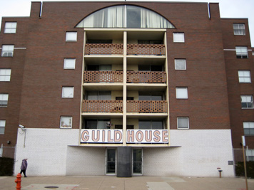
Guild House, Friends' Housing for the Elderly, Philadelphia; Venturi and Rauch, Cope and Lippincott, Associates, 1960-1963. Photo by the author, 2008.
I recently took the river-to-river drive down Spring Garden Street in Philadelphia from the Art Museum steps (where thousands of tourists every year reenact Rocky's triumphant climb), past Broad Street which marks the center of the city (and which, honestly, isn't that broad) to visit a bona fide design landmark — Guild House, built by Venturi and Rauch, Cope and Lippincott, Associates in 1963. This icon of contemporary architecture, however, turned out to be more a testament to the power of language than the power of design.
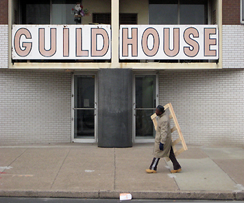
The building was easy to find. It has a big sign on the front announcing that this is in fact Guild House. The red all-caps, sans serif type pops off of the white façade. After this moment of recognition passes, though, the most striking thing about Guild House is how boring it is. It stands unremarkably on a desolate stretch of this cross-town artery amongst vacant lots and a scruffy janitorial supply company. The white paint on the sign is peeling, revealing some rust. It isn't particularly tall. It isn't set back dramatically from the street. Several of the windows are papered over. There are some mattresses abandoned in the lot. There is nothing grand or impressive about it. Considered in a vacuum, the building is completely ordinary and even kind of ugly.

Guild House, sign detail, 2008. Photo by the author
Of course no building exists in a vacuum. The most important bit of context for Guild House is not the neighborhood or the program, or the history — it is a text. Robert Venturi, Denise Scott Brown and Steven Izenour (VSB&I) detailed the theory behind their design of Guild House in the book Learning From Las Vegas, originally published in 1972.
In the text, VSB&I celebrate what they describe as the "U&O" (ugly and ordinary) design of Guild House. They contrast this with another home for the elderly — Crawford Manor in New Haven designed by Paul Rudolph — bluntly critiquing its "H&O" (heroic and original) design and by extension all of what they call "orthodox modernism." They write, "By limiting itself to strident articulations of the pure architectural elements of space, structure, and program, Modern architecture's expression has become a dry expressionism, empty and boring — and in the end irresponsible." They contrast the connotative symbolism of orthodox modernism with the denotative symbolism of Guild House. They cite Guild House as an example of a "decorated shed." While not explicitly arguing for honesty in architecture they state, "Crawford manor is ugly and ordinary while looking heroic and original," whereas Guild House, "looks like what it is not only because of what it is but because of what it reminds you of." The use of explicit, denotative symbolism is not morally superior to the heroic abstraction of orthodox modernism — it is simply more relevant. The writing is cogent, witty and thoroughly persuasive.
Looking at Guild House in light of the text transforms the building. Its boringness becomes essential and animated by the counter-revolutionary spirit of its designers. The tension between intellectual sophistication and visual obviousness snaps into focus. It suddenly seems like a privilege to use irony and vernacular reference in design instead of a trope. I am struck by the fact that in the post-modern period the dialectic between sincerity and irony has become as central to design as form vs. function.
Standing on Spring Garden Street, however, it is also obvious that a building is often not a very enduring vessel for a designer's vision. Renovations are undertaken; neighborhoods change; factories become lofts; etc. And this is certainly the case with Guild House. Many elements of the design have not retained their original impact because of changes in the physical context and the culture at large. The proportions of the double-hung windows no longer seem curious — they are too small to be especially big, too large to be especially small. The brick tenements referenced by Guild House have largely been torn down in this part of town. Actual (unironic) architecture has re-appropriated the eclecticism and irony of VSB&I's "ugly and ordinary" critique, and the argument the building makes seems incongruous with the more palpable local tension between urban blight and Bobo gentrification.

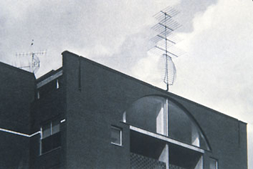
Guild House, antenna sculpture, 1965
There have also been changes to the building itself, most importantly the removal of one of the central elements of the design. Originally the building was crowned with an over-sized gold antenna reminiscent of Klaus Oldenberg. The objet trouve signified (even celebrated) that old people like to watch a lot of TV. In the intervening years critics and occupants came to see the antenna as a cynical joke at the expense of the inhabitants, and it was removed. Of course, Guild House is, if anything, a joke about architecture and the antenna was the punch line. Without this over the top moment, the subtle irony of the rest of the building becomes opaque. When you take the decoration off the decorated shed, it becomes just a shed.
The decision to remove the antenna sculpture is also unfortunate because it would have taken on a deeper, more nuanced meaning if it had survived into this cellular era. The joke would be on the antenna as the senior citizens inside play Wii and watch digital cable. If it had been left intact the sculptural decoration would now read as a self-mocking nod to the triumphant in architecture. I imagine the designers would have embraced this irony enthusiastically.
Learning From Las Vegas has become more monumental than Guild House or any of the buildings featured in it. Not only because so many more people have read the book than will ever visit Guild House, but because the arguments in the text remain vibrant and the images remain frozen in their intended form. This is the power of the caption and it is becoming a central part of design practice. The speed and mobility of information is far out-pacing the mobility of people and objects. Representations of and texts about are more portable, lasting and, in the words of VSB&I, more "relevant" than design artifacts themselves.
Robert Venturi won the Pritzker Prize in 2005 and in its citation the selection committee wrote, "Architecture is a profession about wood, bricks, stones, steel and glass. It is also an art form that is based on words, ideas and conceptual frameworks. Few architects of the twentieth century have been able to combine both aspects of the profession, and none have done so more successfully than Robert Venturi." I'm not sure that buildings should require a text in order to be understood and enjoyed and even now it is striking how unabashedly VSB&I argued for their own ideas. But by doing so they created a new model for design where a building can act as a scaffolding for ideas instead of the other way around. They demonstrated that design and criticism can be pursued not just in parallel, but as inextricable aspects of a single practice.
[Editor's Note: Another essay about Learning from Las Vegas appeared on Design Observer here.]


Comments [15]
In From Bauhaus to Our House, Tom Wolfe is never funnier than when he's feasting on the rhetoric surrounding this unprepossessing building. Here's a taste:
Venturi's decisions resembled those of Gropius, who had decided that the workers should have low ceilings, small rooms, and narrow hallways. Venturi explained that people are perfectly entitled to have in their buildings the sort of familiar and explicit symbols that applied decoration can provide. So on top of his Guild House he put an enormous television aerial made of gold-anodized aluminum. It was not connected to any television set, however. It was a "symbol for the elderly."
A symbol for the elderly? [Critic Vincent] Scully provided a fuller explanation. Venturi's TV aerial was surprisingly direct, refreshingly candid. "After all, a television aerial at appropriate scale crowns [the building], exactly as it fills — here neither good nor bad but a fact — our old people's lives. Whatever dignity may be in that, Venturi embodies, but he does not lie to us concerning what the facts are." The phrase "whatever dignity" referred, presumably, to the dignity of aged middle-middle gorks sitting out the golden years narcotized by the tubercular blue gleam of the TV set. Just how much delight, if any, the residents of Guild House found in this familiar and explicit symbol, he did not report.
I suspect that Guild House — seen in real life — was never much of an "enduring vessel for a designer's vision," even when brand new. I wonder, as Wolfe did, what its residents thought about living in a textbook illustration, that is, if they did at all.
01.27.08
05:26
01.28.08
07:15
With time, I began to wonder what it looked like at the time of its construction. I can see a glimmer of its personality coming through, and that photo of the antennas hints at an appearance that was less out of place and a tad more friendly.
In spite of that, my first thought when I drive past is still "Modernists... gimme a break." Perhaps one day someone will try to polish that stone and I'll get to see it shine.
01.28.08
09:18
01.28.08
09:41
01.28.08
09:53
that has changed little in seventy years. I do not find North Philadelphia "hauntingly beautiful" though there are some beautiful buildings.
01.28.08
10:37
1) When you make a less-than-flattering generalization about a group of people with the intention of being ironic, clever, or funny, it's always better if you're including yourself in the joke. Otherwise, it can come across as lame, or worse -- a cheapshot.
2) If you've got to explain the joke's punchline, it's not funny.
01.29.08
08:15
It might be worth noting that Venturi is not a Modernist. Rather, he is one of the leading proponents of Postmodernism. He might even be considered Postmodernism's father. Remember, he is credited with coining the term "less is bore." Given how actively Venturi has promoted his ideas, it's probably important to place him in the right camp.
Of course, you can't make a silk purse out of a sow's ear. Nor can you make great architecture with words and ideas. Even with the lofty Postmodern ideas behind it, this building manages to look ugly, awkward, soulless and depressing. It is ironic that the same criticism is often leveled at the Modernist architecture against which Venturi and Postmodernism were reacting. Hmm, well, maybe Guild House is modernist after all.
01.29.08
09:11
If the building doesn't work without the help of an accompanying book, then what's the point? This is one of my big issues of the design profession: we don't design for people who don't know anything about design. Instead, we design for ourselves, and it shows.
01.29.08
01:36
01.29.08
02:14
Living in a rich area for architecture, I believe architects have a unique responsibility in that buildings have a great long-term effect on the identity of the city. Even abandoned buildings can possess the charm and character that makes up a city.
This building will never contribute to the Philadelphia landscape the way it could. And why? For a sarcastic joke? Ryan hit it on the head. The designers were designing for themselves. This building will be an eyesore for years to come and never have a chance be one of the "beautiful ruins" mentioned before. A fine example of how irresponsibility can contribute to a huge waste of resources.
01.31.08
10:03
01.31.08
10:06
If the building doesn't work without the help of an accompanying book, then what's the point?
@ryan - the book is the literal text that accompanies the building, but the building itself is a postmodern text separated from the book on it's own. As the context and condition of the building change over time, so does its visual text. All architecture is evolutionary in that regard, for better or worse.
I happen to love postmodern architecture for it's drabness and cynicism. I grew up in Buffalo, NY where nothing evolves except the sprawl of suburban houses, So the pessimistic and theoretical is lovely to me. :)
01.31.08
10:09
What is this timeless nonsense? What real buildings are you referring to that have built in the last twenty years in Philadelphia.
Much effort has gone into criticizing Guild House
but the worst architecture in Philadelphia is the attempts to create timeless buildings, usually brick, always bad. They're everywhere and they are the saddest garbage I've seen. Why do they get a critical pass?
02.02.08
07:12
"If the building doesn't work without the help of an accompanying book, then what's the point? This is one of my big issues of the design profession: we don't design for people who don't know anything about design. Instead, we design for ourselves, and it shows.
However, central to Learning from Las Vegas was the ability of architecture to communicate with the average individual -- a grand departure from the banal and meaningless white boxes and glass curtain walls of modernism. Guild House is clearly labeled. People who walk by it know what it is. While the subtleties of the design (the varying window sizes for example) and the intentional irony behind it may be for the designer or architect audience, the building clearly communicates its purpose to a general public anyway. Guild House was not being designed for designers -- that was what was so revolutionary.
On a sillier note, I wonder why the architects bothered to write Guild House rather than merely "I AM A MONUMENT!"
02.04.08
04:12