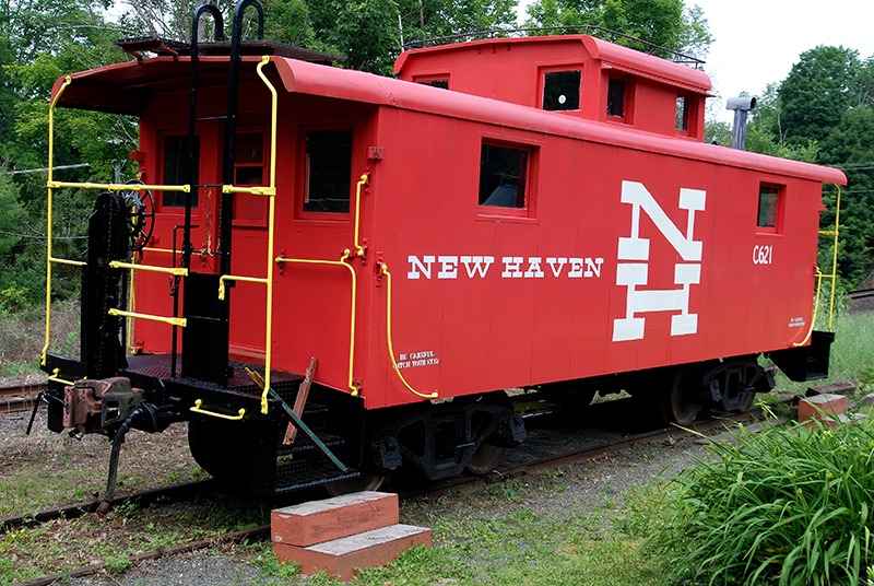
New Haven Railroad caboose.
Editor's Note: This essay was originally published in September 2006, when Jessica Helfand lived in Falls Village, CT. We urge you to read it again because the Connecticut Department of Transportation is considering scrapping the historic Herbert Matter "NH" logo and colors on all commuter trains as part of a rebranding effort. We urge you to contact CTDOT and/or your local state representative to express your opinon.
A center of iron-making in the eighteenth century, Falls Village (est. 1738) is the third smallest town in Connecticut. Today, it is like any of a number of other small, rural communities across America, unfazed by progress and untethered to any visible signs of commerce. (The closest Starbucks is nearly an hour away.)
It is situated in a part of New England known for its dairy farms, its bucolic vistas and pitch-perfect fall foliage. Winters are long, roads less travelled and life understandably quieter: but the impact of industry, of communication and (at times somewhat homespun) technology is no less felt by its inhabitants, many of whom remember a time when a train came through here, carrying freight and passengers up and down the Eastern seaboard.
By the late 1940s, the New Haven Railroad boasted one of the most modern fleets in the country — and arguably, what was, in its time, one of the most identifiable symbols in America.
In April 1954, Patrick B. McGinnis became president of the New Haven Railroad. An outspoken and controversial executive who vowed to lead train travel into the space age, his tenure would last less than two years — yet during this time, his artistically-trained wife initiated a program to rethink the company's corporate image through the use of graphic design principles. Working with Florence Knoll [more] on the then-new executive suite at Grand Central Terminal, Lucille McGinnis convinced her husband that the railroad needed a new logo.
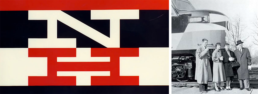
Enter Herbert Matter, Swiss-born designer, photographer and Yale professor whose own education was framed by apprenticeships with Cassandre, Leger and Le Corbusier. Assisted by Norman Ives, Matter developed a forceful typographic pairing of uppercase "N" and H" letterforms that included monochromatic as well as two-color (red/black and later, blue/black) variations. The new visual identity debuted in April of 1955 — exactly one year after McGinnis took office. Matter was named Design Director for the New Haven Railroad a mere two months later.
Matter's new identity was a tour-de-force of mid-century modernism: restrained, colorful and sleek, the bars of color that graced the long, steel bodies of the train cars amplified their streamlined form. The logo debuted on a series of new lightweight trains, and their formal improvements (which required a series of trains, called EP-5's, that had a new size and shape) were articulated by three wide horizontal stripes of color. "To add zest, the stripes would not taper and curve but would end in sharply raked angles," notes train historian Joe Cunningham. "Roof cab and nose top would be black, noses would be white with a horizontal black diamond surrounding the headlight. A wave of the contrasting color would rise to a peak below the headlight diamond. On sides and ends, block letters would form an N above an H, with the colors set off from the background."
Curiously, it was the color palette that proved difficult to resolve. In order to facilitate its selection, technicians at the GE plant produced two trains, one in canary yellow with black, and the other in a trio of white, black and red-orange. Matter chose the latter which, coincidentally, matched the red scarf, black coat and white gloves that the fashionably-attired Lucille McGinnis wore to the GE plant the very day the newly-painted trains were being presented. "Matter noted that yellow was fashionable but showed dirt," Cunningham explains. "Mrs. McGinnis agreed, saying the red looked powerful."

LEFT: Matter's logo. RIGHT: Left to right: Herbert Matter, Florence Knoll, Lucille McGinnis and Patrick McGinnis.
Matter's identity program blossomed over the course of the next several years, incorporating pictorial imagery from woodcuts as well as a judicious form of photomontage: here, he successfully balanced the symmetry of the typographic mark against fragments of photographs to create compositions that were at once visually harmonious and dynamically charged. Matter's personal involvement diminished later in the 1950's, when much of the collateral production reverted to the in-house design staff. But the mark remained an enduring one: later merchandising efforts featured the NH logotyope on everything from cutlery, matchbooks and playing cards to chrome compacts and Zippo lighters, an extraordinary line of products that represent Matter's stunning achievements at a time when the merging of graphic and industrial design required a particular marriage of functionality and grace.
The McGinnis administration only lasted two years (from 1954 to 1956) and the New Haven Railroad went bankrupt in 1961. For a number of years afterward, some of the trains, retired from active duty, were put out to pasture in various train yards up and down the Northeast corridor. Today, at the foot of Main Street in Falls Village sits a shiny red caboose, a disenfranchised relic from a forgotten era. It's a bizarre sight here on this quiet country road, its sidewalks pedestrian-free and lined with an eclectic sampling of Greek Revival, Italianate and Queen Anne architecture. Docked here since the early 1990s, its now the town's visitor center: if you climb inside, you can retrieve brochures with maps, for example, of local hiking trails. And on the side of the belly of the caboose, the Matter logo sits proudly — shiny and perfect, like it was painted yesterday.
I thought I was the only person in this town who knew anything about Herbert Matter. Turns out I was wrong: Denny Jacobs, who owns the auto body shop next to the train tracks, researched and restored the train car. There's also a hobby shop in the next town over that includes a miniature replica of every EP-5 that ever was, several of them sporting impeccable reproductions of the Matter logo. I spent an hour interviewing someone there, a retired engineer who knew all about McGinnis and his wife. This is, admittedly, a different kind of research — different from, say, Googling "New Haven Rail Road" or going to the library. Different, but no less meaningful. Perhaps, even, in some ways more meaningful. As design leaps head-first into the Twenty-First Century — digital, wireless and so highly individualized you can scarcely pin it down — what becomes of these stories, and of the people who participated in making history and in making things? Seems to me we still, all of us, have something to learn from them, the Herbert Matters and Lucille McGinnisses and the Denny Jacobs of the world. As for me, I'm starting right here, right now — right in my little town which is, apparently, full of surprises.


Comments [10]
09.04.06
12:36
09.05.06
11:05
09.05.06
08:29
09.05.06
09:42
Interesting statement. The people, I mean, they die, right? And sometimes their contributions are preserved like this. But I think the sort of situation in which Herbert Matter - or any lone graphic designer - can be tied to the design of a logo and identity system of a major corporate entity seems impossible to create now, and its possible that that sort of situation, in which one designer's name is tied to a project, is much easier to canonize than the situation that occurs today with corporate identity. In any kind of design (graphic design, product design, architecture), you usually get only one name attached to major products when celebrity is involved.
Im not aware of any major corporate ID that is tied to one sole graphic designer. Sometimes they are tied to one body of designers, ie a studio or agency, whose roster of designers and directors change a lot over the years. In fact, over the course of a major branding project, you can start the project with one set of designers and directors, and end with a completely different set of people. How does one track that sort of history? Is it even useful to do so? Most design work is anonymous - maybe thats just the nature of the endeavor?
Of course, Matter's design is beautiful in its directness and simplicity. No swooches or auxiliary graphics signifying movement or speed or progress. Maybe the lesson is that its better to have just one cook in the kitchen.
09.06.06
05:13
I couldn't help but notice Ms. Helfland's oral historian approach to her research concerning the New Haven train line; it's a genre of historical recording that was more popular thousands of years ago in Homer's lifetime, (circa 700BC...a really long time ago).
While oral history is an adequate method for recording, understanding and remembering the past, some consider it too subjective and anecdotal. Despite these criticisms, oral histories offer perspectives otherwise omitted in more traditional avenues of historical documentation. This type of research is more personal and provides a first hand analysis through which historical events transpire.
Recounting oral histories could be an interesting way to document the history of graphic design. Aside from Megg's 'History of Graphic Design,' which makes an effort to cover all major stylistic and ideological shifts of the past century and a half (and then some) we have little to reference in design education when it comes to understanding the greater context through which much of this work was created. At the same time, we have the luxury of studying a topic with an arguably brief history whereby a number of noteworthy designers are still available to (some of) us.
The opportunity to research and record design in a first hand manner is a valuable one, as Ms. Helfland points out, leaving me curious about what other surprises can be unveiled if we continued to seek out alternative and unexpected information sources.
09.06.06
05:29
09.11.06
06:17
09.12.06
09:13
09.15.06
07:54
09.18.06
08:01