At the Cozy Nook Bar and Grill on Long Island, where I briefly held a summer job, the walls were covered with a slew of cheaply made signs with warnings like “Minors Not Allowed,” “No Dancing Allowed,” “Ladies Served At Tables Only.” “We’re Open” and “We’re Closed” hung on the door, and other messages in various bright colors announcing the price of coffee, drinks, and food formed a typographic patchwork. If I knew then that they’d become a small slice of graphic design history (and I’d be writing about that history) I would have taken and preserved them for the ages. Instead, when the Nook forever closed its doors these artifacts were rightly thrown into a dumpster with all the other trash.
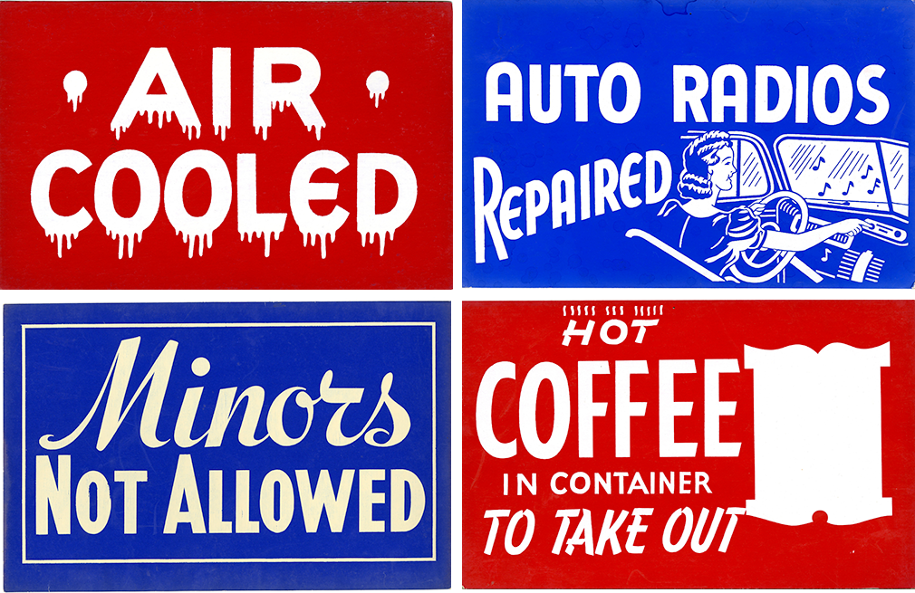
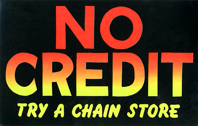
They had little value and in a joint like the Nook they were as common as the novelty placemats and tabletop juke boxes. Since I paid little attention to them, I did not even consider that somebody actually designed them. Later I learned that anonymous somebodies had been creating this stuff the same way for decades. Despite their artlessness, they were typographic and pictorial necessities — with inherent beauty. Cheaply printed, often on 8 x 10 cardstock, tacked up on walls and hung on strings from windows, they did exactly the job for which they were intended. Nothing, for instance, had more direct impact than the “No Credit” sign with letters dropped out of black and printed in fluorescent split fountain colors that hung right over the cashier, just in case.
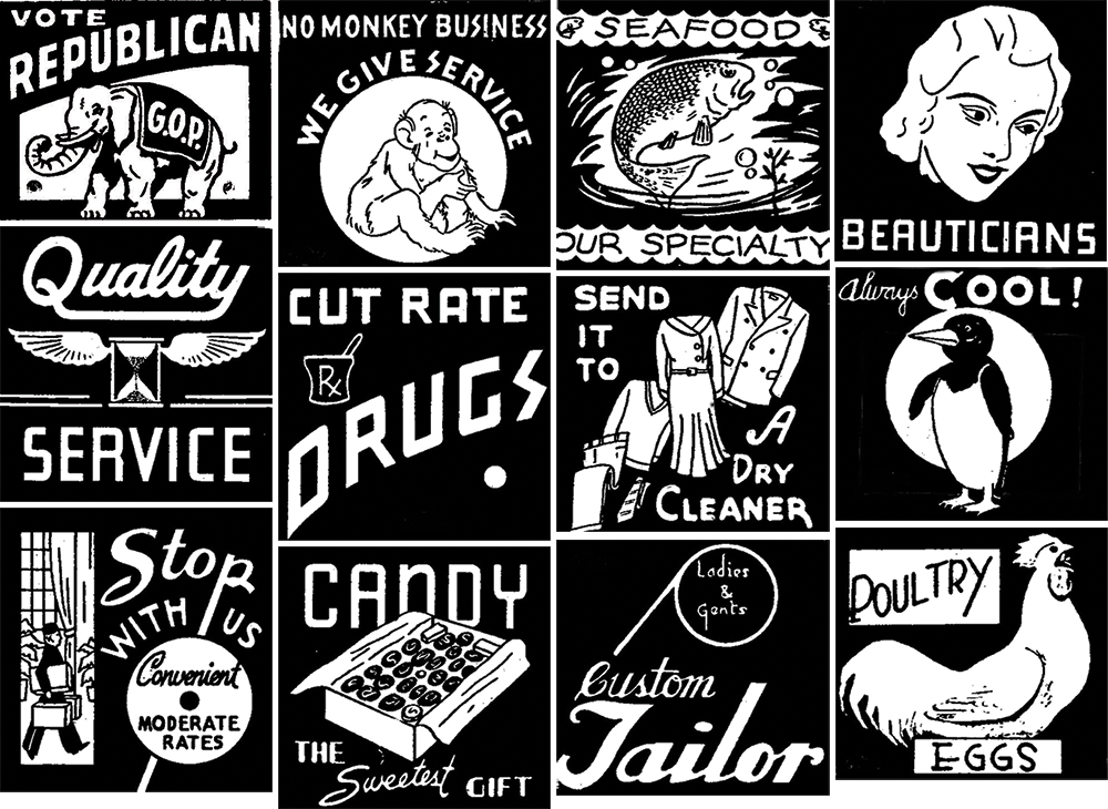
Vintage commercial art — which today is labeled “vernacular” — created by old school job printers, show card and layout artists did not just emerge from under the proverbial rock. Their standard store signs, cardboard easel-back points of purchase, and window displays may not have had a modern design school pedigree yet they were deliberately designed following accepted layout models and templates. Sure, they could look either goofy or quaint through today’s jaundiced eyes, but such routine sign production before the heady years of design thinking and branding strategy were the way some of our print shop ancestors earned a living. What they practiced was no-nonsense yet skillful communicative typography, lettering, and illustration, sometimes with a dollop of wit to hold the viewer’s interest.
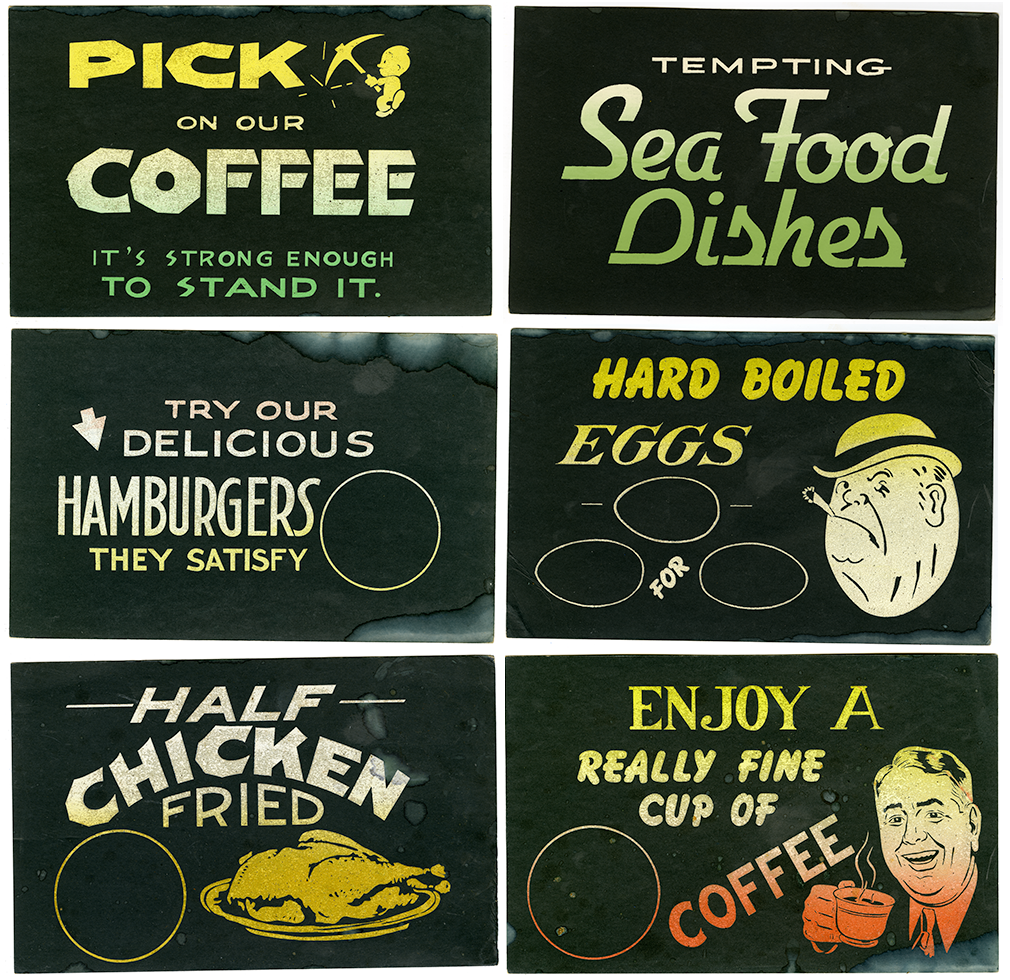
For the past couple of decades or more, renewed appreciation for the so-called “untutored look” has been on the rise among contemporary designers. It has become pastiche style. But the men and (some) women who made the originals were pioneers of sorts and there is a lot to learn about printing (and even commercial culture) from the genuine articles.
The preferred technique during the early twentieth century was the silkscreen. “The letterforms could all be cut from frisket paper by a barely yeoman craftsman, overlaying the frisket (perhaps over a light box) on ideal forms supplied by a draftsman or photostat copy of an alphabet,” explains underground commix artist Justin Green, who studied painting but learned the vintage graphic methods that influenced some cartoonists. “Many type specimen books were available during the era (1920s to 40s) when this stuff was produced.”
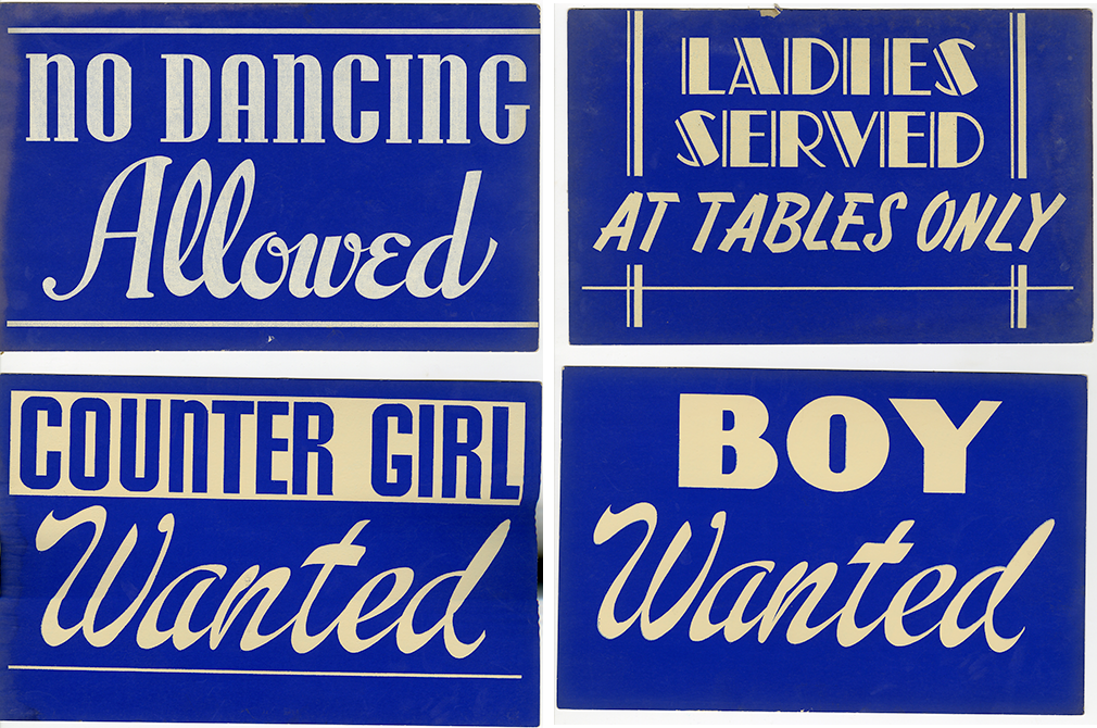
There were always slight screw-ups, like in the sign “Counter Girl Wanted,” on top of G in Girl. “It is dead giveaway of this process,” adds Green. The words “Counter Girl,” which employs a modernistic, customized lower case “N”, could all be done, he says, with mechanical guides available to printers at that time and "Wanted" most like copied from specimen book. Tracing from existing sources was common practice. “The more type sources the better.”
“Most large shops had a silkscreen department and projects like these could be done during down time, as work flow has always been the bane of the sign trade,” adds Green. There were craftsmen of different skill sets, so maybe this was a collaboration by the master letterer and his assistant. Ads in issues of Signs of the Times, among other trade publications dedicated generous edit and ad space to push techniques and tools for making for these signs. Although it seems like “an odd little graphic cul-de-sac in the graphic arts and typography fields,” says Green. It is also a slice of history that is obscured within the pedagogy of type as art form.
From the late nineteenth century sign making was a “highly profitable and specialized field” of “lettercrafters.” Even in the late fifties, kids from my neighborhood who attended New York School of Printing a vocational school in Hell’s Kitchen, did as a matter of course learn to make these signs that were sold in some hardware and stationery stores. There was always a need and, therefore, a way to make a living producing signs.


