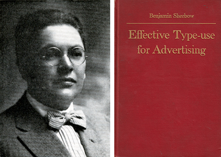
Benjamin Sherbow was born in Germany in 1878 and emigrated to the U.S. where he studied writing. In 1906 he was hired by the advertising pioneer Earnest Elmo Calkins as a copywriter at Calkins & Holden ad agency. Although he started without typographic training, “it was quickly evident that this was to become his ruling passion” wrote Calkins. He honed his typographic skills and fervently learned the nuances of type and language by making frequent trips to second-hand bookshops where he voraciously consumed magazines and books about, or filled with, typography lessons and examples. In his own book “Making Type Work” he wrote: “Back in the days when I first got the notion that I would like to learn how to make type do what I wanted, I used to make no end of dummy layouts . . . I clipped all sorts of type pages, illustrations, ornaments and borders. Then I played with them in much the same way that a child in kindergarten plays with piece of colored paper.”
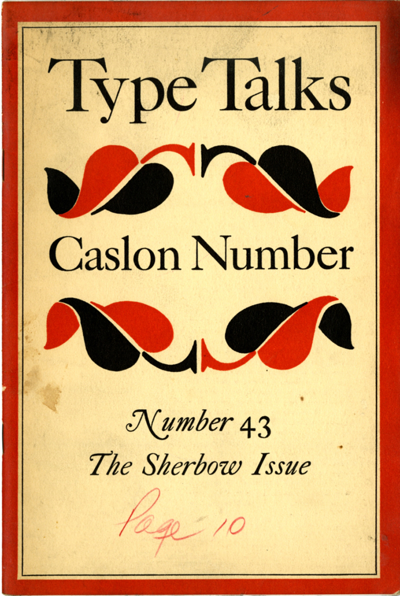
Looking back at Sherbow’s significance in 1930, Calkins recalled that before Sherbow it was difficult to find a competent printer/compositor who would set his advertisements with aesthetic intelligence. “Into this stagnant pool of indifference to the decent use of type Sherbow jumped with both feet,” noted Type Talks, “proselytizing and arguing with recalcitrant printers and (presumably) clients.” Sherbow was not a radical; he believed in type’s functional role: “In advertising print, typography is merely the servant of the advertising idea . . . Any willful eccentricity of arrangement that hinders the clear flow of the text injures that chances of the advertisement to get itself read and understood.” Sherbow was hailed as “The First Advertising Typographer” in Type Talks, the magazine of the Advertising Typographers Association of America.
Sherbow remained at Calkins & Holden for six years. His colleagues included Walter Dorwin Teague, the progressive industrial designer, and Rudolf Ruzicka, designer and typographer. Sherbow became the prototype for a new breed of typographer and production manager in agencies at that time. In 1912 Sherbow opened his own consulting office on Union Square catering to such clients as NY Telephone Co., Mergenthaler Linotype Co., The New York Times, and others. He redesigned The New York Tribune, which was the first newspaper to break with the all-cap headline tradition. Harper’s Weekly, McClure’s, and Woman’s Home Companion were also his redesigns. As promotional material he produced a series of booklets on type usage. A devoted lecturer on type and printing, Sherbow had an extremely high voice, “which he sought to compensate for by the constant smoking of pipes and cigars.”
In 1916 he authored “Making Type Work,” a manifesto about type that “caused a minor revolution in a field which needed one very badly,” wrote Type Talks. His introductory text included this idea: “I shall try to avoid laying down rigid rules,” he wrote. “Print depends for its effect not alone upon the face of type selected, but also upon its size; not alone upon the type itself, but also upon its spacing, its arrangement, its combination with other types. . . Good typography can add to the force of the final impression, but action depends on what the words say, not how they look in print.” This may sound self-evident, but as Type Talk noted, in Sherbow’s day ‘decent, clean typography’ was very much the exception.
Sherbow also created a system of layout called Sherbow’s Charts that Calkins called “a remarkable contribution to the practical side of printing . . . the first time a printer’s specimen book had been put in scientific workable form.” He added that they were “a godsend to the hard driven layout man that they were practically worn out in most advertising agencies.”
Dedicated to his work, Sherbow had a “serious breakdown” and retired in 1922. That year, at age 44, he died suddenly. “…[H]e can be said to have almost single handedly…” given birth to advertising typography and design “which is comparable in the book publishing field to the distinguished work of W.A. Dwiggins and D.B. Updike,” stated Type Talks, “both of whom he admired.”


