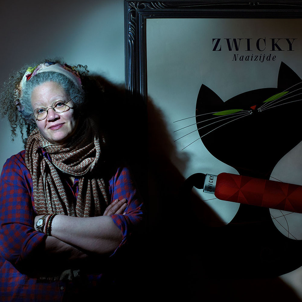
Photograph by Rafael Vasquez. Image via Gail Anderson.
This interview is part of an ongoing Design Observer series, Chain Letters, in which we ask leading design minds a few burning questions—and so do their peers, for a year-long conversation about the state of the industry.
It‘s July, and we're all looking to kick back at the beach. This month, we examine design and books, and why good readers make good designers.
Gail Anderson is the creative director of Visual Arts Press at the School of Visual Arts and a partner at Anderson Newton Design. She has taught at SVA for close to thirty years and is co-author of fifteen books on graphic design, illustration, and typography with Steven Heller. Anderson serves on the Citizens’ Stamp Advisory Committee for the USPS, and is a 2008 AIGA Medalist. In October 2018, Anderson will receive the Cooper Hewitt, Smithsonian National Design Award for Lifetime Achievement. She fell in love with reading through the comics section that came with the Sunday New York Daily News (Dondi, but not Terry and the Pirates).
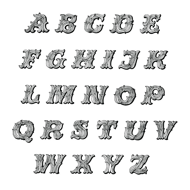
“A few years back, I started scanning type from my Lettera books and giving vector files to students. Paying it forward, I guess.” Image via Gail Anderson.
The chief executive of Hachette Livre, Arnaud Nourry, recently said he was “convinced” that the publishing house could do more to use their content and digital properties beyond ebooks, but they’ve fallen short because editors are used to creating designs on a flat page and “don’t really know the full potential of 3-D and digital.” Do we need to think about reading differently?
I will admit that I am “reading” more books than ever as audiobooks. I still purchase a healthy number of design books annually, but I listen to all my other books—while I’m driving, walking, or commuting; while I’m on a flight or at the gym. I am consuming more information than ever. So, yes, it’s time to think about reading differently. That said, I’m not interested in having my books turn into digital experiences. But this comes from someone who initially turned her nose up at audiobooks.
A recent study found that the psychological experience of owning a physical book is different than owning an e-reader: a physical book is an object with lasting value and emotional worth, like an heirloom. An e-reader, in its current form, is more transactional; like a movie, you read it for the experience of its contents and the vessel is ephemeral. What value do you place on either and why?
Ebooks seem like a good idea if you fly a lot or have a long commute. They do feel transactional and lack the intimacy of a book. “Real” books, on the other hand, take on their own patina and become your friend over time. The page is warm; the screen is cold.
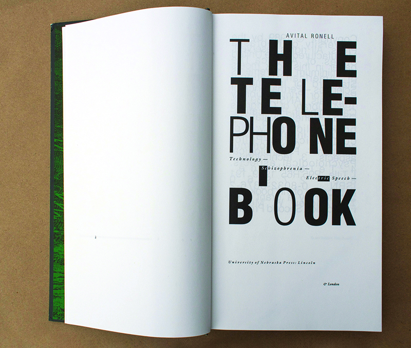
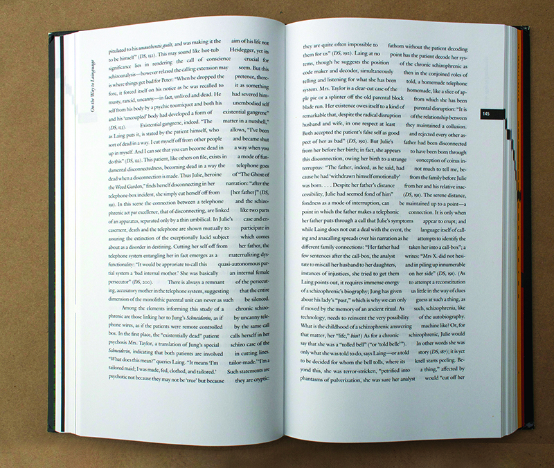
“Richard Eckersley’s Telephone Book is an early—and timeless—Mac gem. Genius.” Image via Gail Anderson.
Is the direct comparison made between print and ebooks even a fair one to make when the experience is so completely different?
I suppose the comparison isn’t really fair, though who doesn’t enjoy picking at things and complaining? As a designer, I am sensitive to the way people consume information, and very concerned about the survival of print. Thumbing through an actual physical book is a much more satisfying experience than holding an ebook, though you can’t argue with their convenience.
As a designer, I am sensitive to the way people consume information, and very concerned about the survival of print.
What are the design features that encourage you to return to a book again and again?
I enjoy the heft of a book and the feeling of accomplishment as I make my way through one. I love finding the tickets and receipts stuck between the pages, and the occasional note on a page. A good cover design is always a bonus. I really miss that with my audiobooks, where the cover doesn’t matter as much. A shelf of well-worn books is a record of your life—mementoes of your many different chapters, so to speak. There’s no souvenir from an audiobook, no history to display or own. It’s sadly ephemeral.
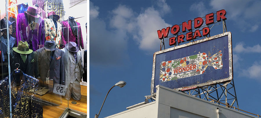
LEFT: "Lots of Sunday finest displayed in shop windows along Main Street in Columbus, Georgia. Wow." RIGHT: "So much goodness to shoot in Memphis." Images via Gail Anderson.
From Joan Wong: In a world where technology has advanced to a point where the possibilities are limitless, what would your ideal container for reading look like?
All books would be hardcover, with good paper inside. No bar codes on the back, no testimonial quotes or sell lines. My needs are few.
Next week, Gail continues the conversation by asking: A well-respected author has written a book that sounds interesting. You finally track down a copy and the cover is hideous. How much does a bad cover influence your book buying decisions?
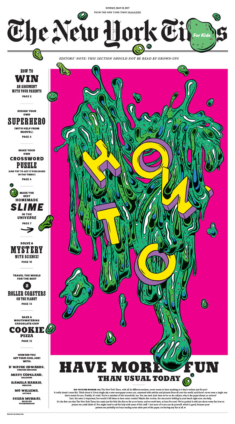
“My old pal Deb Bishop might be the best editorial designer out there today, and now I’m hoarding all of her Times for Kids supplements in the Sunday paper.” Image via Gail Anderson.

