This interview is part of an ongoing Design Observer series, Chain Letters, in which we ask leading design minds a few burning questions—and so do their peers, for a year-long conversation about the state of the industry.
It‘s July, and we're all looking to kick back at the beach. This month, we examine design and books, and why good readers make good designers.
Joan Wong is a designer that creates visual responses to narratives. She has designed book covers for Penguin, Random House, Alfred A. Knopf, Farrar Straus and Giroux, New Directions, Simon and Schuster, and Harper Collins. She is also a frequent collaborator with the New York Times, creating spot illustrations for their articles. In 2018, she curated and illustrated a collection of online stories about “lives that could have been” called “Sister Life.”

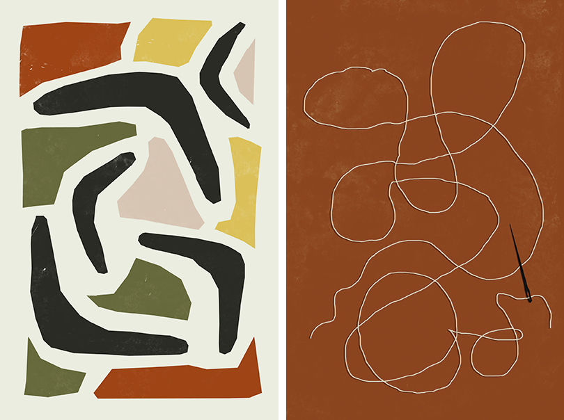
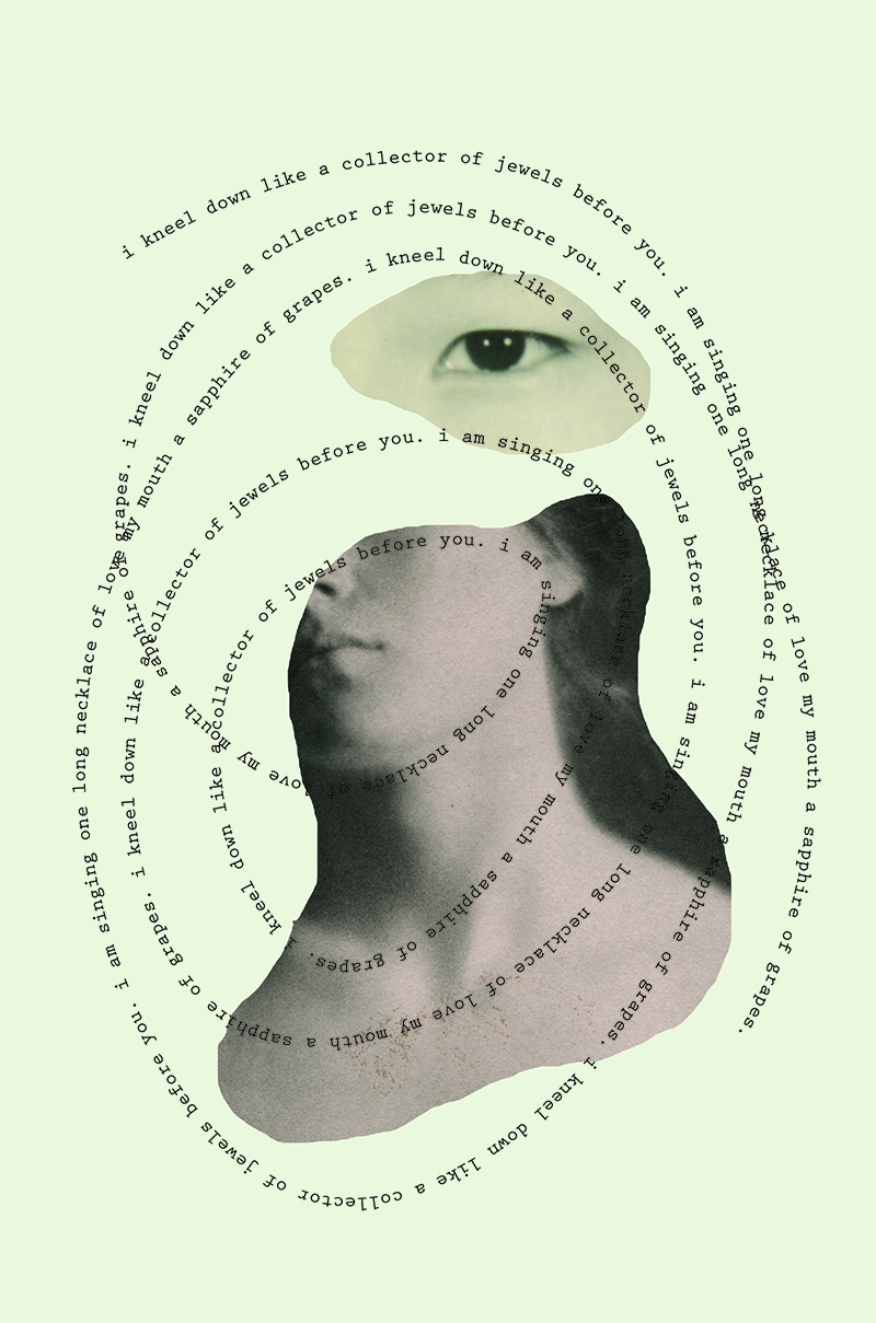
Visual experiments for story contributions made to the “Sister Life” project.
The chief executive of Hachette Livre, Arnaud Nourry, recently said he was “convinced” that the publishing house could do more to use their content and digital properties beyond ebooks, but they’ve fallen short because editors are used to creating designs on a flat page and “don’t really know the full potential of 3-D and digital.” Do we need to think about reading differently?
As Nourry said in the article you mention, it’s true that e-books are currently the same as print, but electronic. Makers of ereaders can continue to work on the user friendliness of their product, but e-reading is still essentially long-form reading, with the exception that instead of turning a page, the user clicks a button. There is an audience for that. It is for people who enjoy reading as is but prefer the convenience of being able to carry multiple books with them on one device, can forego the nostalgia of “the fresh book smell,” and don’t feel much sentiment for the printed book as an object. That market needs to be catered to even after we start to experiment with e-reading.
There is a lot of potential in 3D and digital for storytelling but in a way, other industries have already tackled it. “The Last of Us,” “The Last Guardian,” “Beyond: Two Souls,” and the “Uncharted” series are all popular narrative-based video games with a protagonist, a plot, and a world to dive into. When you add too many visuals, interactivity, or digital tropes to the design of an e-book, is it still a book? Are we reading or does it become a video game? Or a short film? Or some kind of hybrid? I hope that more experimentation leads to something new and exciting for storytelling and not just a derivative of what already exists.

Visual experiment for story contributions made to the “Sister Life” project.
A recent study found that the psychological experience of owning a physical book is different than owning an e-reader: a physical book is an object with lasting value and emotional worth, like an heirloom. An e-reader, in its current form, is more transactional; like a movie, you read it for the experience of its contents and the vessel is ephemeral. What value do you place on either and why?
There’s a place for both. Like most changes, there’s going to be people who appreciate the craft and nostalgia of the old but that does not detract from the convenience and efficiency of the new. Currently, I’m traveling. I’ve been on the road and working for the last nine months and every kilo of weight I carry with me matters. There is no denying that the Kindle has been a useful tool: with it, I can carry a library of books in one seven-ounce device. It keeps me reading while on the move. I value that.
Printed books have their own value. Books take up space and we tend to display them in our homes so it doesn’t have as much of an “out of sight, out of mind” quality. There are fewer unread books on my physical shelf than unread ebooks within my large Kindle library. Printed books demand space in the physical world and effectively, take up more space in the mind.

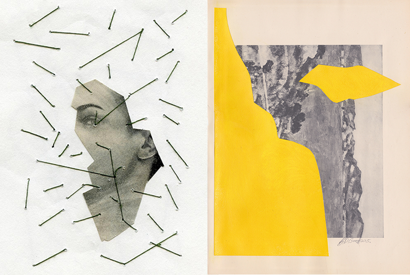
LEFT: Najeebah Al-Ghadban's mix media collages always have a raw emotional weigh to them. Here is one of my favorites. RIGHT: I love Brian de Graft's series "Add Yellow" where he questions the idea of art and ownership. "Is it mine if I add some yellow?"
Is the direct comparison made between print and ebooks even a fair one to make when the experience is so completely different?
I’m not sure the experience is really that different. Recently, I read Chemistry by Weike Wang on my Kindle. It was the most comprehensive novel about the Asian American experience I have ever read. It’s an Asian American story devoid of boats, tragedy, and laundromats, but full of subtle observations that are so relatable and so touching that I found myself putting my Kindle down every 10 pages to process the poignancy of what I read.
I’m not sure the experience between print and ebooks is really that different.
I recommended the book to a fellow traveler who I thought would have the same appreciation for it. Instead of lending her a printed copy, I sent her a link to buy the ebook. To me, one of the greatest values of literacy is how it connects people with ideas. The act of recommending a book is one of the greatest gestures of affection. I had wondered if the transaction of sharing a digital book would be too cold; if the well-intention of the recommendation wouldn’t come through. However, she read it and loved it. We stayed up all night talking and crying about it, just like we would have had I lent her a physical copy.
What are the design features that encourage you to return to a book again and again?
The only thing that gets me to return to a book is its content. The design of a book will always be important: the setting of type on a page, measuring margins, and reconfiguring the lighting of an ereader is well worth the work and creates a more pleasurable reading experience. It can also be thankless. However, it is my belief that good writing can transcend the quality of the container. At the end of the day, if the book is good enough, I’ll read the full manuscript as a word document off of the tiny screen of my iPhone. In fact I’ve done that for work many times.
The design of a book will always be important, but good writing can transcend the quality of the container.
From Jennifer 8. Lee: What, in your eyes, goes into a spectacular and memorable book cover?
The covers that catch my eye are often abstract and emotive. Sometimes they are minimal and designed with a controlled hand; sometimes they are loud, busy, and purposefully overdone. Either way, they are designs that offer a tone or a feeling.
Next week, Joan continues the conversation by asking: In a world where technology has advanced to a point where the possibilities are limitless, what would your ideal container for reading look like?

