This interview is part of an ongoing Design Observer series, Chain Letters, in which we ask leading design minds a few burning questions—and so do their peers, for a year-long conversation about the state of the industry.
It‘s June, and you know what that means—the unofficial kick-off of summer concert season. This month, we examine design and music, and why fans everywhere benefit when these creative industries work in concert.
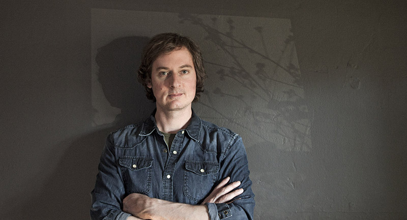
Paul Moore is a creative director, graphic designer, and photographer currently living in Los Angeles and working for the Capitol Music Group as Senior Creative Director. While working at CMG, Paul has worked with artists such as Beck, Halsey, Ne-Yo, Robert Glasper, Chaz French, BJ The Chicago Kid, Kandace Springs and Blue Note All-Stars. He has also designed packages for a handful of artists including Trombone Shorty, Pete Yorn & Scarlett Johansson, Day Wave, and many others. Paul has also had photography assignments with The New Basement Tapes, Poo Bear, Parade Of Lights as well as other up-and-coming artists on the CMG roster.
Prior to CMG, Paul worked for independent label New West Records, where he was the art director and main designer for Tom Morello: The Nightwatchman, Dwight Yoakam, Kris Kristofferson, Steve Earle, and John Hiatt. Paul has also had a freelance career working for Bill Frisell, designing three of his four last albums and some independent artist package design and photography along the way.
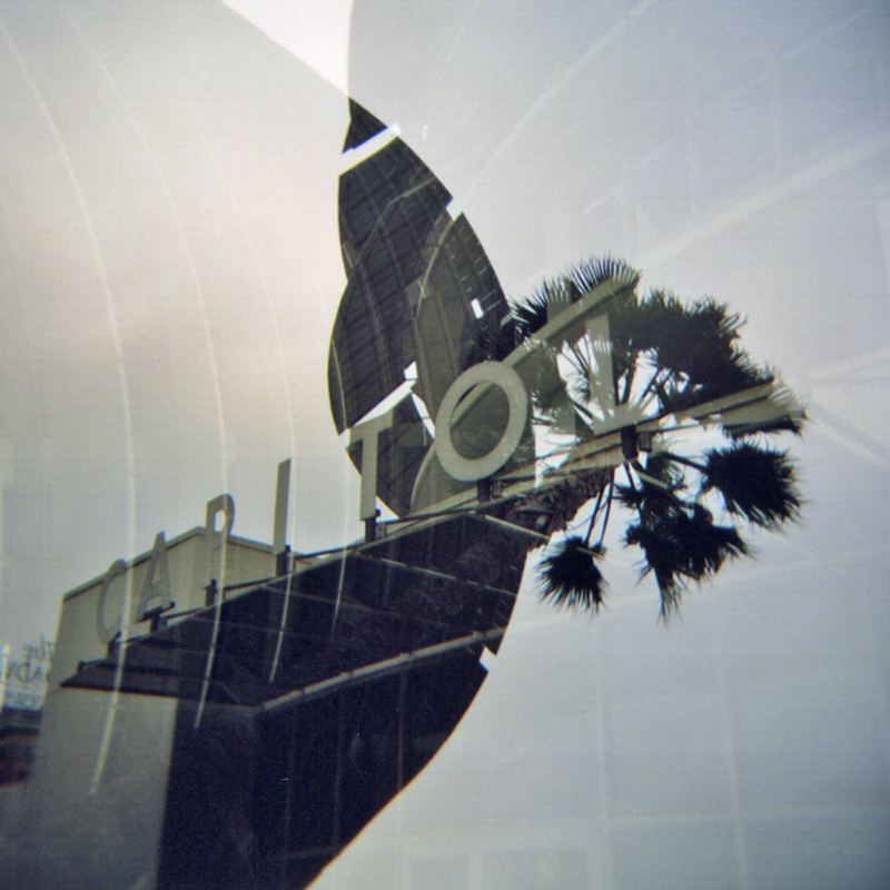
A double exposure of the Capitol Records tower photographed from the back parking lot. Image courtesy Paul Moore.
First and foremost, music is an auditory experience. How do you assess the role visuals play in building the listener’s relationship with your client?
It’s definitely an auditory experience, but visuals play a powerful role in defining a musician’s identity. Music evokes emotion and memory. The corresponding visuals—whether through photography, graphics, illustration, or typography—create a world in which the listener can immerse themselves and build a deeper connection with the music they hear. And those visuals permeate throughout fashion, lifestyle, and culture. How many times have you seen someone wearing a black biker jacket and a Ramones t-shirt and knew exactly what they were about? Visuals tell the story of the music and set the stage for what to expect before you hear a single note.
As digital downloads and streaming have taken over and CD sales have declined, the element that has become of the utmost importance is the digital album cover. Yes, vinyl has seen a resurgence, but it still makes up less than 15% of the market. So the average listener views visuals on their device at a display of about two inches. It’s a much smaller space to make an impact. But there’s nothing wrong with the way the industry is going; it’s part of an evolution. If anything, design for music is the best it’s been in decades. Streaming has shocked new life into the music industry and the vinyl we all hold dear to our hearts. Now the platform is finding a new generation of ardent fans. As designers, that’s where we can influence a movement.
Streaming has shocked new life into the music industry and the vinyl we all hold dear to our hearts. Now the platform is finding a new generation of ardent fans. As designers, that’s where we can influence a movement.There is as much written about the death of the music industry as there is about the death of print, yet neither is gone. What parallels do you see, or what differences are there?
There are definitely parallels. The way people choose to consume media has been the catalyst for that, mostly. The internet has made the speed at which we get information almost instantaneous. We used to have to wait for the evening paper to read about the day’s news; now it’s updated in real time on our phones. Now, subscription-based services and devices that conveniently store media are preferred by most people over a wall of books, movies, and music that are perfectly categorized and displayed in your living room. It’s changed, and that’s ok.
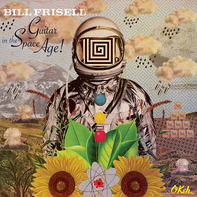
Cover art illustration and design for Bill Frisell, Guitars In The Space Age!. Image courtesy Paul Moore.
There are fans out there who are willing to pay for a physical product—the difference these days is that the product has to feel special and unique. We’re seeing the music industry address this with direct to consumer (D2C) packaging, and with special editions in print. That’s where the job of the designer comes into play. We can be the gatekeepers for those relics and fan experiences that can’t be achieved through a device.
I’d still love to see a strong push for better visual presentation in digital media, but the gratification people get from holding a tangible piece of work in their hands won’t be overshadowed by a solely visual experience any time soon.
Designers can be the gatekeepers for those relics and fan experiences that can’t be achieved through a device.‘Zine culture was very influential to the visuals of independent music in the 1980s and 90s. Is there fan-created content that influences you today?
I remember picking up ‘zines in indie record stores on Thayer Street near Brown University to get the pulse of what was happening. They were the underground source of information when I was getting introduced to music. Later, when I was a field marketing rep, I made a ‘zine to distribute to stores on my route. We only printed 250 copies because that’s all our friend’s dad with a print shop allowed us to do, but we still made an impact. People from all around the state emailed us to share their thoughts on the ‘zine. It was such a cool experience.
Today, the main source of inspiration has to be Spotify playlists or Instagram. Anyone with a phone and something to say can reach millions without getting into a beat-up Nissan Pulsar and driving all over Southern California like I did. Fans are producing content on a digital level, and I totally respect them for picking up the torch and carrying on the anti-corporate message of music and ‘zine culture.
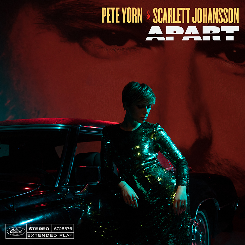
Cover art design for the Capitol Records release of Pete Yorn & Scarlett Johansson, Apart. Image courtesy Paul Moore.
Does music’s ongoing evolution into the digital present a visual opportunity or a design challenge? What’s missing, visually, in today’s music experience?
This evolution has been astounding at times and frustrating at others. In digital, we’re constantly presented with the challenge of creating for the lowest common denominator. Since devices display visuals at a small scale, there’s always a nervousness about creating a digital cover with type that could be considered too small to read on a phone.
But we don’t have to worry about a sales rack or a sticker blocking an artist name or title anymore. For decades, type had to be formatted into the top third of a record cover where it could be easily seen. The digital space has presented new opportunities for designers to have bravado and explore bolder, more brash typography; the kind of unadulterated statement that reminds me of the Reid Miles era of Blue Note Records or the early years of punk. We’re able to explore new ways and create new experiences. I like to think this is how Storm Thorgerson felt when leaving type off of Pink Floyd's Dark Side of the Moon.
What’s missing is a fully encompassed, finer approach to how visuals are seen on digital platforms. We’re still only at the mouth of this frontier, and the possibilities are limitless—as long as there are creative minds willing to push the forefront.
The digital space has presented new opportunities for designers to have bravado and explore bolder, more brash typography.If video killed the radio star, what did streaming services kill?
Streaming killed the time allocated to design, the tactile experience of holding music in your hands, and the sales of any prior auditory format, like the CD. I will say though, streaming has allowed me to experience more music than ever before. For a nominal monthly fee, I can now explore an entire album that I might’ve hesitated to buy based off of a single alone. And just getting into the parking lot of Amoeba Music here in LA could destroy any love you once had of purchasing a physical product. I loved watching music videos on MTV when I was a kid. It was my after-school escape; I could pretend I was just as cool as the artists on screen. But we all know that ain’t workin’ anymore.
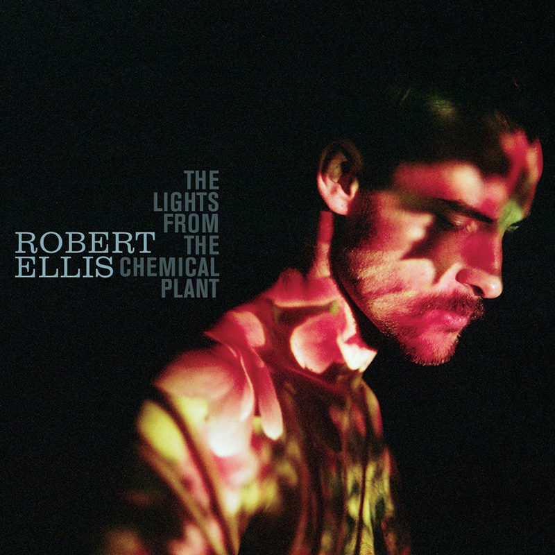
Cover art design for Robert Ellis, inspiration from Reid Miles’ typography. Image courtesy Paul Moore.
From Emily Batson: As a creative person, do your personal philosophies and values influence the projects you work on? What do you think is the role of creative influencers in our world’s current political state?
As creatives, we’re fortunate to work with a lot of like-minded people. My position is to portray the values of my clients through the visuals I create for them. I’d like to think those shared philosophies naturally show through the work because of the relationship I form with an artist. Our role in this political climate is to be an instrument for those who need one and a voice for our core beliefs. It’s important for us to stay active, and to support and vote for the people who can lead to a better future.
Next week: Paul asks Anna Gerber, co-founder of Visual Editions, Do you feel there is a perceived notion that art created for digital use is valued and respected less than in the print medium, and should therefore take less time to create?
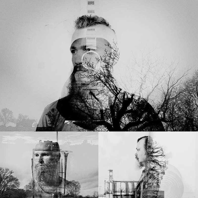
Digital collage of photographs for the Ben Miller Band. Image courtesy Paul Moore.

