It is extraordinary that the New York City Department of Sanitation has retained its distinctive look since 1966. That year, during Mayor John V. Lindsay’s administration, a task force was established to consider redesigning much of the city’s diverse institutions, including mass transit, street signage, and government agencies. The initiatives that were decided upon had mixed outcomes. Massimo Vignelli and Bob Noorda’s subway refinements were only partially implemented—and not without difficulty. Years passed before many of the street sign applications were launched, though even today confusion exists sometimes from block to block. The initial success of the Department of Sanitation’s graphic overhaul, however, was “a conspicuous and impressive indication that the Mayor’s Task Force proposals were penetrating interdepartmental politics,” John Lahr wrote in PRINT magazine (March/April 1968). “The redesign of the sanitation trucks and signage epitomizes the paradox of urban design: an enlightened dictatorship in a democratic form of government.”
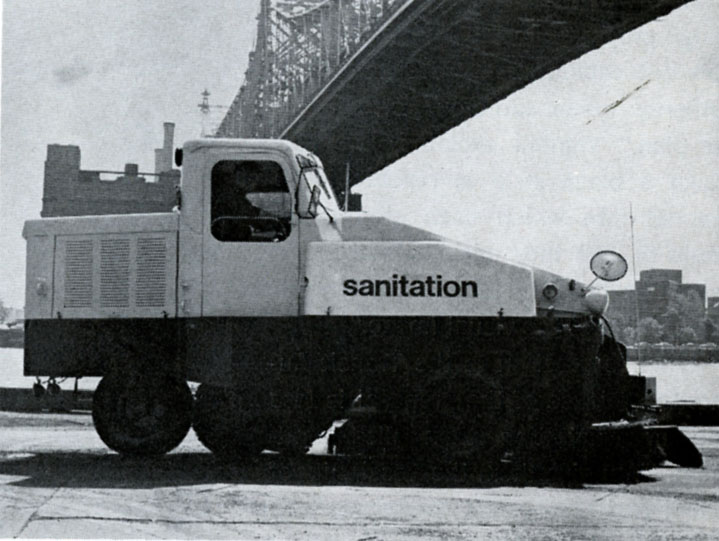
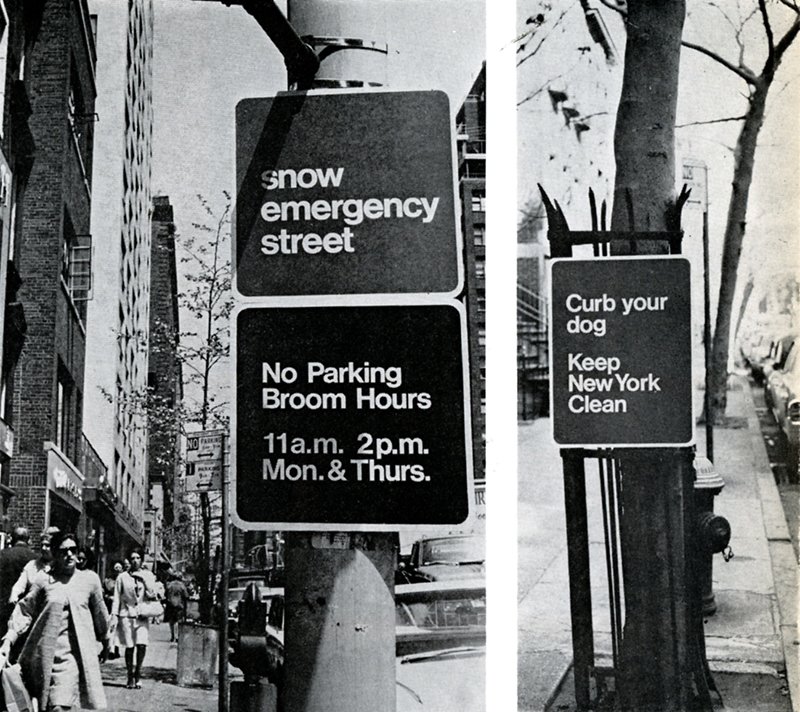
The program was overseen by then-Commissioner of Sanitation, Samuel Kearing Jr., who was determined to change the department’s image. His choice for designer was Walter Kacik (1931-2013), a former employee of I.M. Pei & Associates, who founded Walter Kacik Design Associates in 1966. He had redesigned the BSAF company logo and typeface (still in use) and transformed the NYC garbage trucks from a dingy yellow to a white truck with only “sanitation” in sans serif on the sides. He also designed numerous signs, though the Keep New York Clean iteration was the only one used. “What we wanted to accomplish when we took the assignment,” Kacik told Lahr, “was a complete redesign of the format of the Sanitation Department. We started with the rolling equipment—garbage trucks, etc.—because they are very visible facts in the New York environment; you can hardly walk around the corner without bumping into one of them.”

The sans serif type and black and white color scheme were chosen because “we didn’t want to contribute to the general Christmas tree effect you see in the city,” said Kasik. “Blue was to be used as an auxiliary color. We were also setting up a general sign control.”
Colleagues thought Kearing was out of his mind to hire a design consultant. “But we aroused a lot of interest throughout the city government—especially in areas concerned with similar design values, like the Parks Department.” In fact, Kearing’s commitment to design was matched by his ability to launch the program quickly. The project, which was begun almost as soon as he took office in February 1966, was finally formalized in a contract in July. “Usually, there is a tremendous amount of time between the proposal and the enactment of design,” noted Kacik. “But with Kearing all the decisions were made in remarkably short time…Newly designed sanitation trucks were on the street before we had signed our contracts with the city.”
Vignelli had been virtually locked out of the Transit Authority’s sign shop, but Kacik found it easy and helpful to work with the sanitation men. “They were skeptical at first; up to that point they had made decisions on their own,” he added. “We pointed out to them that what we were doing was a way of enhancing their own jobs and performance. Once the trucks were painted, this became obvious to them. The vehicles had a stark, clean, new look.”
Regrettably, Kacik’s relationship with the Sanitation Department came to an abrupt end when Kearing resigned from the Lindsay Administration, stalling further redesign efforts. All that remains are the vanilla trucks and the lower case Helvetica.


