Like so many American boys, when I was a kid I collected baseball cards. Until my teens I think I liked baseball cards better than professional baseball itself, which I sometimes found boring. Baseball cards I never found boring. There was a sense of excitement you had when you opened a pack — would I get any of my beloved Yankees? A Reggie? — and then the various pleasures of examining each one, categorizing it by team, perhaps trading it to a friend for something better. Looking back, I now see baseball cards as my gateway drug into the world of graphic design. In a sense, the baseball card is a pure design object, its singular purpose being to deliver a sense of aesthetic satisfaction.
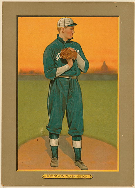
If you're looking for aesthetic satisfaction in a baseball card, I would start with the Turkey Red series of 1911, a set of beautiful color lithographs that could be redeemed with a coupon in a cigarette package. [Above is Walter Johnson, the great Washington pitcher, with the Capitol dome in the hazy distance.] I'm also partial to this Roberto Clemente, from 1972. In Steve Heller's new book, I Heart Design, I have a short piece about this 1887 Allen & Ginter John Ward, who was the Derek Jeter of his day as well as a Columbia-trained lawyer and union advocate.
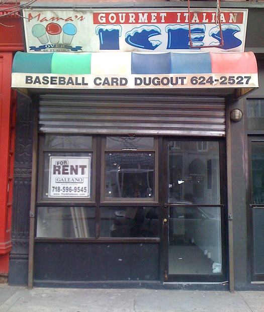
Though I no longer collect baseball cards — and was really never that obsessive about it, even in my youth — buying a pack of the latest Topps set (always Topps for me; I'm a traditionalist) has always been an annual spring ritual, and one that over the last few years I've made sure to transact at the local card shop here in Carroll Gardens. Sadly, the Baseball Card Dugout, run by inimitable Brooklyn institution Joe Rock, closed last fall, which means I'll have to satisfy my card fix elsewhere.


Comments [5]
apart from the design of cards over the years and eras, the content they offer can be as rich a source. Take the rare instances where a pitcher's image on his card portrays him while at-bat (I've only ever seen this on a Greg Maddux and David Cone)—subtle form and style shifts and anomalies provide a fascinating landscape.
03.08.11
12:35
In my case, it was Hockey cards (hey, I'm Canadian). Like you, I found the cards much more interesting than the game itself (although Peter Puck helped). However, card packs soon gave way to Comic books... from from there it was a slippery slope into the design industry. The graphic storytelling moulded my impressionable young mind in ways that made a career dealing with visuals on a daily basis virtually inescapable.
03.10.11
12:51
03.11.11
08:40
I found a nice set of images of the 1960 Topps set here:
http://www.vintagecardtraders.com/virtual/60topps/60topps.html
03.13.11
12:36
those 1960 Topps cards are fantastic--outstanding design. thanks for the link.
03.15.11
04:10