What makes a graphic designer strange? Is it the obsessive attention to kerning on street signs, arguing whether PMS 172 is orange or red, or collecting odd scraps of paper on every European vacation? These may seem strange activities to civilians but they are some of the many quirks that define us. Our ability to find wonder in almost anything, however, is the truly rare skill. There are few subjects for a project that don’t elicit first interest, and then the need to know everything. A sound designer can take drill bits, ducks, polyester shirts, or viral infections and make something incredible and compelling. Contrast that with a non-designer guest at a dinner party. When I ask, “Did you know that a tungsten carbide drill bit can penetrate almost any material?” my dinner partner may look confused and then bored.
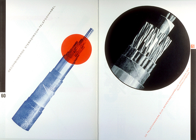
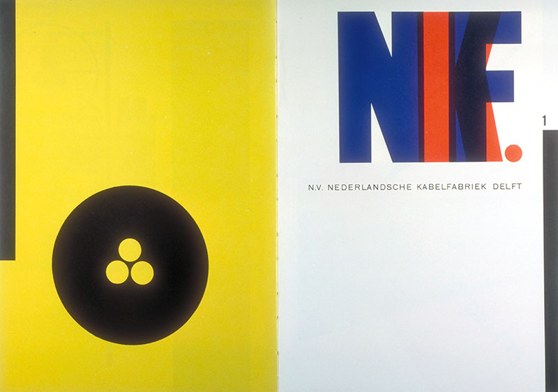
Piet Zwart, catalogue for cable company, 1928
Tobias Frere-Jones recently released a new typeface based on Bulgarian Lotto tickets from the 1930s. This inspiration may seem somewhat oblique to an investment banker but is entirely in line with the way designers see the world. Bulgarian lottery tickets? Why not?
Fere-Jones discovered the typography while researching a project for letterforms as security devices. The numerals are an example of self-verifying numbers. The name of each digit is spelled out beneath. Eighteen months passed and Frere-Jones began to question what sort of alphabet might go along with these monolithic, theatrical numerals?
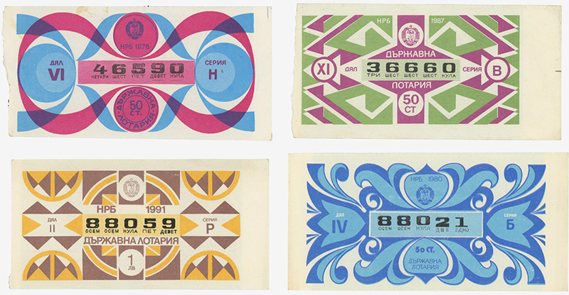
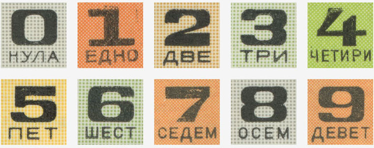
Serial numbers from Bulgarian National Lottery tickets.
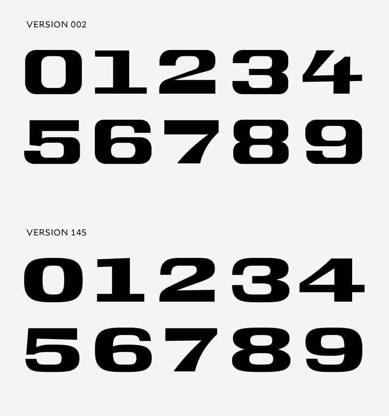
Version 002: an early draft, with an exact tracing from the lottery tickets.
Version 145: final version of Conductor Wide Bold.
Frere-Jones and Senior Designer Nina Stössinger determined that the resulting typeface, Conductor, would be a display type. The team used the idiosyncratic Bulgarian numerals as a fertile starting point for a robust and elegant typeface. As is typical with those of us easily obsessed, the group continued designing an equally aggressive italic. This created a variation that works with harmony and contrast with the roman display type.
The name, Conductor, hints at high-contrast letterforms that allow words to be legible from oblique angles, as you might view a train from the end of a boarding platform. It merges a certain Soviet-era airport severity with the elegance of a Pullman car. Frere-Jones and Stössinger explored almost 100 names, deciding on Conductor for the range of influences and references it contains. It implies places and functions and bridges the past and the future. Frere-Jones and Stössinger’s examination, design, and development of the typeface is proof that a designer can take the mundane and everyday and make something into music.

Conductor Weights and Styles

