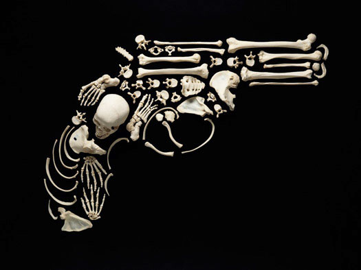
Gun by Francois Robert
Francois Robert was at an auction in rural Michigan. It was the mid 1990s. A school was selling off supplies, and Robert was looking to buy some furniture for his studio. "I was interested in buying some lockers, and they had three for $50." Two of the lockers were empty, but not the third. When Robert opened it up, he found a human skeleton.
Francois Robert was at an auction in rural Michigan. It was the mid 1990s. A school was selling off supplies, and Robert was looking to buy some furniture for his studio. "I was interested in buying some lockers, and they had three for $50." Two of the lockers were empty, but not the third. When Robert opened it up, he found a human skeleton.
The skeleton, fully articulated and in reasonably good condition, must have served as a teaching aid in a science class. Francois Robert is a photographer. He took the lockers back to his studio in Chicago. It took him years to figure out what to do with the skeleton.
"Bones have always fascinated me," says Robert. His portfolio has always included images of animal skulls, recovered from the desert. He once spent five weeks photographing skulls in the collection of the Field Museum of Natural History. By 2007, the recession was taking its toll. "I had so much extra time. What was I going to do with it?" He turned to the skeleton in his locker.
Robert realized that his skeleton was limited: it was wired together for display. He decided he wanted a skeleton he could take apart. Online, he found a source for disarticulated human skeletons, and he traded his in, and took delivery of a box containing 206 separate bones, each the real thing, not plaster or resin.
Since then, Robert has spent hundreds of hours working with those bones, arranging them painstakingly into striking, iconic shapes, each five or six feet wide, and photographing them with a 4x5 Hasselblad rigged to a boom to provide a bird's eye view. He calls the resulting images "Stop the Violence." Each shot takes a full day to set up. "I was on my knees for all of 2008," Robert remembers.
The results are beautiful and haunting. Robert confesses that more than anything else he is motivated by the fear of death. "The bones are something left behind, a form of memory," he says. "I try to treat that person on my studio floor with respect."


Comments [31]
04.22.10
12:16
04.22.10
02:07
i'd rather pop bones than yves behar lamps anyday. where can we buy prints!
04.22.10
02:37
04.22.10
04:28
04.22.10
04:45
04.22.10
05:44
04.22.10
10:28
Sometimes we really different things coming up into one single image. The rough plane of a newly built house for example, I sometimes see a human face there.
04.23.10
12:24
04.23.10
04:13
04.23.10
09:29
04.23.10
04:18
Dammit, why didn't I think of that.
04.24.10
11:34
04.24.10
10:19
What if Francois Robert's work was delivering a "new", "profound", "critical" statement? People would maybe recognize it as such and utter a word or two of admiration... and they still would not pay attention to it. They would turn to their habitual means of self-absorbed escapism and continue to ignore whichever trascending and deep message you people believe an artist ought to be transmitting.
No. We don't need "new" or "profound" statements. We need the old, simplistic ones continually pounded on our heads, since it seems we have such a hard time ingraining the most rudimentary and basic moral concepts in our minds. Francois Robert's work does a good job in advancing that cause. After all, isn't it the case in advertising that people only start thinking about what you are saying after they have grown sick and tired of listening to it over and over?
Besides, is there even *any* innovative thing to say about injustice and death? They are the same they have been since the dawn of mankind.
04.25.10
11:08
That said, the assemblages themselves are clever, intricate, and the images strangely beautiful, they remind me of illuminated letters.
04.25.10
11:17
I would be really interested in hearing what Francois Robert's actual intent was with the series, beyond the title. It seems like most of the posts refer to the subjects in the images as "violent," when in reality, what makes them violent is the human force controlling it, not the things themselves.
So is the artist's intent to say that the human component is what makes these items violent, with the use of the bones? If so, then I find the work pretty brilliant. If not, it's just something else taking responsibility away from where it should be, in the hands of mankind.
04.26.10
08:31
Also, I did not think that the use of religious iconography is necessarily a bad choice – as others have said – as religion is behind a great deal of the violence in our history (and our present day for that matter). But the random placement of these icons in the slideshow is what made them seem jarring to me. Maybe they should have been last, as a reminder that while they may be symbols of peace they are also used as an excuse for violence in the same manner as the swastika – which is oddly placed at the end of the exhibit. I say oddly because there are many images – the jet fighter for example – that are more "modern" than the swastika. The slideshow format always gives the illusion of a progression through time, even when unintended, so I thought it seemed out of place.
I think the order in which the images are displayed needs to be examined. The images themselves are of parts thoughtfully assembled in an new and evocative way. Greater care should be given in the way the individual images are arranged as well.
04.26.10
11:25
04.26.10
01:15
Please advise. Thank you.
04.27.10
08:37
04.29.10
12:01
04.30.10
01:03
04.30.10
05:02
04.30.10
10:14
05.02.10
09:03
05.02.10
03:18
05.02.10
10:14
Besides that, it looks nice.
Nothing that can't be done on a computer in 1% of the time, just as effective. But maybe it's the morbidity that should fascinate us?
06.01.10
05:55
06.23.10
08:08
06.23.10
09:30
But what sketchtastic online store lets you buy authentic human bones? Is there some kind of screening process or can anyone just order them if they have the cash? My ethical side wants more information and isn't entirely comfortable. It seems crude to use an actual skeleton.
08.16.10
09:02
People would maybe recognize it as such and utter a word or two of admiration... and they still would not pay attention to it. They would turn to their habitual means of self-absorbed escapism and continue to ignore whichever trascending and deep message you people believe an artist ought to be transmitting.
12.09.10
01:32