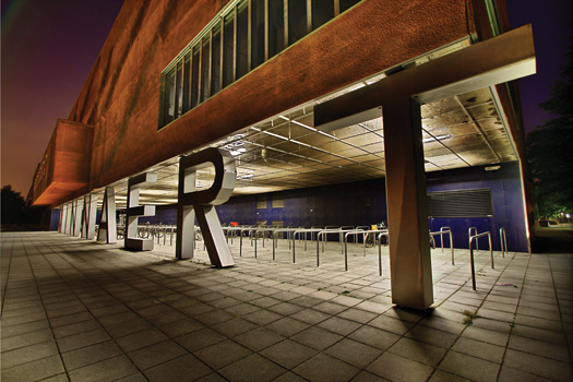
Minneart Building, Utrecht, The Netherlands, 1997.
Before printing, lettering was writ large on stone and in wood. Today, type is no longer the product of a special breed of type designer used by specialist typographers. Architects and artists as well as environmental graphic designers are big on type. And making type big on everything from buildings to mountains. In fact, some buildings (and maybe a mountain or two) are made from type. Lettering Large: Art and Design of Monumental Typography by Steven Heller and Mirko Ilić (The Monacelli Press), is a chronicle of lettering and type in public space. The following is an excerpt from the chapter "Big and Bigger: Type as Object."
Cuneiform script emerged in Mesopotamia as the first pictorial writing system during the late fourth millennium. Meanwhile the ancient Egyptians made paper from the papyrus plant and developed three of their own writing scripts, notably hieroglyphics, used mostly by priests. But dimensional lettering on buildings dates back to an age when paper was still new and rare, stone was the primary medium for statements writ large, and walls and gravestones were default message boards. Rome, the birthplace of the Roman alphabet, gave rise to various monumental writing methods.

While Trajan capitals were laboriously carved into travertine, which captured light and produced dimension-enhancing shadows, bronze letters were also affixed in relief to wood or stone, providing greater dimensional intensity. Centuries later, imitating the storied grandeur of the Roman Empire, Benito Mussolini decreed that Italian architects design generous spaces on facades of new fascist buildings on which the dictator’s orations would be immortalized in sculptural friezes. Born of his hubris, a voluminous three-dimensional block lettering style emerged that referenced ancient Roman epigraphy while celebrating the past, present, and future of Il Duce’s oppressive reign. Today’s neon (and recently, LED) advertising signs perched atop or bolted onto the facades of many Roman buildings may come and go, but Mussolini’s so-called action words were literally set in stone less than a century ago and were given the same credence, epigraphically speaking, as the venerated inscriptions by and about many emperors and popes from millennia past.
Three-dimensional typography made from stone, concrete, metal, or other indigenous materials, owing to volume and mass, is well suited for architectural display. And there is no better place to post statements for all to see than on permanent structures in well-trafficked outdoor environments. When three-dimensional typography is rendered large, its architectonic impact is even more impressive—and physically much more enduring—than temporary scrims, banners, or posters affixed to similar platforms.
The practice of placing lettering in relief on or around buildings has experienced a revival of sorts. Increasingly, dimensional lettering is used not just for advertising, but also for integral components of architectural schemes, including artworks and institutional branding.


Comments [1]
11.20.13
06:27