This is the first installment in a three-part series based on a lecture Rachel Berger presented to the Pinterest Design Team in August 2015 on current trends in graphic design.
It is difficult to have any perspective on our own historical moment. That would require looking into the distant future and predicting what will have mattered. The upside is that if we’re all still around in fifty years and any of what I have to say here turns out to be right, I can feel very smug about it. And if I’m wrong, no one will remember anyway.
Of course, pundits are racing to lay claim to this era: it’s meta-modernism, hyper-modernism, the digital age, the information age. It’s the metrosexual, mass indie, new Victorian, normcore, hipster, yipster, post-ironic, boomerang, millennial, generation Y. To be safe, let’s just call it: the NOW.
In the NOW—as in prior eras—the oscillation between simplicity and complexity has been a major theme in graphic design. Design historians follow the pendulum’s swing from the highly decorative style of Art Nouveau, to the rise of Modernism and its criminalization of ornament, to the postmodernist backlash, with design fracturing into countless subcultures and the disorder of early digital experimentation.
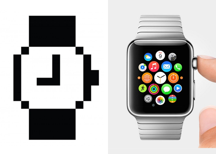
Apple has taken us all on its own ride between these extremes. In the 1980s, its visual language was driven by the radical simplicity of Susan Kare’s low resolution screen graphics for the original Macintosh computer. Twenty years later, company leaders like Steve Jobs and Scott Forstall championed the adoption of a highly ornamented aesthetic known as skeuomorphism. Skeuomorphic design models the look of digital products after their real world counterparts, even if there is no direct relationship to functionality. And the growth of the iOS mobile operating system brought skeuomorphism to billions of screens. More recently, under Jony Ive’s creative direction, Apple has adopted a resolutely modernist flat design aesthetic.

Susan Kare, watch icon; Apple Watch
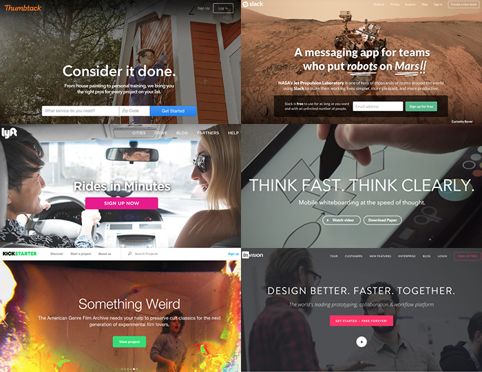
Contemporary designers are the inheritors of these competing legacies. And when I think about complexity and simplicity in the visual culture of the NOW, the NOW appears to be suffering from bipolar disorder. As far as the digital product space goes, we are drowning in a sea of sameness. A quick survey of tech startup homepages reveals an absurdly narrow and reductive visual language. Site after site employs a pithy slogan in white san serif type, centered top to bottom and left to right, overlaying a responsive, edge-to-edge photograph that includes at least part of a white person. Even Google has finally succumbed to the gravitational pull of the anodyne sans.

Homepages for Thumbtack, Slack, Lyft, Think Kit, Kickstarter, and InVision
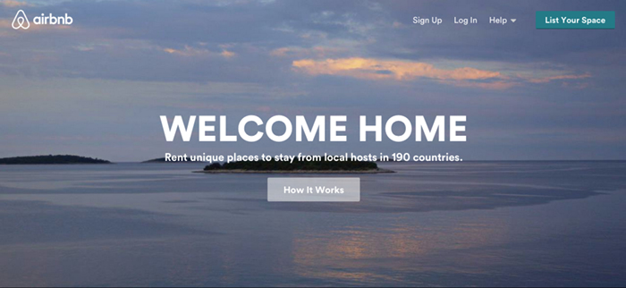
Airbnb was a pioneer of this visual style. In the summer of 2012, the company’s homepage started featuring a large white headline over a pretty, full-bleed photo. But the company’s 2014 identity redesign—and the subsequent attention it garnered—secured Airbnb’s place on the shortlist of start-ups that are genuinely invested in visual design. Airbnb hired London-based creative agency DesignStudio to lead the redesign, which took over a year to realize. Members of the DesignStudio team embedded themselves at Airbnb’s company headquarters and stayed in Airbnbs on four continents. They also had plenty of access to Airbnb founders Brian Chesky and Joe Gebbia, who are RISD grads and designers in their own right.

DesignStudio, Airbnb logo

Airbnb homepage
When the new identity was finally unveiled, the press focused almost exclusively on the new logo: an abstract icon Airbnb called “Bélo.” Compared to the coverage of the Bélo (It looks like someone else’s logo! It looks like genitalia!), there was scant mention of the site redesign, except to tout its functionality and consistency across devices. At the time, the attention paid to the Bélo made sense—the mark represented Airbnb’s aspiration to become a true global brand with a universally recognizable symbol. Meanwhile, the web redesign was solid, and a logical evolution from the previous design, but it wasn’t revolutionary. Unfortunately, Airbnb’s reputation as a design-led company that mints money and the bland, all-pleasing nature of its web design has made the site a tempting object of replication.
Book cover designer Peter Mendelsund recently took to Twitter to complain about copy cat art direction:
Whenever I hear that someone in my field has been asked (told) to design a book jacket that looks like some other, pre-existing jacket, told to ape a previously successful title, or a "genre look" (and this is increasingly how we are directed), I think to myself there's a word which describes when a thing is designed to look like those things which surround it, and that word is "camouflage.”
While camouflage means blending in, it can also mean fitting in. When product managers in companies that lack a strong creative vision of their own direct their designers to “do that thing that Airbnb did,” they probably view it as a fast and easy way to signal to the public that their product is in the same class as Airbnb. Sites like these aren’t clones of each other because this is the best or only way to design a user interface. It is a good enough way. It is also a fearful way. It sells both the product and the user short.
If we assume a product is unique, why should it be delivered in the same way as every other product? If we assume a user is a human, wouldn’t she appreciate variety, specificity, and design choices that support the unique experience she is about to have with the product? The simplistic, unconsidered visual language of so many digital products and the time we spend engaging with it in THE NOW has made us ravenous for ink, paint, ornament, humanity, beauty, and evidence of the hand (and not one that’s a prop for a device).
In the next installment, I will look at complexity in the visual culture of THE NOW and reveal where we’re going for our ornamentalist fix.


Comments [3]
11.30.15
08:58
12.01.15
03:08
12.01.15
06:24