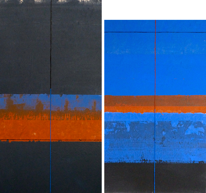
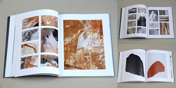
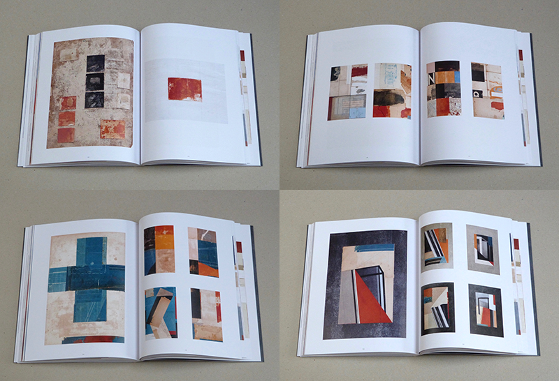
Dan Fern (b.1945) is a legendary teacher, who spent the better part of his career at the Royal College of Art (RCA). As an illustrator for Nova, The Sunday Times Magazine and other publications, he was invited in 1974 to teach in the illustration department and in 1986 he was appointed a full-time professor of illustration. In 1994, Fern became head of the School of Communication Design, with responsibility for graphic design, illustration and interactive multimedia. In parallel with his educational commitments, he has continued to work as an artist in different realms and with many media. In November 2018 a monograph of Fern’s dramatic abstract landscape work from 1996-2017, “On the Horizon” was on view at London’s Coningsby Gallery with a 200-page eponymous monograph that covers Fern’s work over the past 20 years using painting, drawing, collage, photography, sculpture and poetry to express ideas about landscape and the nature of things both seen and invisible. It includes a foreword and essays by Rick Poynor and designed by art director Nerina Wilter. Although communication, transportation and shipping goods has been streamlined in the 2000s, only recently did I receive the impressive On the Horizon. So better late than never, I asked Fern to discuss his paintings and collages and the ways by which he weds the fine and applied arts.
Dan, after teaching RCA for so long, how do you see art, such as the free expression in your own work, as complimenting or supplementing or co-existing with typography and graphic design?
Having studied graphic design at Manchester College of Art and then Illustration at the RCA, I found it natural and enjoyable to make images that also incorporated type forms, sometimes as direct communication - a book-title, say, or a poster - but also sometimes as pictorial elements with a purely abstract visual function. This was at a time (the late 60’s) when illustration and graphic design had become two quite distinct activities, taught in separate departments. Improbable though it sounds today, my work at that time was comparatively unusual in that it occupied an area of overlap between the two. (In most commercial work at that time an art director commissioned an illustrator to make an image and then employed a designer to add the type.)
After I [graduated from] the RCA I immediately started to receive commercial commissions which enabled me to produce work in which image and type were fully integrated. So I was busy, and getting good commissions, but at the same time I always found it an important part of my practice to go ‘off-piste’- to set my own agenda outside of commercial work, experimenting with different graphic processes - print, collage, drawing, photography and so on, trying out different ways of using type forms and letterforms and other graphic devices - geometric shapes, grids and so on - free of the necessity to follow a brief, or communicate an idea, or sell a product. It became the R&D department of my practice, feeding into the commercial work but also gradually establishing itself as a body of work in its own right. Then around 10 years after graduation I had my first solo show of this non-commissioned work at a gallery in Central London, titled ‘Print and Collage Constructions on Paper’, and since then I’ve exhibited fine art work of this kind regularly in galleries in various cities around the world, at the same time as having work included in books and exhibitions of commercial graphics.
There is quite a legacy of artists who use type as form and content. I presume you were influenced by the pioneers of this form?
Not surprisingly I’ve always found most of my personal inspiration outside of what was going on in commercial Graphic Design; I was more interested in the work of fine artists and printmakers, especially those who used text, type or other graphic elements or processes in their work: Dieter Roth, Henrik Werkman, Joseph Beuys, Antoni Tapies, Robert Rauschenberg, Kurt Schwitters. Whilst I was still a student at the RCA Herbert Spencer, who was Professor there, published Pioneers of Modern Typography which was seminal for me, as were David King’s great collections of Russian Constructivist graphics, architecture and fine art. Lissitsky’s great propaganda poster ‘Smash the Whites with the Red Wedge’ was a great favourite, and I was excited by the ideas and visual language of the de Stijl movement.
The work in On The Horizon is not representational. Abstraction, such as yours, has had an up and down relationship in the applied arts yet goes back to the early 20th century, where and how did you begin?
Throughout my teaching career in visual communication at the RCA, I encouraged illustration and graphic design students to similarly broaden their range of cultural and visual reference, to find inspiration outside of the D&AD Annual - for many years an all-powerful arbiter of standards in applied visual communication; to recognise and understand the obvious differences between fine and applied art but not to be constrained by them. It’s been a great pleasure over the years to see how many of them subsequently ignored the conceptual border between art and design in their own practices.
For many years the Bauhaus-like ethos of the RCA encouraged this interdisciplinary approach, with all of the disciplines physically located alongside each other on one site, providing a wonderful hot-house atmosphere. Now, given the radical transformation in recent years brought about by digital media, interdisciplinary activity no longer relies on physical location of course; though I feel that something important has been lost by the separation of disciplines at the RCA onto different sites across London.
I’ve always felt completely at ease with the idea of abstraction in visual art. I love music almost more than anything else, and there of course it’s simply a given that work needs no direct connection with the objective, ‘real’ world. Similarly I was always attracted to visual art that employs colour, line, pattern or texture to express ideas, without the inclusion of realistic imagery. In my own early non-commissioned work I used these elements alongside letter-forms and other graphic elements; I wasn’t aiming for anything more ambitious than a personal kind of visual poetry. Obviously the opportunity of freeing content from meaning in commissioned work were rare, though it was often possible to pare it right down to a few carefully chosen elements, and the self-commissioned pieces were useful in rehearsing these possibilities.
What are the themes that the works in On The Horizon address?
By the mid-90’s the fine art-oriented side of my work had more or less replaced commissioned projects; I turned down all but the juciest commercial jobs. I simply found it more interesting to set my own agenda. The work documented in On the Horizon starts at that point.
Throughout my career as a graphic artist I’d been soaking up ideas and inspiration from things I saw on my travels - to Japan and China in particular, where the calligraphic visuality of the language was, since I wasn’t able to understand it, entirely abstract. I became increasingly drawn to the traditional art and architecture of Japan in particular; visits to the Imperial Villa at Katsura on the outskirts of Kyoto had a profound effect on me.
I’ve always been an admirer of the work and ideas of the American artist/architect/designer Donald Judd, and a visit to the Chinati Foundation at Marfa in Texas a few years ago was also one of the most inspiring places I’ve been - a perfect example of how being an artist or designer can reach far beyond professional practice and become all-embracing, a way of life.
I’ve been interested in mountaineering for many years, but in 2000 I found myself in an area of SE France which had a radical impact on my work; from that point landscape, in particular the mountain landscape of that particular area, become my main subject matter, though I’ve carried on making work about other things - also documented in the book. It was through my experience of that particular landscape, though, that my growing interest in the trans-material world developed.
On The Horizon, at least for me, does not belie your origins as a designer/illustrator. Is my observation correct?
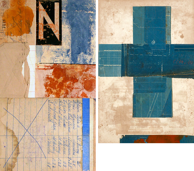
Running through the whole of OtH are references, sometimes overt, sometimes more veiled, to my training and professional life as a graphic designer/illustrator and teacher of visual communication. The visual vocabulary I’ve developed is essentially a graphic one - I use text, print, photography, typography, grids, diagrams and maps; my images are carefully composed, and they’re usually on paper; I can’t start a project without first having an idea. I set myself briefs! I have aims and objectives! When they’re finished I critique them! In writing! If a project succeds in communicating an idea I’m happy, though I have to say it’s not a priority any more.
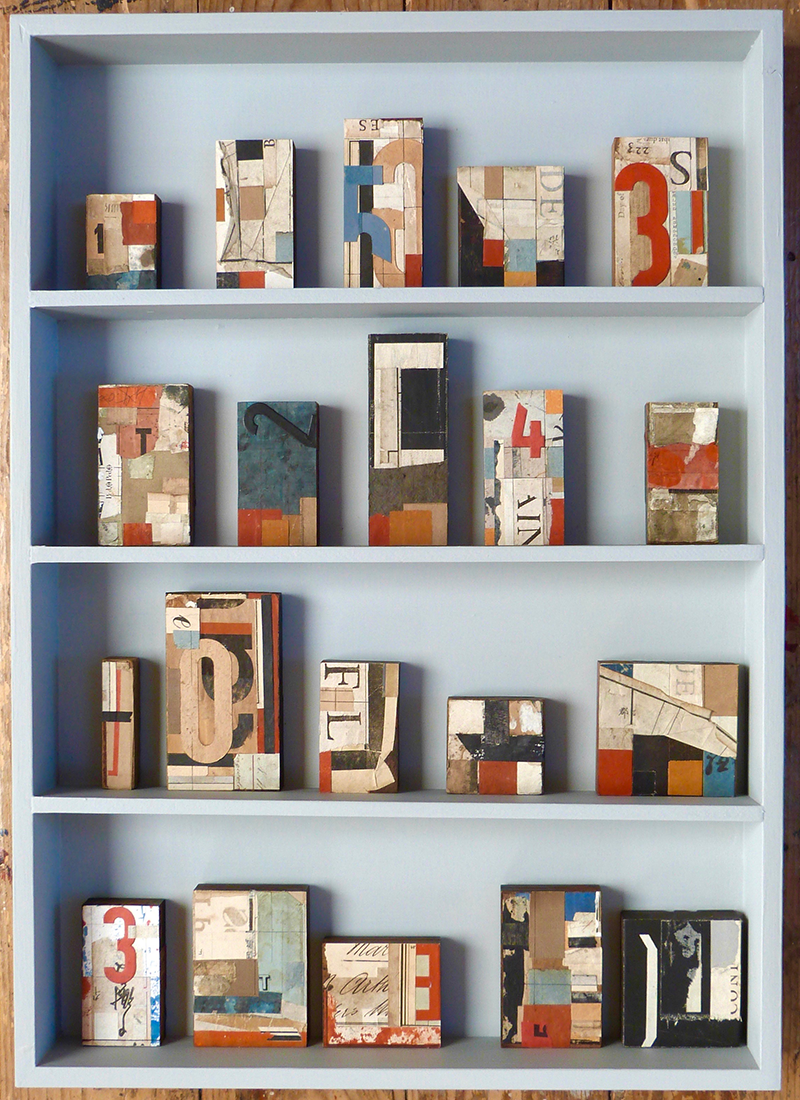
I’d say that publishing OtH as a book - my favourite of all forms of communication - was important for me from a personal point of view - to put down a marker, as it were - to document this period of my creative journey and to hope that some of it resonates with other artists and designers. I called it ‘On the Horizon’ partly from the obvious artist-in-the-mountains point of view, but also because it’s always been intrinsic to my nature to be constantly looking forward to the next project, to always have something on the horizon. The work I’ve made since OtH went to press is visually more rooted than ever in my background as a commercial artist and designer, so I’ll be interested to see where it leads. Right at the moment I’m focused on a project titled ‘make-ready’ which references the old practice used by printers to add scraps of paper to the reverse of woodblock type to ensure an even pressure when printing. I’ve made around 50 pieces so far, using collage on the reverse of woodblock letters.
What’s next for you?
Each project in On the Horizon is a sort of gateway which offered me the opportunity for research into different personal, cultural or philosophical areas which I found interesting.
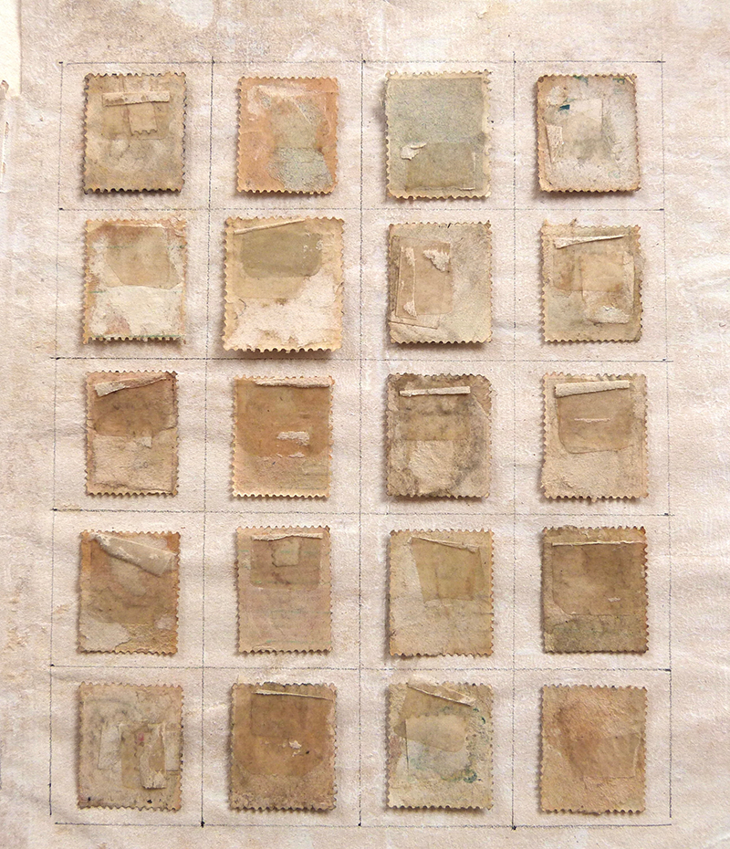
A good example is the project titled ‘A Foreign Country’ - I collected postage stamps when I was a boy - an early fascination with collisions of image and typography - and a few years ago began a long process of re-visiting my childhood collections, reversing all of the stamps and mounting them face down on hand-drawn gridded pages. This process followed a pattern I’d established back in the 90’s of reversing printed material, sometimes using the reverse as a surface to make images on, as in the projects made with maps, but also as an act of erasure - with the postage stamps I wanted to hide all references to countries, currencies, politicians and monarchs, and focus on the simple collector’s obsession with arranging pieces of paper on a gridded surface. At the same time it became a personal meditation on family, and memory, and loss.
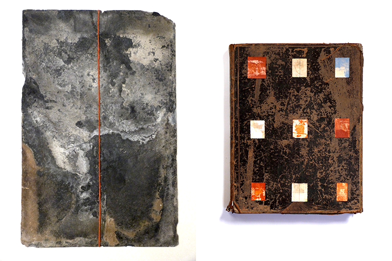
I’ve written in the book about Wabi-sabi, a Japanese philosophy which celebrates the beauty of objects which have become faded and worn through use, and which demonstrate the vulnerability and transience of the material world. This is another theme which runs all the way through the projects in On the Horizon: in the roots and stones I collect and work with; in fragments of found paper ephemera which I use in collage; in the project titled ‘Ephemera/l’ which uses light-sensitive paper; in ‘Cahiers’ which documents time passing through the medium of the pages of an old French year-book, and so on.
Each of the projects in the book is a small selection from a far greater body of work. Each of them usually led to an exhibition or a publication.

