
But what does the data say? American Airlines’ “Flight Symbol,” via FutureBrand
Looking for yet another opinion about the American Airlines logo redesign? Well, here’s one anyway: “FutureBrand has done a good job of implementing a contemporary look that nicely augments and preserves American’s traditional identity, weighted down as it is with somewhat dated elements.”
That’s from Emblemetric, a blog that launched back in July and that “reports on trends in logo design, using quantitative analysis,” drawing on a “database of more than 1.2 million logos dating back to 1884.” Its analyses, in other words, are based not anecdote, conjecture, or assertion, but on the data.
In the course of assessing the new American Airlines logo, Embelmetric offers up various charts relating to the frequency of use of stars, eagles, wings, red-and-blue color schemes, and abstraction, in the logos of transportation firms and U.S. companies in general, between 1968 and 2011. Stars have apparently gotten more popular; eagles less so. Emblemetric also has a sort of bar chart that assigns a “trendiness” rating to elements of the AA logo such as “single diagonals” (trendy!) and “U.S. flags” (un-trendy!).
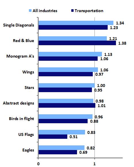
“Trendiness” of design elements, 2007-2011, via Emblemetric
If you’re skeptical: I understand. I don’t want to see data-mining replace point of view. From a recent Awl piece about “Big Data” criticism: "A content analysis of Animal Farm can tell you what Animal Farm says about animals. But it can't tell you what it says about Stalinism." As that piece suggests, any data set, no matter how vast, is only as useful as what a knowledgeable interpreter makes of it.
And Emblemetric’s analysis is not purely database-driven: The American writeup cites various contemporary and historical sources and obviously exercises some critical judgment. (The specific use of words like “traditional” and “dated,” both of which are loaded variations on “old,” is one example.)
So I don’t consider Emlemetric the last word, but I do think it’s useful, and certainly interesting — especially on broad trends. How can you not enjoy a graph like the one below, quantifying logo shape-usage over decades? Or on the increased use of leaves in logos? Or one on the uptick of logos involving “two stars in a circle”?
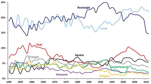
Percentage of new logos featuring specific shape elements, via Emblemetric
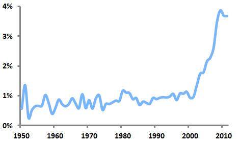
Percentage of new logos containing leaves, via Emblemetric
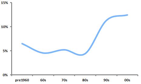
“Logos with two stars in a circle, as a percentage of all logos,” via Emblemetric.
In other words, I’m more drawn in by Emblemetric’s offering of information about broad trends than its assessment of any specific logo. (Although I more or less agree with its verdict on American’s logo.)
My main suggestion for the blog, actually, would involve its actual graphics, which are, to be blunt, rather ugly. C’mon: You can do better than whatever free plug-in produced these charts and graphs! This is the age of mouthwatering data-visualization and fancy infographics!
Or at least I’m pretty sure that’s the trend; I haven’t run the numbers.


Comments [3]
02.02.13
07:53
02.04.13
01:47
09.29.14
03:18