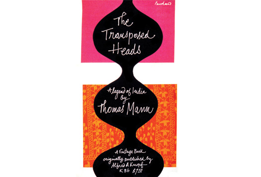
My handwriting should be a font. That’s what everyone has been saying since I was about 12, and while I agree it is true, it never seems like a compliment to me. What good is handwriting nowadays? To have nice handwriting seems sort of like a secretarial skill. My mother, my grandmother and one of my aunts also have good handwriting, and there’s a certain familial evolution from Palmer copperplate to more modern printing. The fourth grade year I spent learning cursive (another bit of dead curriculum) was hell. But we all know how to write a thank-you note.
Because/despite this, I love graphic design that uses handwriting. When I did research on Paul Rand, I was always attracted to his bits of happy, open, handwritten text. I have no idea if it was his hand, but it made him seem much more accessible. The greatness of his UPS logo is partly due to the homemade jauntiness of the package bow. Ditto for the Alvin Lustig covers of earlier vintage. Handwriting seems to have gone out of style (is it the infinite fonts), except for the work of designers who are fans of past glories or the effect of tears on ink.
Which is why I was so pleased to see the cover for David Barringer’s There’s Nothing Funny About Design (by Felix Sockwell). And I was hoping Barringer had written in the book about choosing the cover for his book, since he writes about other book covers, and the validity of written explanations for design work. No such luck. I have to assume handwriting was chosen for some of the same reasons Rand picked it in 1959. Handwriting seems both exotic and casual amidst a sea of proper type. The little face in the lower left of Barringer’s could well have come from a 1950s philosophy paperback. The whole is amusing without being expressly funny. It is for the text to make you laugh.

